Kubefirst
.avif)
About the client
Full-service SaaS design for a Kubernetes GitOps platform
Polybox Studio has been Kubefirst's SaaS design partner for over a year — delivering a full rebrand, website design, product UI/UX, design system, and marketing design.
- Timeline:1 year
.avif)
Problem Statement
.avif)
Kubefirst needed a real branding makeover, not just a quick fix. It's a powerful tool that makes Kubernetes more accessible, but its branding was way behind its tech. It was stuck in a boring grayscale, which gave the impression of being outdated and intimidating. That's the opposite of what it's supposed to be – making complex tech easier to understand and use.

Our role
Kubefirst needed to become a harmonious part of the Kubeshop family. This meant adopting the style and visual language of the master brand, both visually and vocally, to show they belonged and had the same technical DNA.
Most importantly, Kubefirst couldn't just blend in - it needed its own unique identity with a visual language that showed its value - high speed and efficiency in onboarding Kubernetes. It wasn't just about looking different - it was about feeling faster and smoother.
— Polybox marketing research
Design Rationale
The client had a pretty clear vision of what they wanted - they wanted to capture the spirit of Inspector Gadget, without all the awkwardness. They wanted cleverness and a always-ready toolkit that solves problems quickly. Kubefirst was like a perfect multitool, and that idea became our major inspiration.

— Elizaveta Vakhrameeva
Brand designer
Logo anatomy
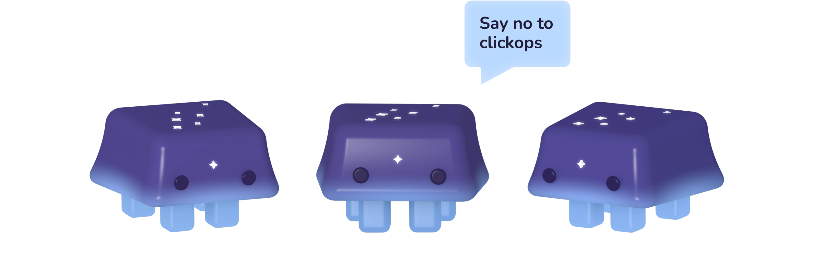
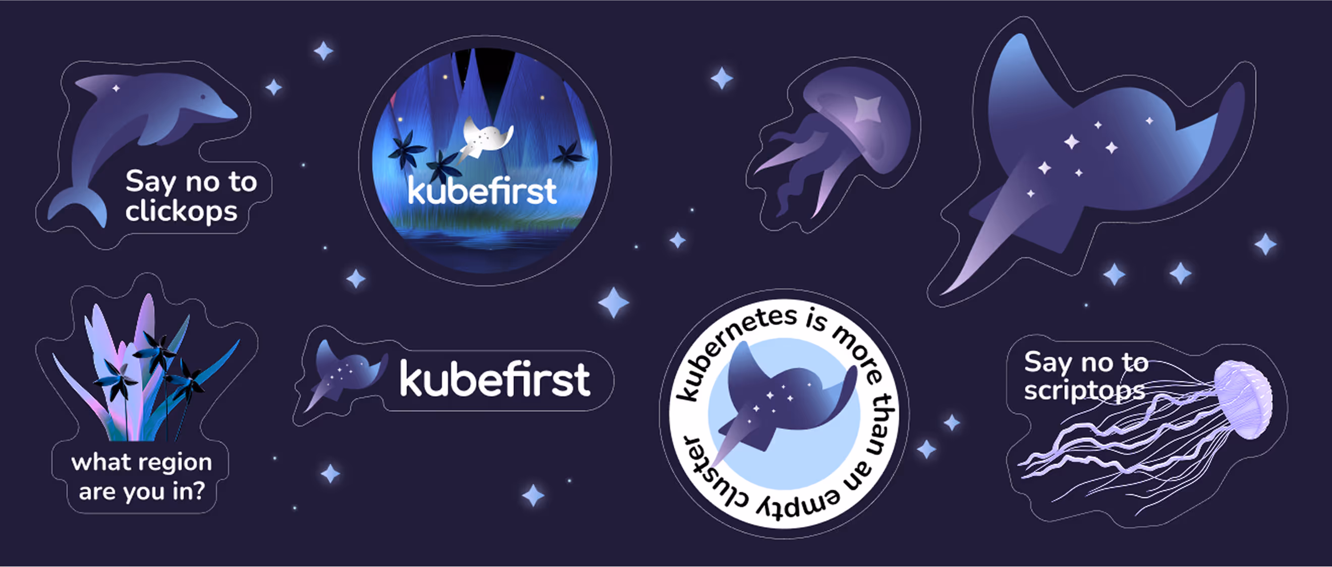
The Kubefirst logo is a combination of an aquatic creature (K-Ray) and the words "Kubefirst." The K-Ray is this spotted eagle-ray that serves as the main brand element. It's shaped like an arrow that moves through clouds, so it represents speed and how we navigate through complex systems.
On its back are seven stars, which aren't just for decoration. They're actually the Pleiades constellation, from Greek mythology, and they represent Atlas and Pleione. So the K-Ray's an eternal celestial navigator. Its arched shape and star map symbolize resilience and exploration.
The Kubefirst Design System
%201%20(1).avif)
With Kubefirst, we've created a dynamic design system in Figma. It's a single source of truth that ensures consistency across all platforms.
Some of the main parts of system included:
- The basics like color schemes, typography, and icons.
- Interactive components like buttons, forms, and menus.
- Pre-made templates and patterns for layouts and content.
- Documentation with clear instructions on how to use assets.
.avif)
- ManagerValeria Kozlova
- Technical DesignerElizaveta VakhrameevaAleksandra Kalinicheva
- Web DesignersElizaveta VakhrameevaYana KutlushinaSvetlana KalmykovaAlina SultanovaJulia MolochaevaDenis Gurkov
- DesignerElizaveta Vakhrameeva
- 3D DesignerElizaveta Vakhrameeva