sezwe
About the client
Rebranding and website design for a short-video social platform
SEZWE is a short-video digital public square.
Polybox Studio delivered the complete rebrand and website in 2 weeks — new logo, visual identity, social media templates, and website design.
- Timeline:2 weeks
- Services:
Problem Statement
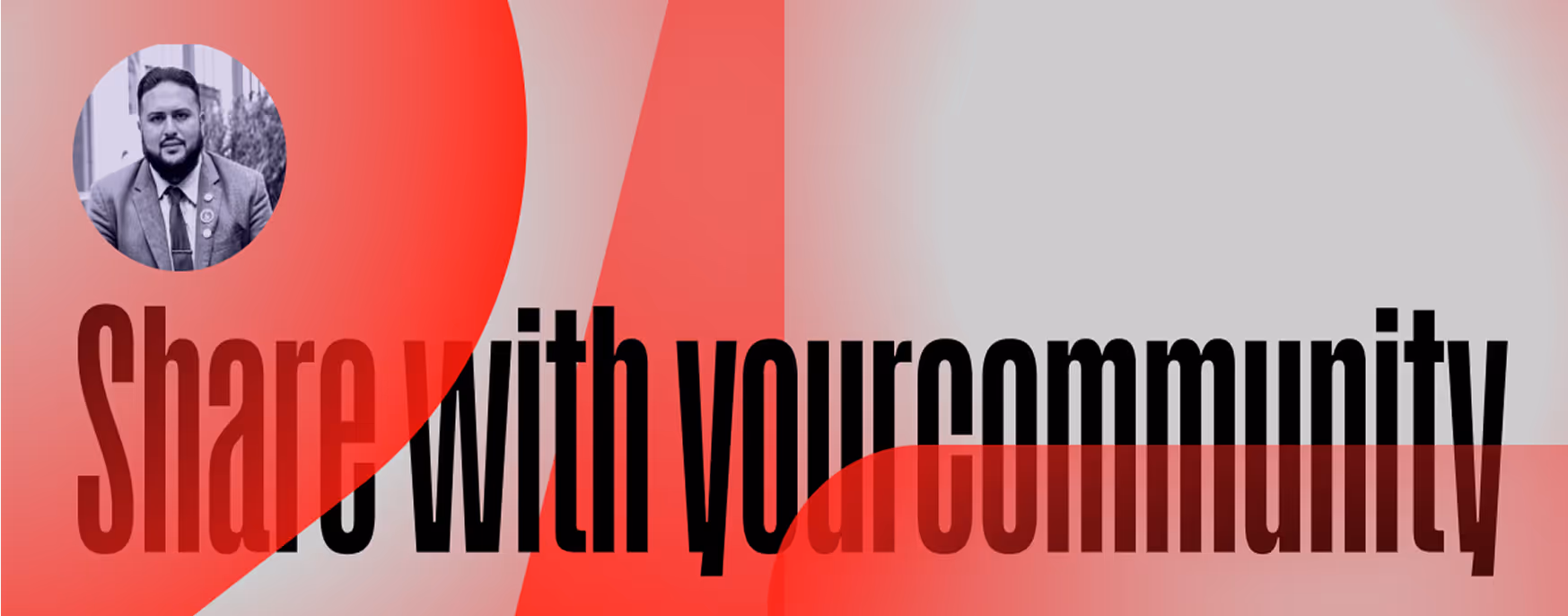
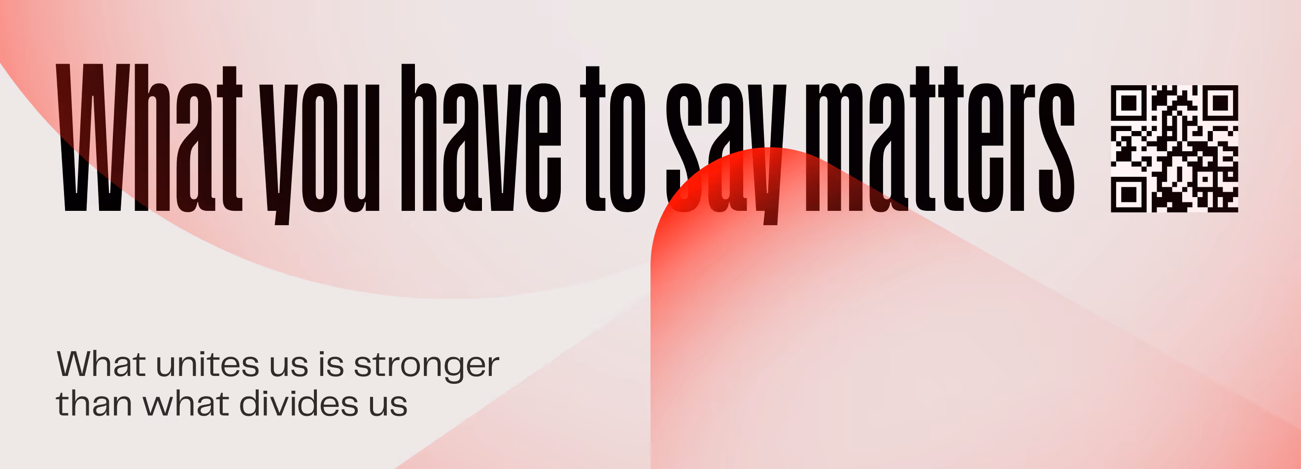
In the busy video hosting and social media space, it's hard for any platform to really stand out. SEZWE wanted to give its platform a makeover to appeal to a younger audience: Gen Z and political activists.
.avif)
Our role
Unapologetically bold and inclusive - that’s exactly what SEZWE needed for its rebranding. The brand had to capitalize on people’s desire for authenticity and turn the app into a digital public square that promotes open dialogue.
We wanted to create a visual identity that reflected the intellectual friction of our users.
The new branding had to show that SEZWE is a place where people can examine ideas, not just argue with each other. We went through every single brand asset and extracted its core idea, then incorporated it into the refreshed identity.
— Polybox marketing research
Logo anatomy

In the redesigned logo, we emphasized the dynamic "S" icon and updated the wordmark. A stylized white letter "S", for "Sezwe", is formed by two parallel lines with a red "play" triangle embedded in its center. These lines evoke rapid motion, symbolizing quick content creation and consumption. The play button clearly indicates the video-based nature of the platform.
For the redesign of the wordmark, we used PP Telegraf, a font with a strong presence and a hint of brutality. New typography gives the logo a modern and grounded appearance.
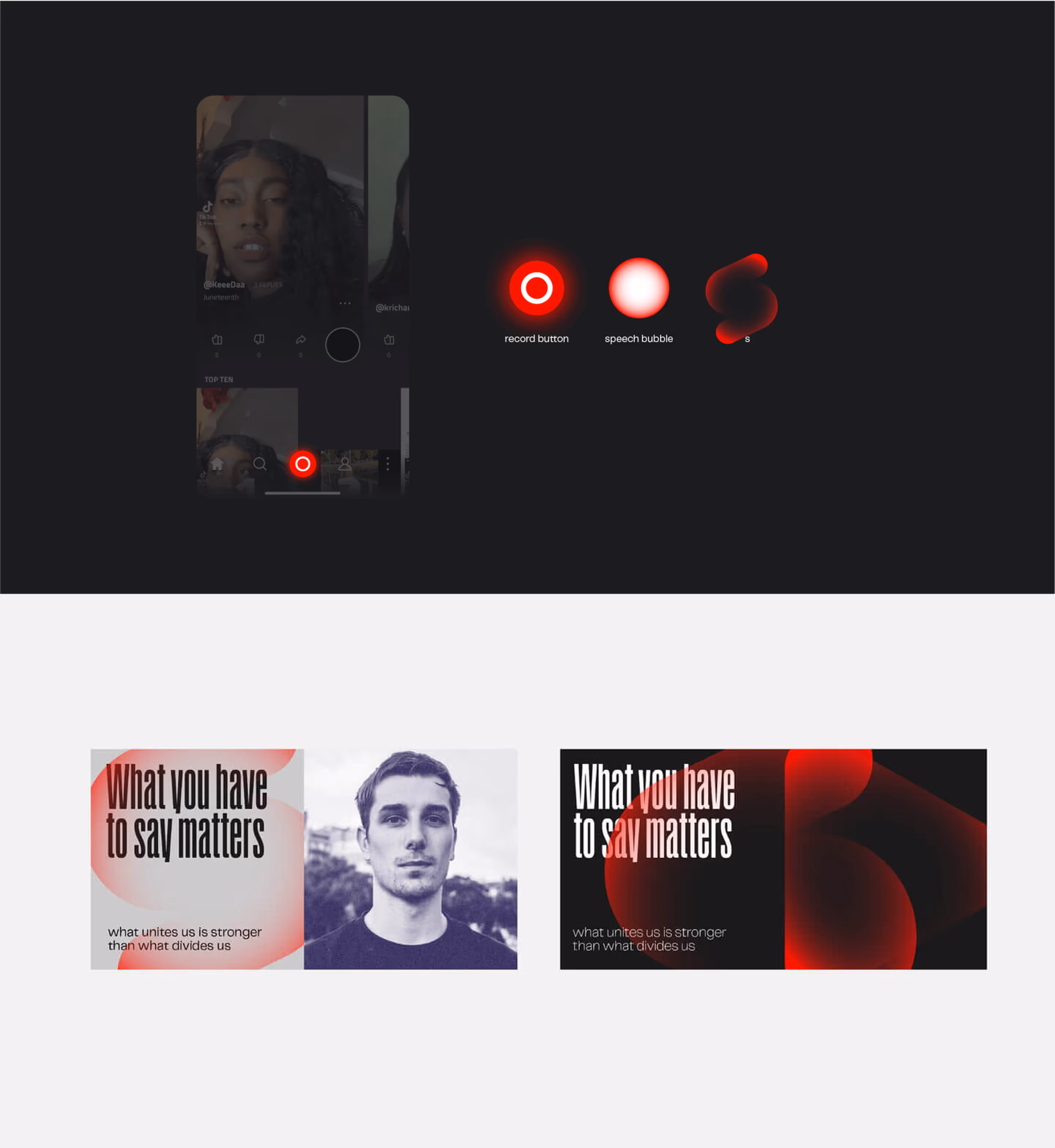
Visual language
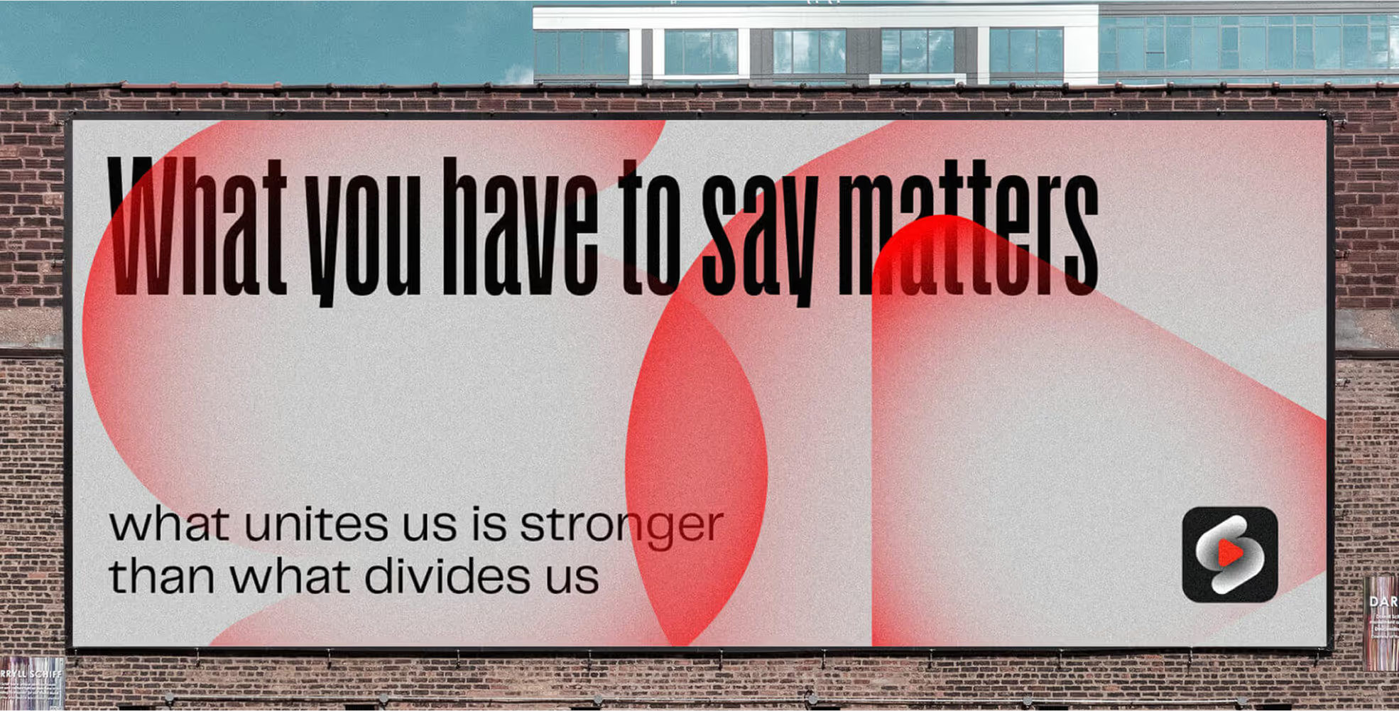
The main visual elements of the brand are kinetic, red shapes that are intentionally translucent and unstable. These shapes represent the idea that ideas become stronger through collision, rather than isolation. When they bump into each other, they create more saturated hues, and when they push away from each other, there's space for new ideas to grow.
Design Rationale
We used fluid, see-through red shapes, because a good conversation isn't about fixed ideas - it's about ideas bouncing around, clashing, and blending together to create something new. It's like painting on a canvas, not building a wall with bricks.
— Elizaveta Vakhrameeva
Brand designer
.avif)

- ManagerValeria Kozlova
- Technical DesignerElizaveta Vakhrameeva
- DesignerAlina Sultanova
- Web DesignerAleksandra KalinichevaYana Kutlushina