Agency.OS

About the client
Brand identity design for a go-to-market agency
AgencyOS is a consulting agency that helps companies enter the US market by developing go-to-market strategies.
Polybox Studio delivered the complete brand identity in two weeks — logo, 3D illustration system, visual language, and marketing collateral.
- Timeline:2 weeks
- Services:
Problem Statement

Agency.OS was looking to create a corporate identity that would appeal to companies looking to enter the US market.
They needed a brand that could visually represent their philosophy - a combination of strategic knowledge and data-driven insights, with a focus on modern and agile solutions and the use of AI-powered tools.
In the US market, where strategy, clarity, evidence and flexibility are all that matter, these are the things that will win customers over.

Our role
The visual system had to make the most of the AgencyOS and turn it into powerful design elements.
For a new GTM agency, we didn't want to go too corporate (that feels cold) or too casual (that undermines authority).
We needed to follow the path set out for us by the company's vision: being modern, flexible, and universal.
Branding for go-to-market agencies falls short when it's descriptive instead of prescriptive. We needed to turn an abstract process into something visual, and convert numbers into compelling graphics.
To do so, we had to choose the right imagery, something versatile but with a touch of edge.
— Polybox marketing research

Design Rationale
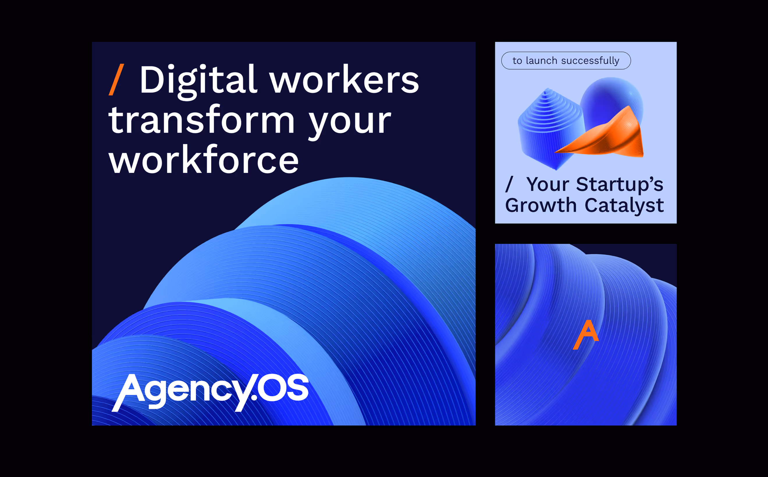
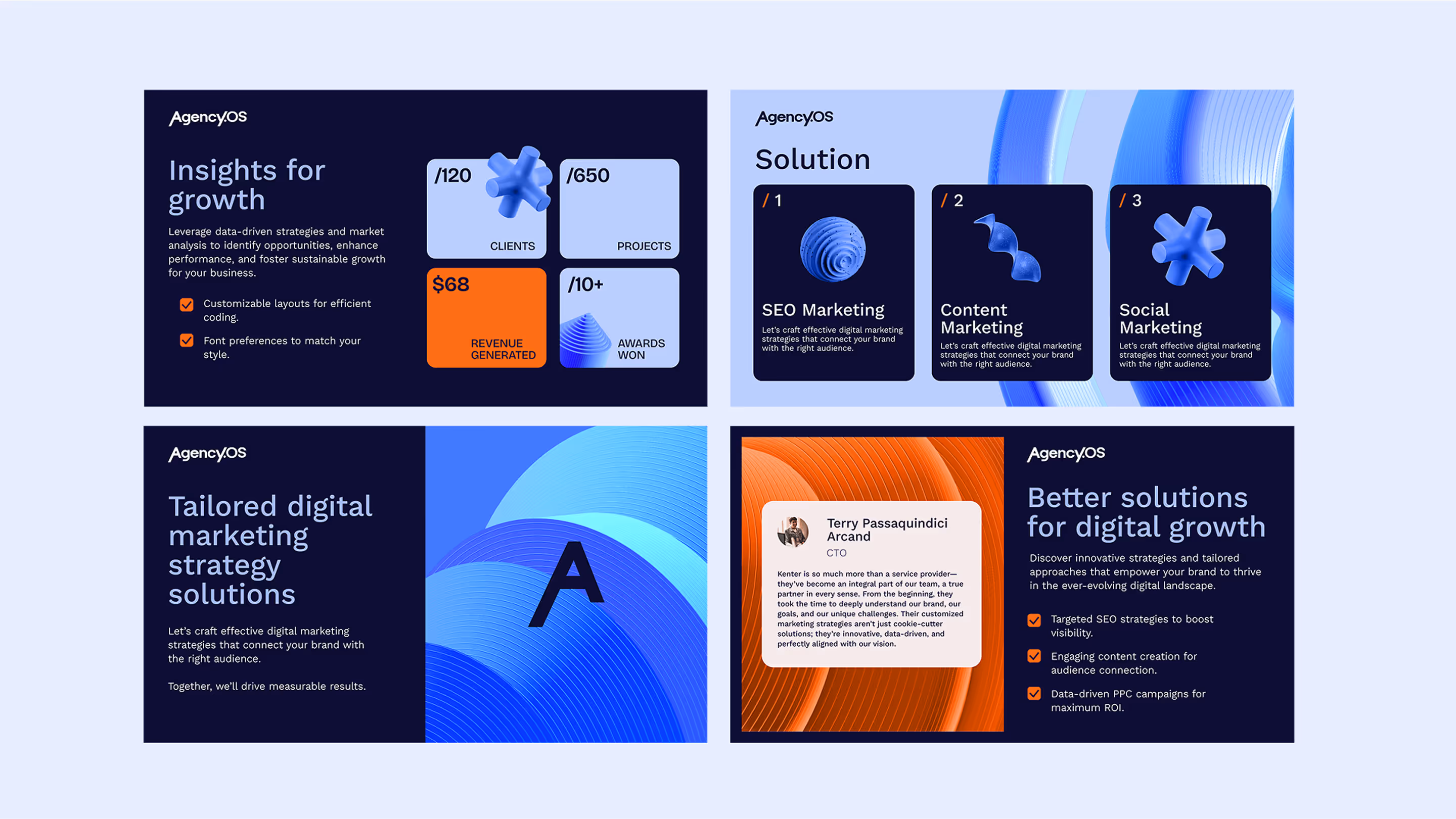
The visual identity has this really cool 3D element system that mixes organic and geometric shapes in contrasting colors of orange and blue. It gives a feeling of movement and change, showing how Agency.OS' structured approach and flexible strategy work together.

— Elizaveta Vakhrameeva
Brand designer
Logo anatomy
For the Agency.OS logo, we used the Kantumruy Pro font and customized it to make the A and Y letters look like they're part of a graph. These kinetic letters give off a feeling of forward movement and flexibility, two important qualities for entering the market successfully.
Color palette
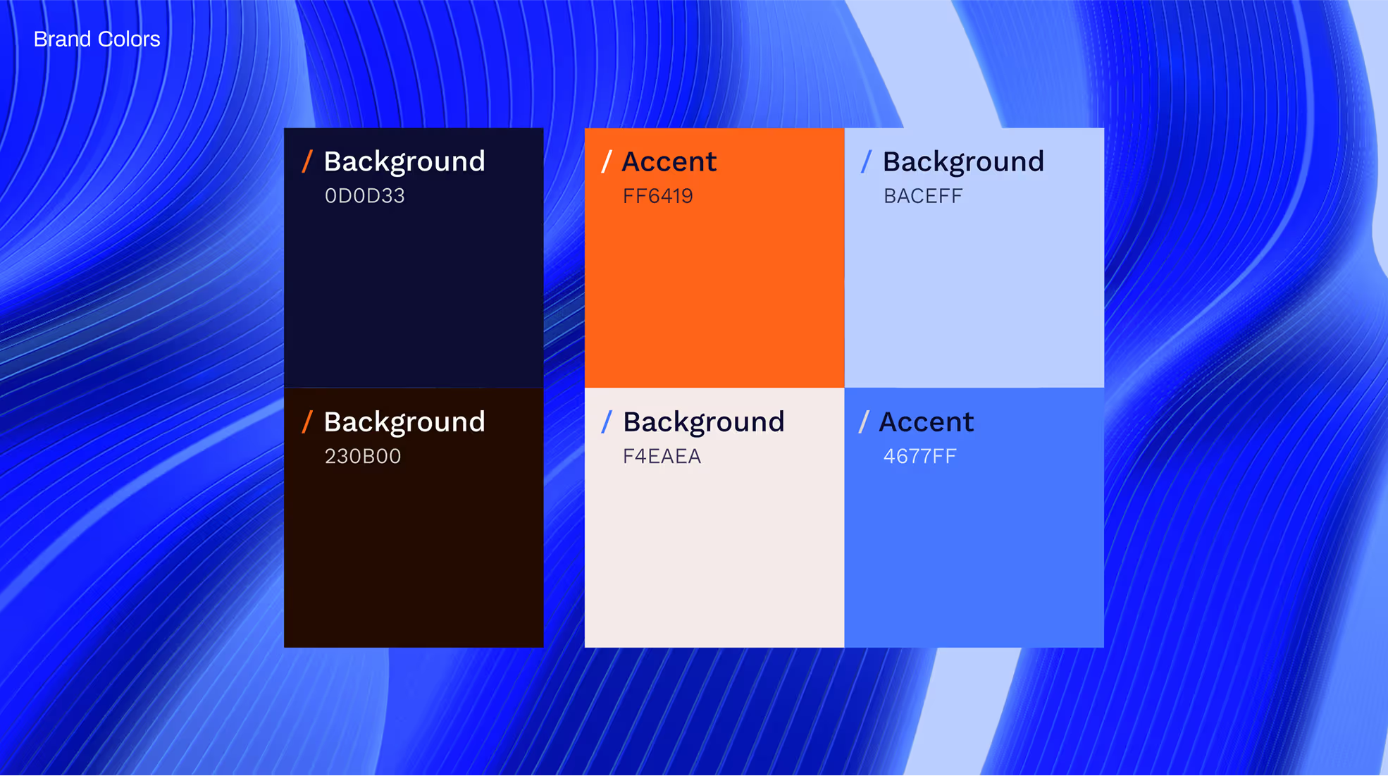
For the color palette, we chose a combination of bold orange and cool shades of blue to create a contrasting look. Orange is inspired by the warm glow of screens where important decisions are made, while blue represents the deep insights that guide those decisions.
This combination carries over to our overall brand identity, with orange acting as an accent color that adds excitement without overshadowing the professional vibe created by blue.
- ManagerValeria Kozlova
- Technical DesignerElizaveta Vakhrameeva
- DesignerElizaveta Vakhrameeva