&Market

About the client
Brand identity and website design for a commercial kitchen platform
&Market is a modern and commercial co-working kitchen based in Washington, DC.
Polybox Studio delivered the complete brand identity and website in 2 weeks — logo, visual identity system, B2B and B2C marketing collateral, and website design.
- Timeline:2 weeks
- Services:
.avif)
Problem Statement
&Market wanted to encourage and empower potential members to take the leap. Through branding, they needed to convey how easy it was to join and get started.
Their goal was to empower chefs, home cooks, and food entrepreneurs by helping them turn their passion into a working business without the typical high-risk investment.

Our role

Our ultimate goal was to create a corporate identity that attracts potential customers and encourages them to use our professional food services.
The brand identity should visually represent the simplicity of getting started, the high quality of &Market service, and their commitment to providing excellent support.
— Polybox marketing research
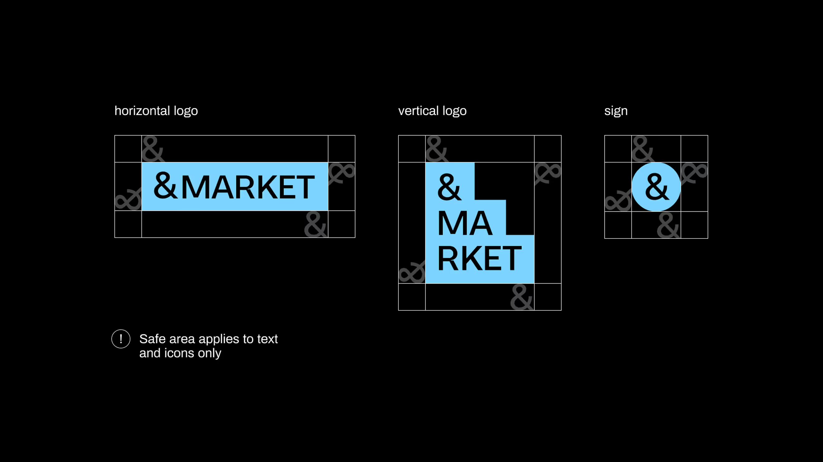
Logo design

We used the modern neo-grotesque Neue Augenblick for the logo. We loved its industrial and slightly brutal atmosphere, which matches the vibe of the big city where &Market lives. This logo seamlessly fits into the urban environment as well as advertising banners and digital media, due to its clarity and readability.
Design Rationale
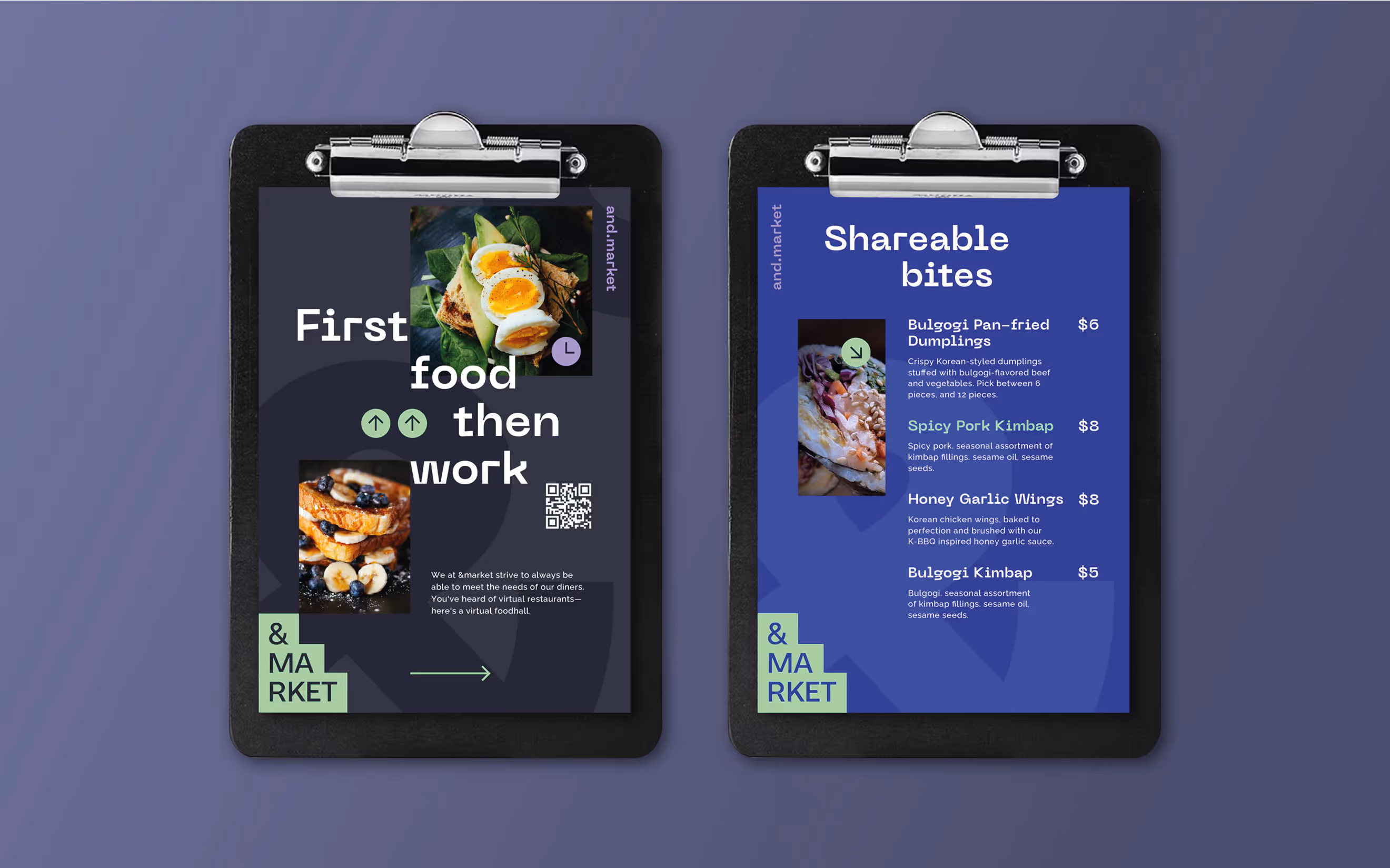
For us, the main idea behind the branding is "a place that has everything," which is perfectly expressed in the photographic collage concept. At the center of the collage, we used a large ampersand (&) symbol, formed by combining smaller images. This symbol ties directly to the brand name and serves as the focal point of the design. We filled the ampersand and the surrounding space with various photos that represent different aspects of the &Market ecosystem.

— Elizaveta Vakhrameeva
Brand designer
.avif)
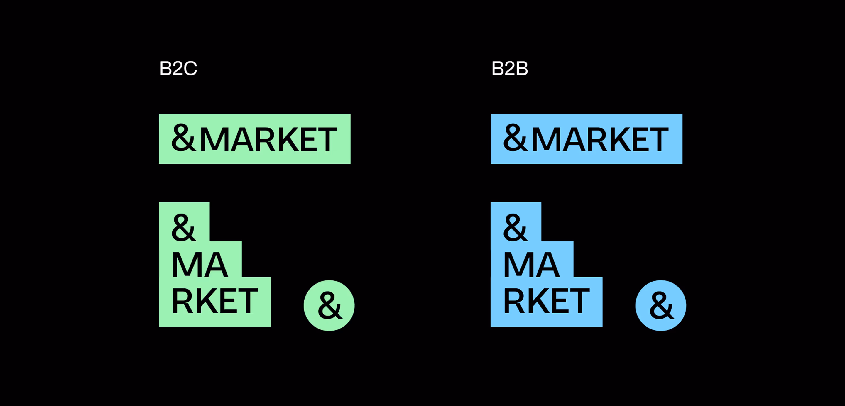
Color palette

We created two different color schemes for our B2B and B2C marketing campaigns. For B2B, we chose cool colors that convey professionalism, trust, and a modern vibe. For B2C, we decided to go with bright and fun colors to grab customers' attention. Both schemes share the same muted gray tones, allowing us to use them interchangeably without overwhelming the audience.
.avif)
.avif)
- ManagerValeria Kozlova
- Technical DesignerElizaveta Vakhrameeva
- DesignerAleksandra Kalinicheva