Ark
About the client
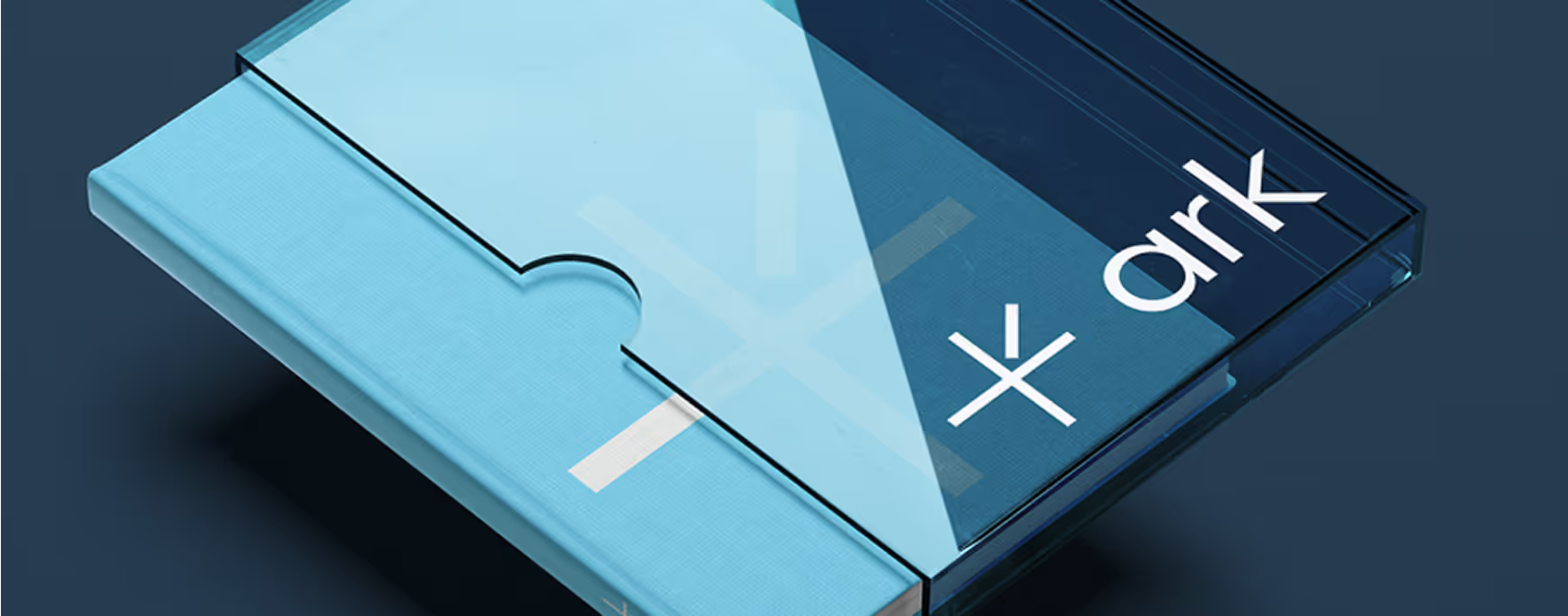
Brand identity and website design for a Tanzanian financial advisory firm
ARK is a capital and advisory firm, operating in Tanzania. The company offers financial services for businesses, including investment management, financial planning, and advisory support.
Polybox Studio delivered the complete rebrand and website in two weeks — new brand identity, visual language, corporate collateral, and website design.
- Timeline:2 weeks
- Services:
Problem Statement
.avif)
ARK intends to expand the market and go international. To do this, the company needs to update its existing branding to meet the standards of the international market.
Our role
We dove deep into the old ARK brand identity to find its roots through design analysis and employee interviews. In the end, we found the core values: "reliability" and "practicality."
We needed to make these roots grow and bloom so ARK could confidently enter the international market and stand tall among companies that had been operating for many years.
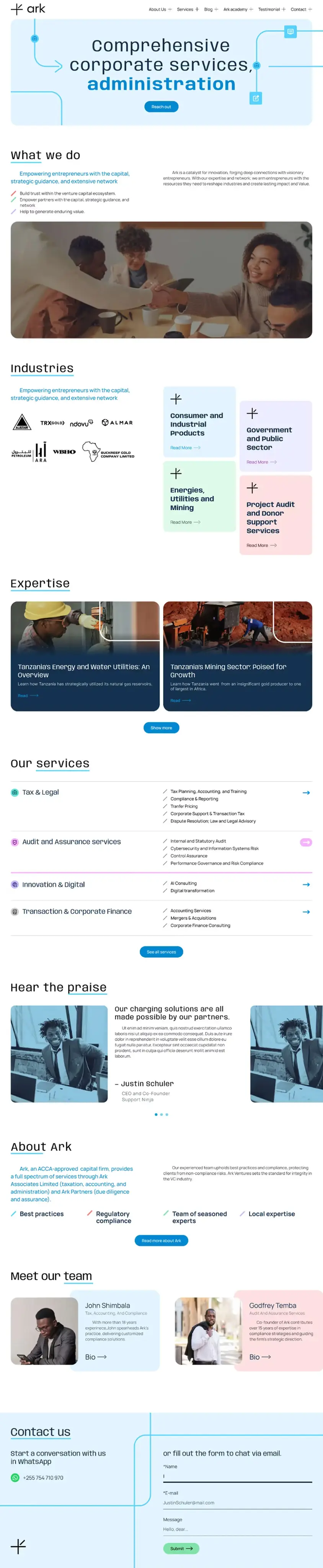
As a result, we created a new look that's unmistakably ARK but can travel the world without losing its Tanzanian zest – because who says you can't bring a little spice to the world of capital advisory? In addition, we addressed critical usability issues on the ARK website. The overhaul made it more attractive and user-friendly, representing the revamped corporate identity in all its glory.
— Polybox marketing research
Design Rationale
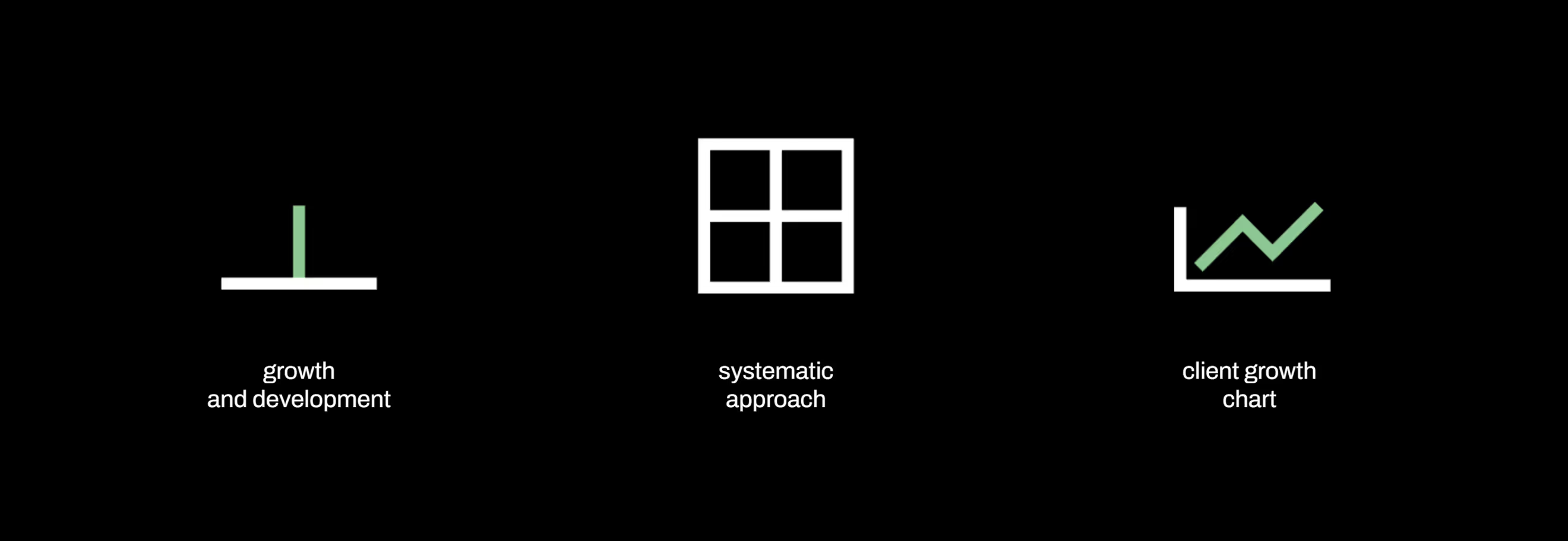
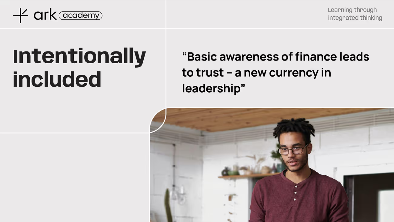
In our redesign, we really emphasized ARK's part in helping businesses grow. We added more colors, like bright greens, to show prosperity. The grids show financial info, like how precise ARK is. We also added smooth, organic shapes for fluid communication. It's a mix of structure and freedom, just like ARK - data-driven but still human.
— Elena Pantuhina
Brand designer
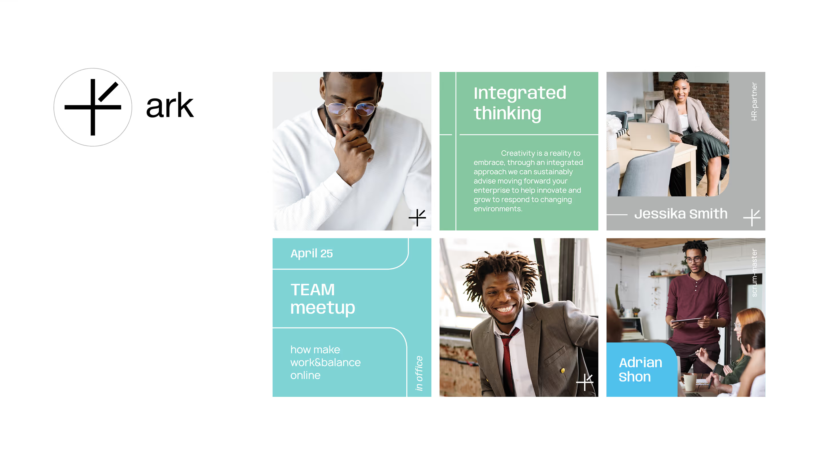
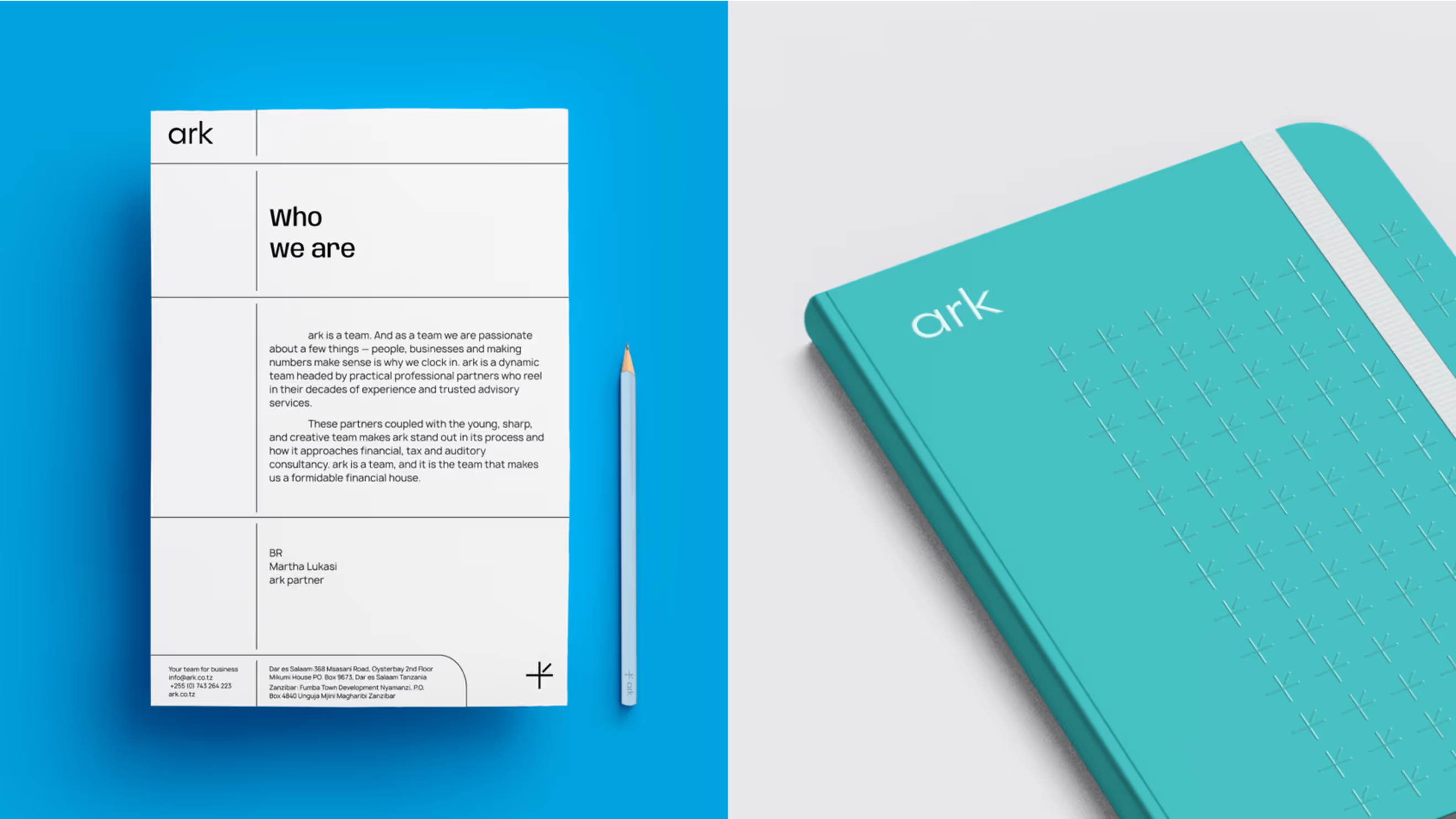
Logo anatomy
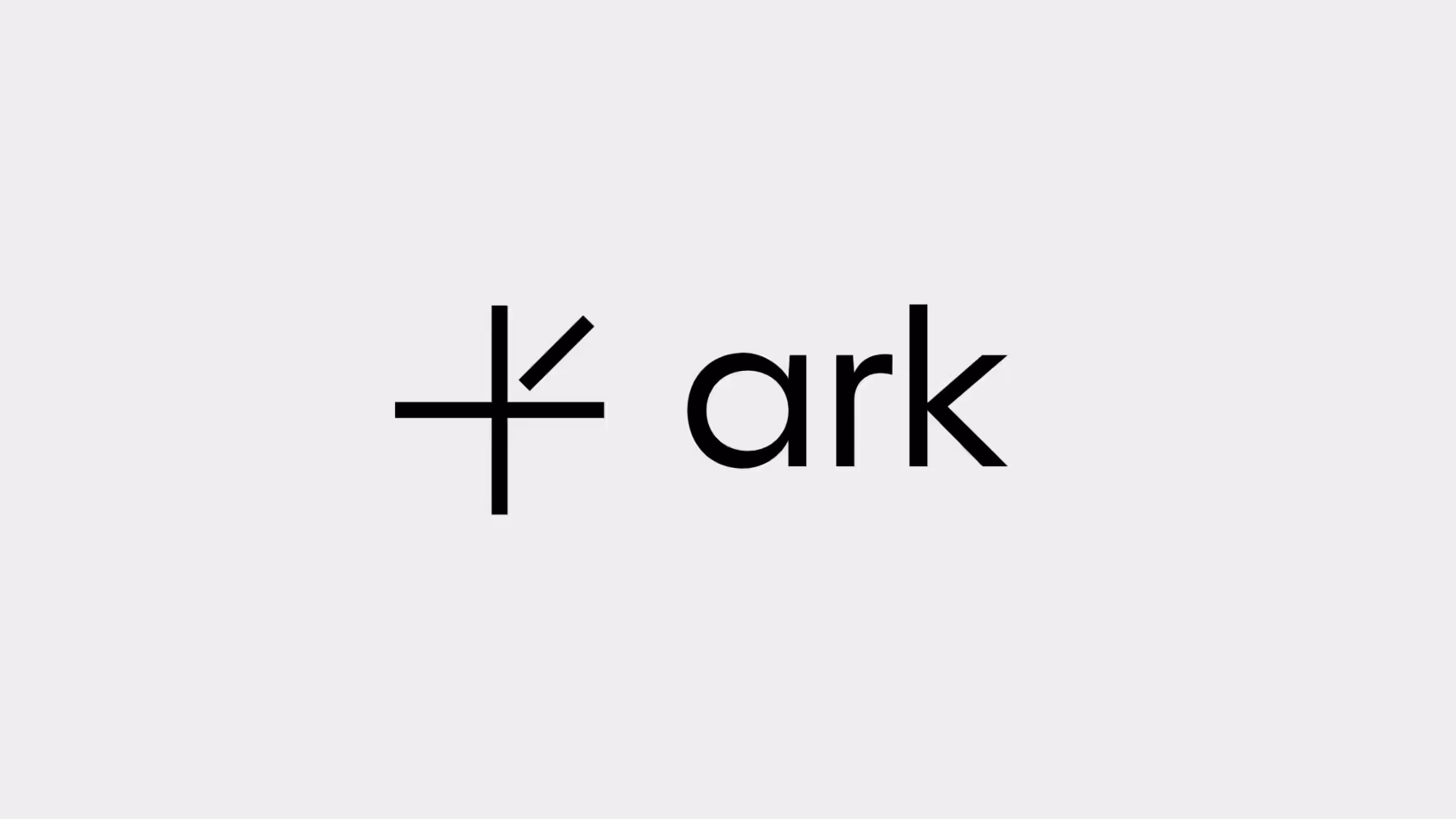
We redesigned the existing logo by simplifying and composing it from typical forms used in the company's industry: graphics and grids.
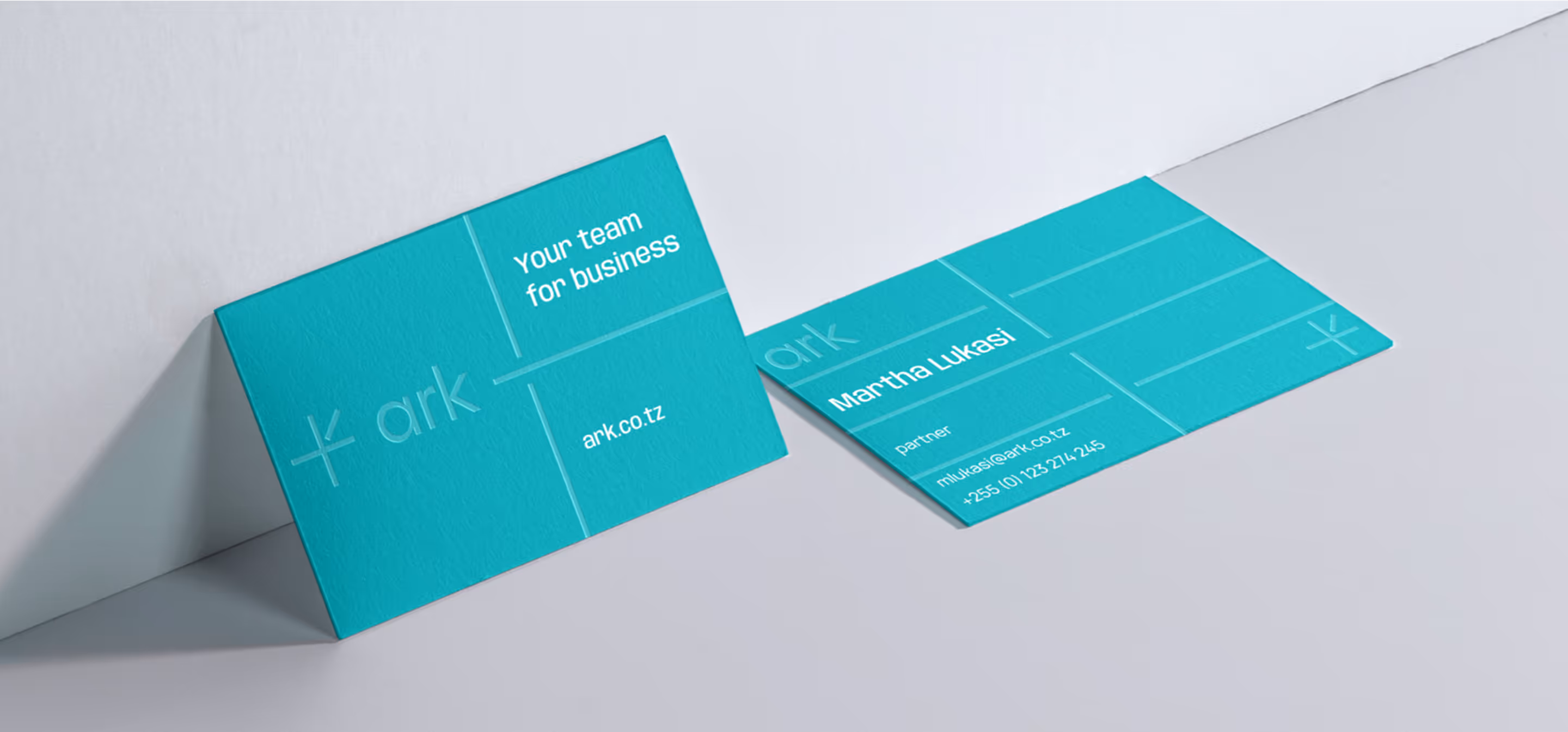
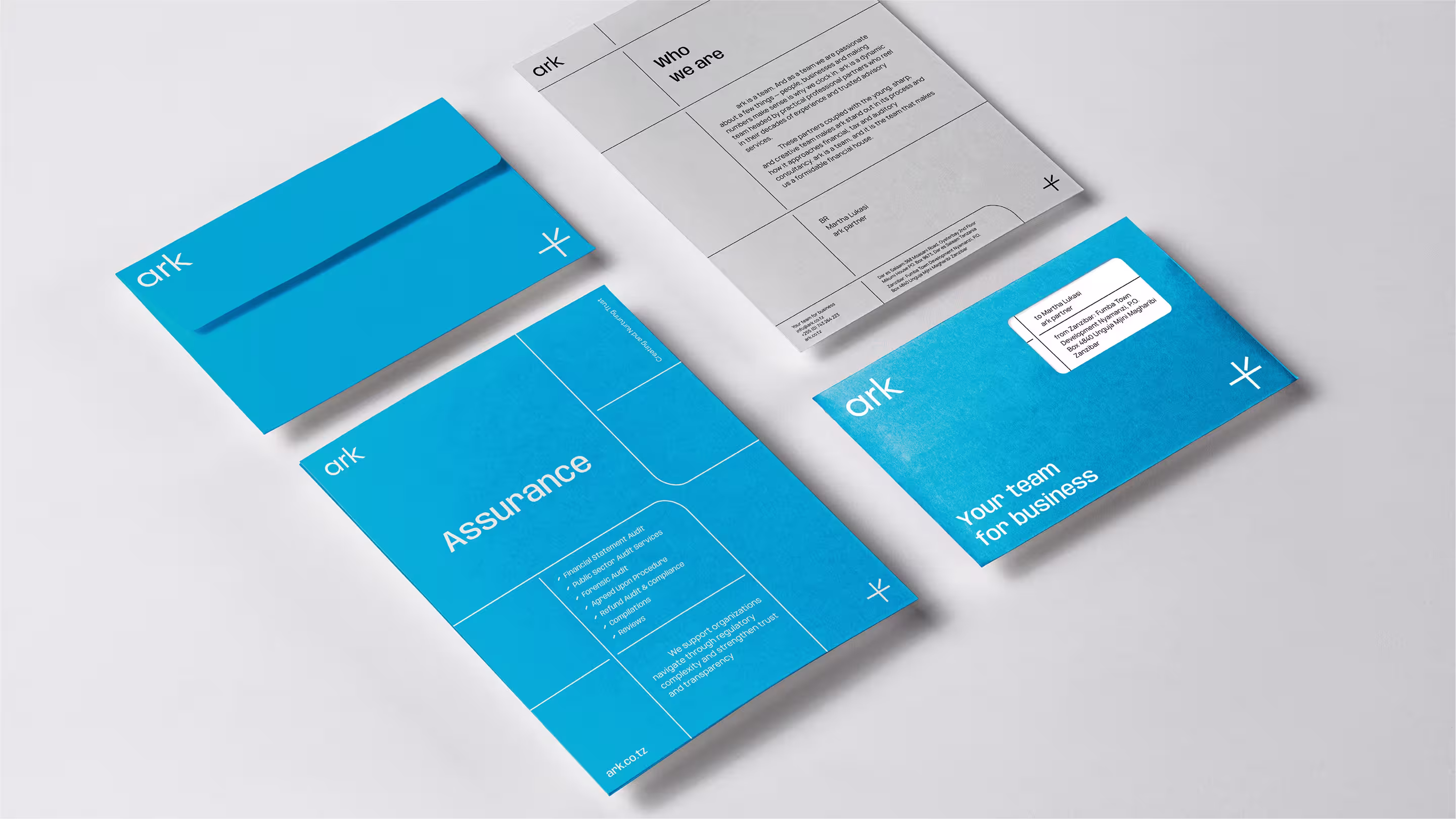
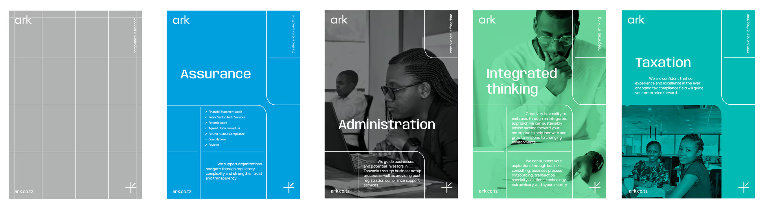
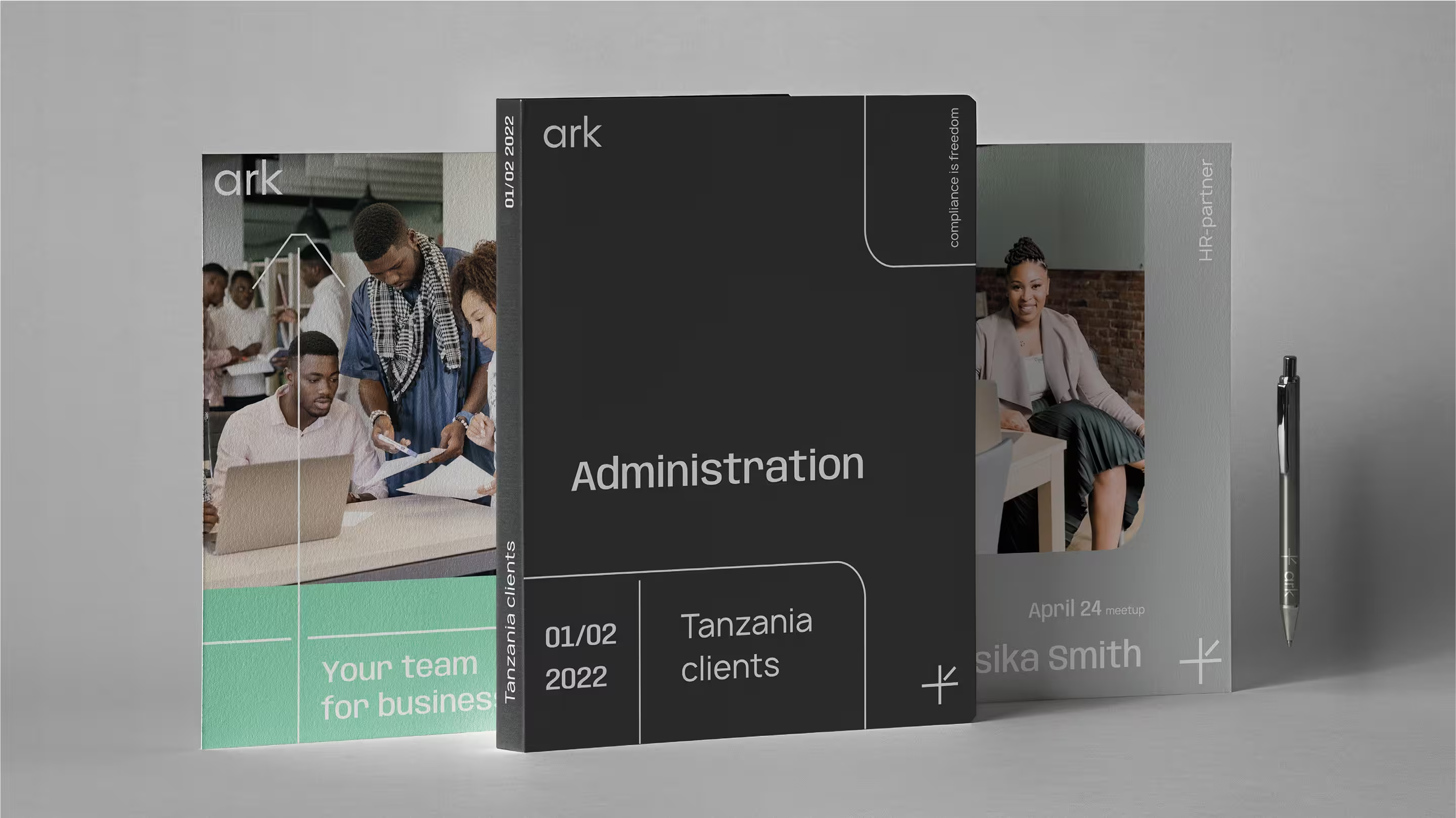
Corporate grids
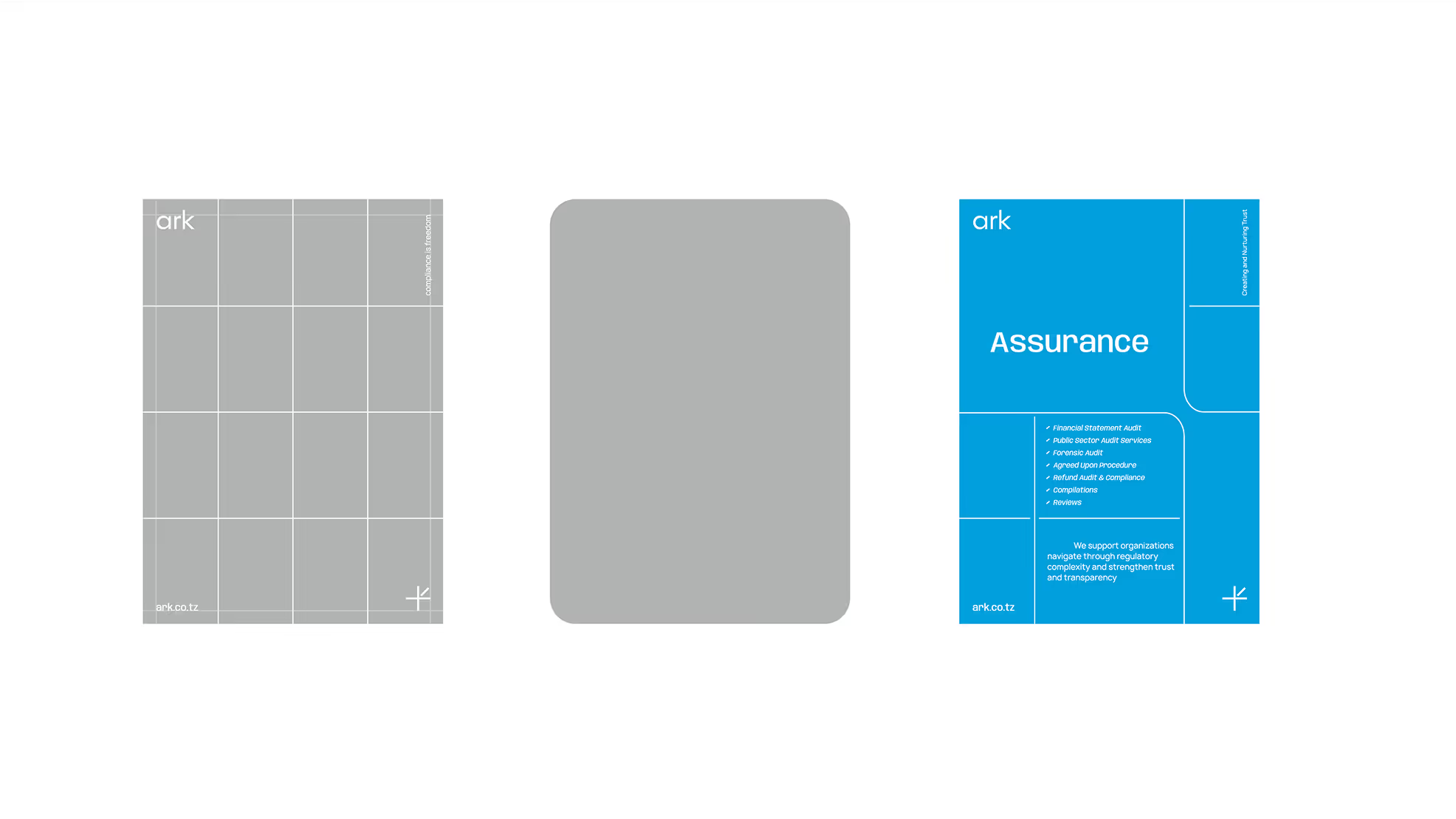
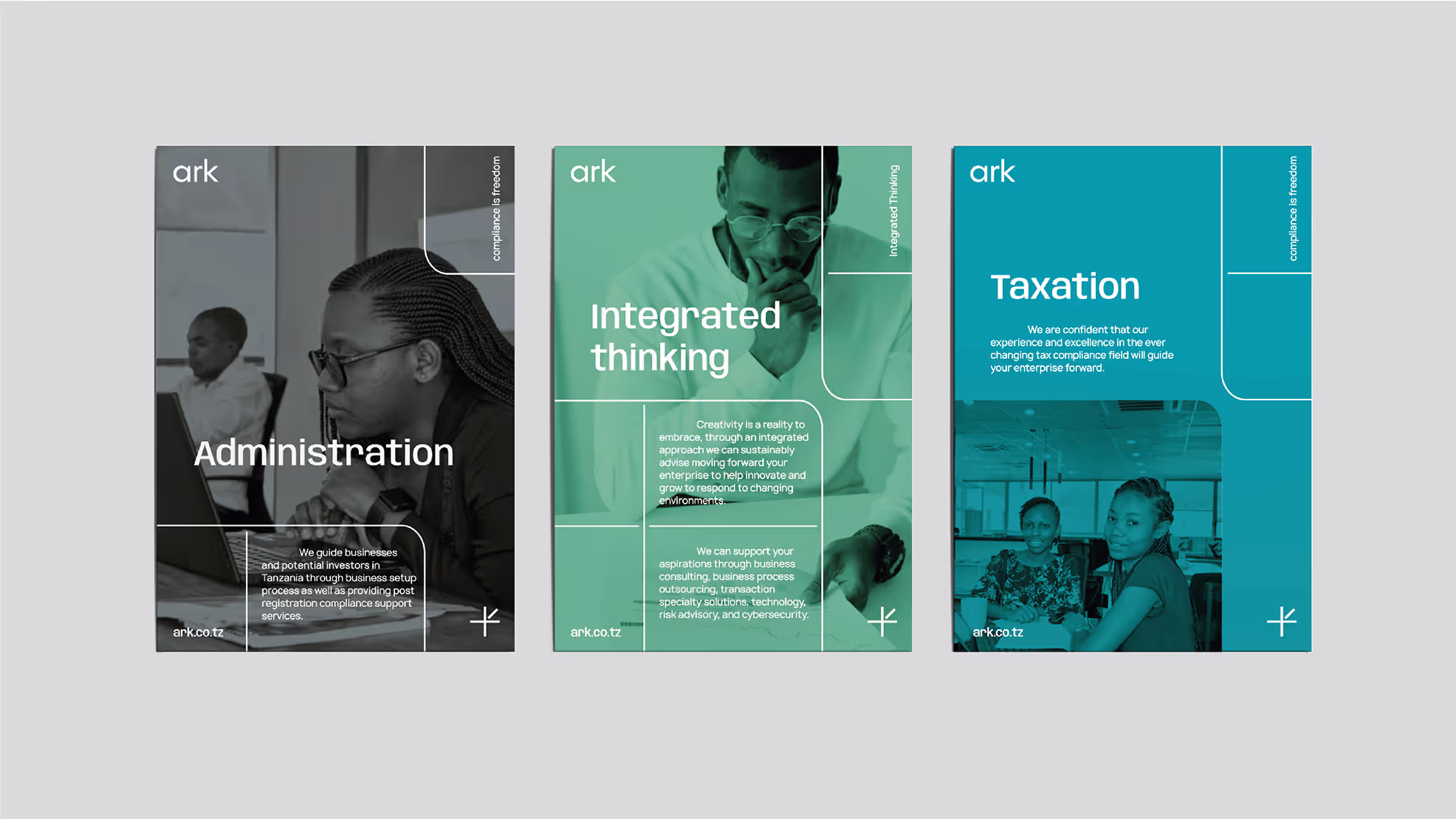
The idea of a clear, grid-like structure is evident throughout the corporate identity, and it is used in advertising media as well as in the website layout.
Color palette
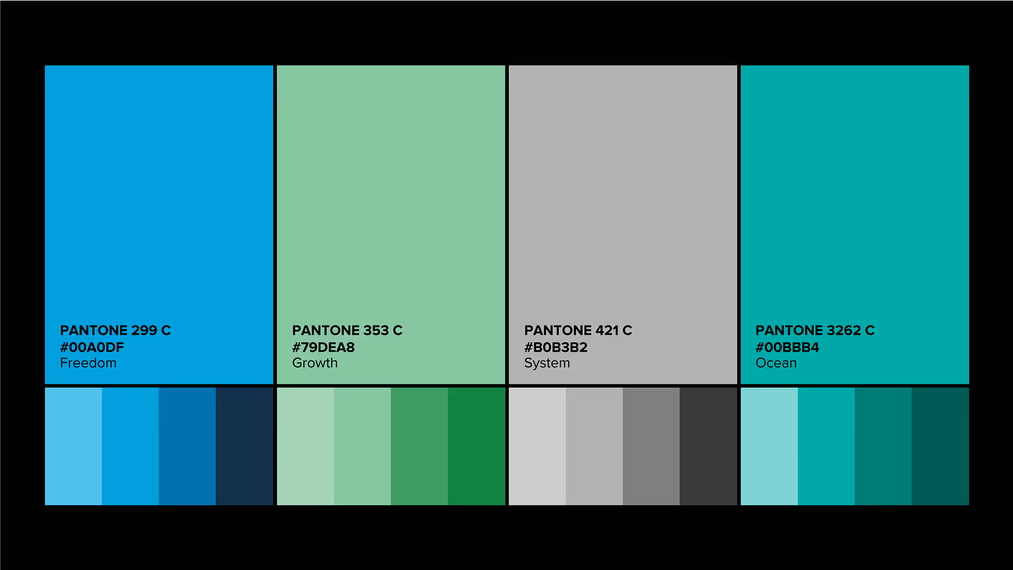
In the new branding, we maintained a light and airy feel, adding a vibrant and bright palette. This new palette is used extensively on the site to color-code the various services.


- ManagerValeria Kozlova
- Technical DesignerElizaveta Vakhrameeva
- DesignerElena Pantuhina