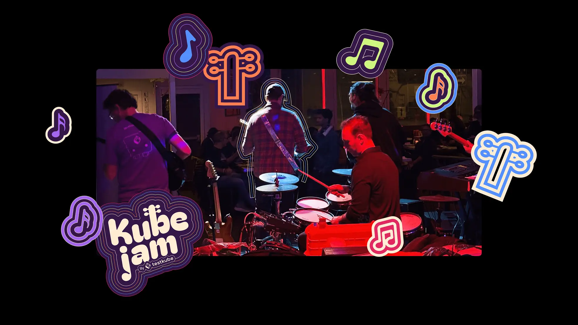
KubeJam
About the client
SaaS branding and rebranding for a cloud-native developer event
Testkube came to us needing a brand refresh for KubeJam, their music-centered networking event at KubeCon 2025. The event had been running successfully, but the original identity wasn’t scaling well across different cities and marketing materials.
Polybox Studio delivered the rebrand in 3 weeks — new brand identity, event website, and marketing design system for social, print, and event signage.
- Timeline:3 weeks
- Services:
- Website:kubejam.com
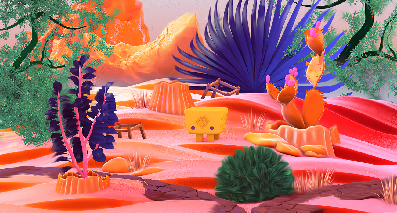
The original brand identity
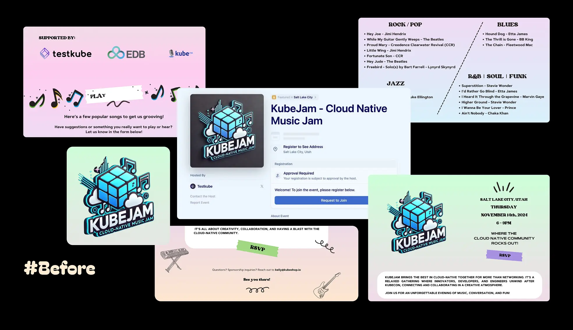
As a player in the SaaS industry, Testkube recognized the importance of a strong brand identity and an effective marketing strategy to drive customer acquisition and business growth. The refreshed brand needed to better communicate the unique value proposition of the event to its target customers, including both enterprise customers and individual developers, while supporting retention strategies and enhancing brand loyalty.
The existing brand featured a 3D cubic logo with musical elements. While it communicated the Kubernetes connection, it had limitations:
- Limited color flexibility made sponsor integration challenging
- Complex shapes didn’t scale well to small sizes
- The visual system lacked enough elements to create varied layouts
The new brand voice
Firstly, we needed to develop a more flexible identity that maintains the music and Kubernetes concepts while solving these practical challenges. A strong SaaS brand communicates its value clearly and builds trust through consistency across all customer touchpoints.
Successful SaaS branding involves a focus on continuous value through product-led design, personalization, and consistent support. We needed ownable graphic devices that could create visual interest without relying solely on the logo, and enhance brand recognition among other SaaS companies.
— Polybox marketing research
Three approaches for new brand positioning
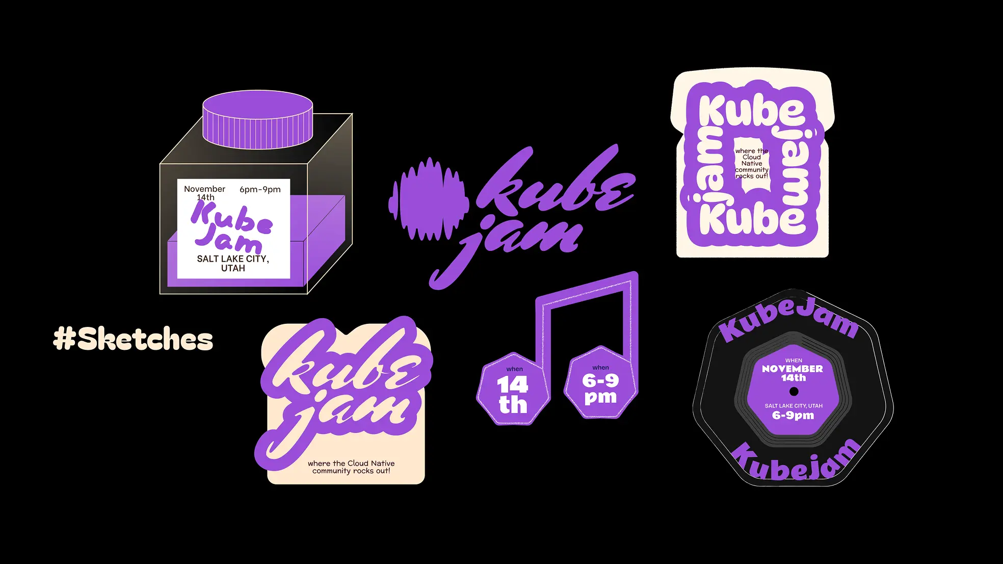
Concept 1: Cubic Jar of Jam used transparent cubes with colorful jam as containers. Literal interpretation with strong product-like appeal.
Concept 2: Jam on toast treated toast as a canvas for jam and musical notes. Warm and approachable but limited connection to tech.
Concept 3: K8s musical shapes combined Kubernetes’ geometric forms with layered contour lines suggesting sound waves and topographic maps. Musical elements as graphic accents rather than literal representations.
The client selected the third direction for its balance of technical credibility and creative energy. This direction also supports clear brand positioning for the event within the SaaS industry, helping differentiate KubeJam and clarify its value proposition to the market.
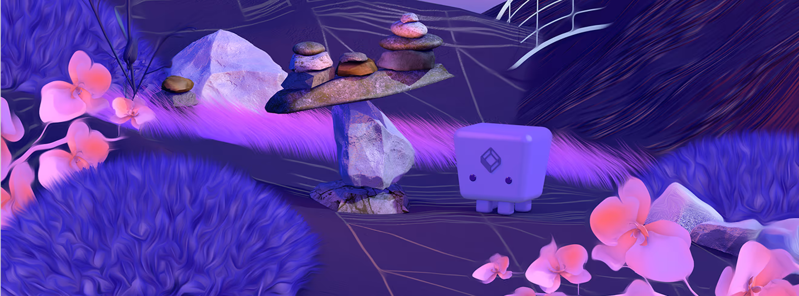
Core elements of the brand strategy
.webp)
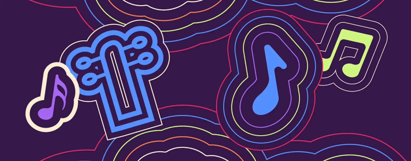
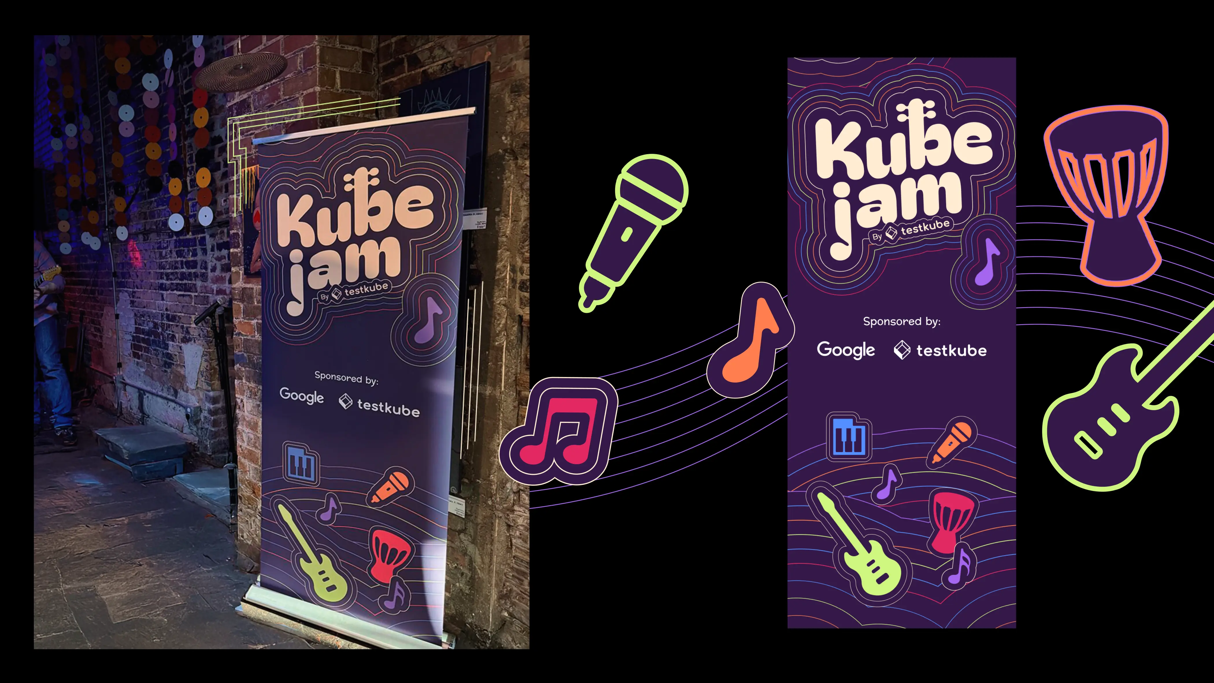
Layered contour lines became signature device. They reference sound waves, community connections, and topographic maps while providing endless compositional variation.
- Modular graphic elements including musical note icons, geometric badges, and instrument silhouettes.
- Flexible color system that works with sponsor brand colors and adapts to different event locations.
This approach gives the team building blocks rather than rigid templates. Each application can feel fresh while maintaining recognition. The chosen visual elements contribute to a cohesive brand identity and reflect the brand's personality, ensuring that every touchpoint consistently communicates the event’s core values and style.
Design Rationale
Instead of going with the typical Kubernetes images, we decided to make music the visual focus. The "jam" in KubeJam was literally there: flowing sound waves, musical notes, and rhythmic patterns that suggested improvisation and collaboration.

— Elizaveta Vakhrameeva
Brand designer
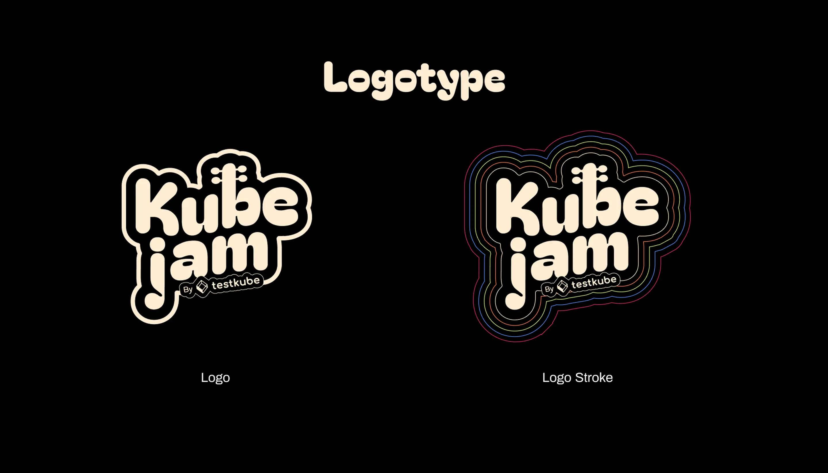
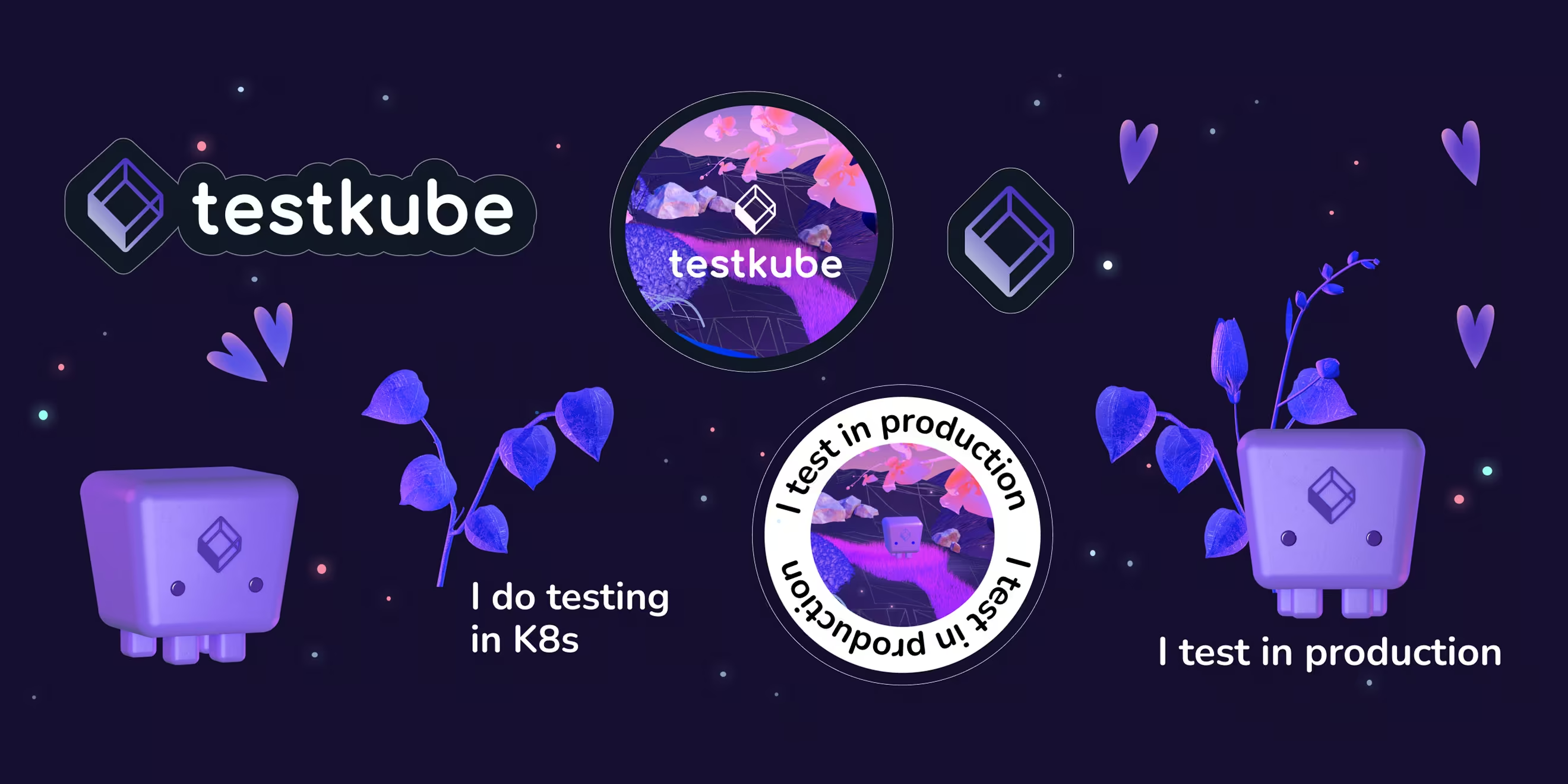
The logo
.webp)
The wordmark uses custom letterforms that work at any size. Rounded terminals create an approachable feel without sacrificing legibility. The contour line stroke version adds visual interest for larger applications while the solid version ensures clarity at small sizes.
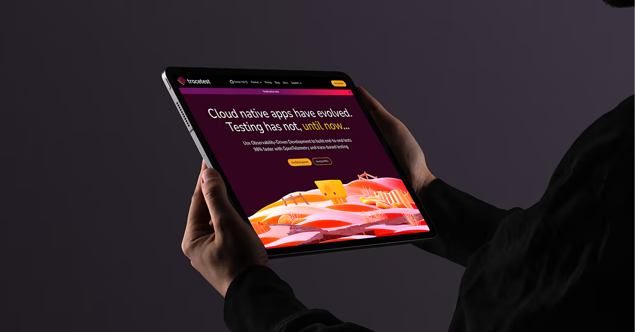
WEBSITE DESIGN & DEVELOPMENT
%20(1).webp)
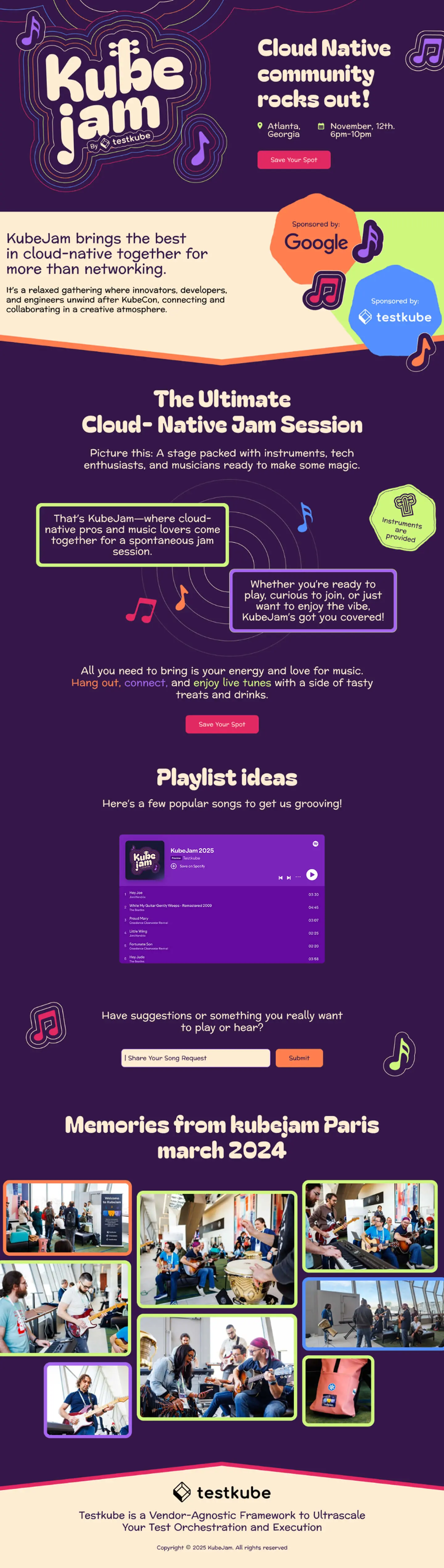
The website needed to work as hard as the event itself, handling everything from event information and sponsor recognition to registration and community building.
We structured content like a well-organized venue: event details, date/time/location, and sponsor logos positioned where attendees naturally look first. Clear hierarchy means visitors find what they need without hunting through cluttered pages. Calls to action guide them smoothly from curiosity to commitment.
Animated contour lines bring energy to the experience. We built the system to perform consistently across desktop and mobile, ensuring the brand presence stays strong at every breakpoint. No matter how the community connects, they'll get the same professional experience.
Color palette
.webp)

Deep purple serves as the primary brand color, providing a consistent anchor across all materials.
The accent palette includes electric blue, orange, lime green, pink, and cream. These can be used individually or in combination depending on the application and sponsor colors present.
Brand typography
.webp)
Bagle Fat One for headlines provides bold, friendly personality.
Preahvihear for body copy ensures readability across applications.
The pairing creates clear hierarchy from large event banners to small social posts. Both fonts are web-safe and perform well in various contexts.
Marketing strategy and social media
.webp)
The brand system extends to social channels with templates for announcements, event information, and sponsor recognition.
We created flexible compositions that accommodate different content types: text-heavy announcements, image-focused teasers, sponsor callouts, and post-event recaps.
The modular element system means new graphics can be produced quickly without requiring custom design work for each post.
Templates work across platforms (LinkedIn, Twitter, Instagram) with appropriate sizing for each.
.webp)
Effective SaaS branding
The visual system is designed for three levels of complexity:
- High-touch applications (website hero, main event signage) use full visual richness
- Standard applications (social graphics, handouts) focus on 2-3 key elements
- Quick applications (text announcements, basic signage) rely on typography and color
This tiering allows the Testkube team to maintain brand consistency while producing materials efficiently. Not every piece requires custom design work. The visual system helps communicate effectively with the target audience, including both enterprise customers and individual users, by creating messaging and design to their specific needs and expectations.
Results
The rebrand achieved its core objectives:
- Scalability: The system works across events in different cities with different sponsor combinations
- Flexibility: The marketing team can produce new materials using the element library without requiring custom design work
- Recognition: Consistent use of contour lines, color palette, and typography creates immediate brand recognition
- Professional polish: The identity holds up alongside enterprise sponsor brands while maintaining its creative energy
- Practical application: All materials are designed for real-world production constraints, from digital display to physical printing
The benefits of the rebrand include increased event recognition, greater flexibility, and an improved ability to attract more customers by clearly communicating value to both enterprise customers and individual users.
- ManagerValeria Kozlova
- Web DesignersDenis Gurkov
- DesignerElizaveta Vakhrameeva