Konstruct
About the client
Constructing Konstruct, an umbrella brand identity for a SaaS technology ecosystem
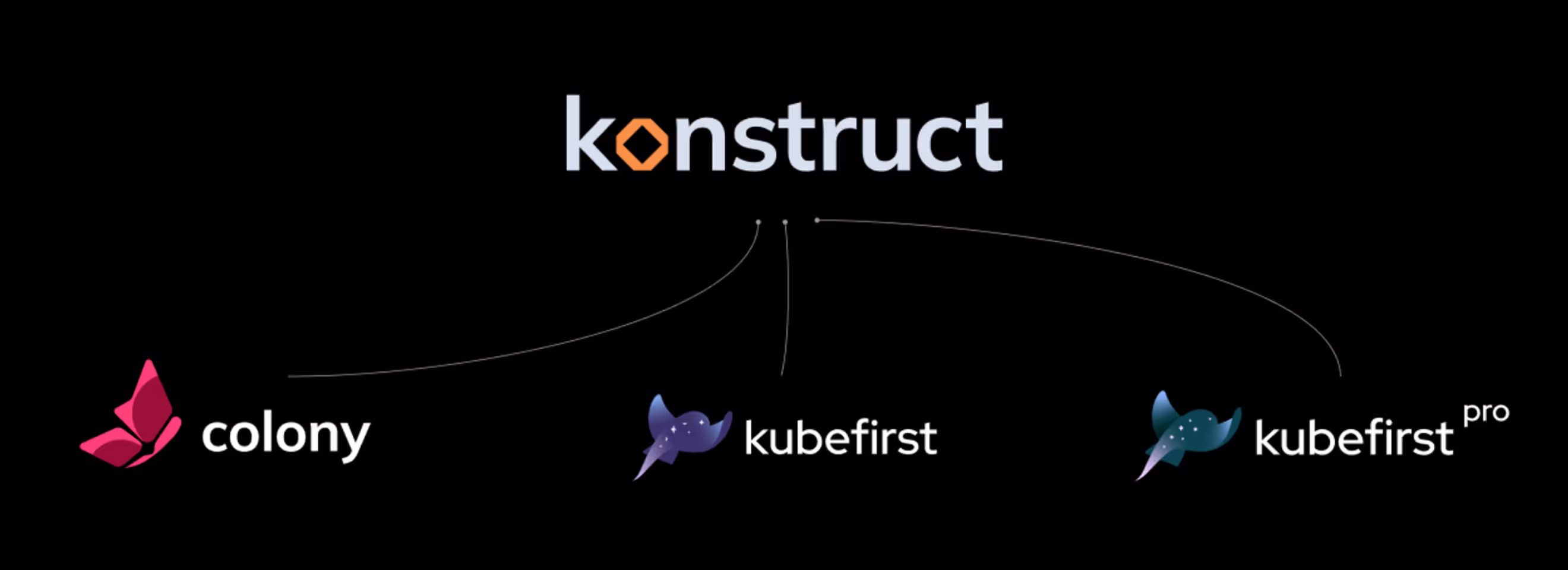
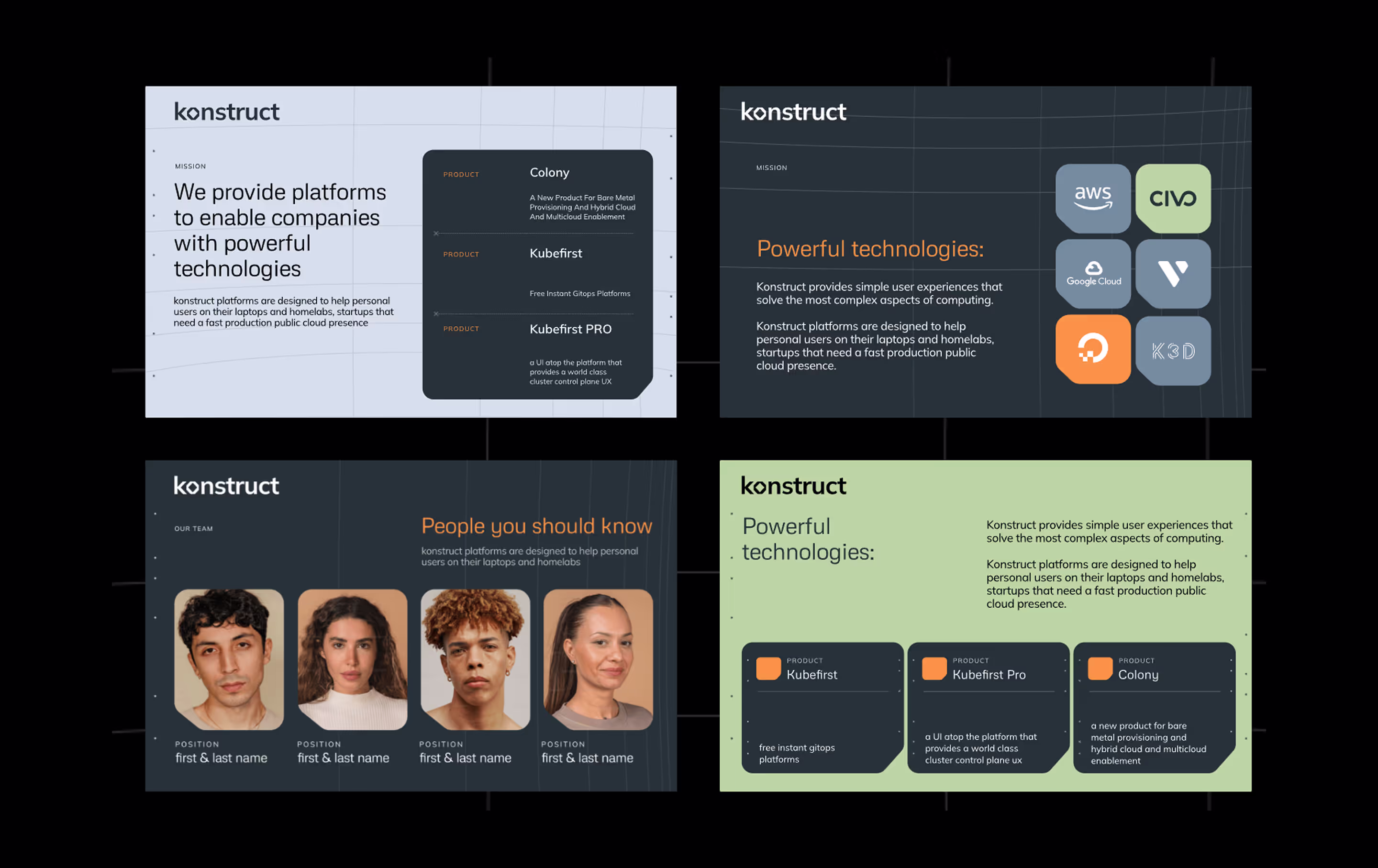
Konstruct is a house of brands uniting several directions that provide powerful technologies to empower companies.
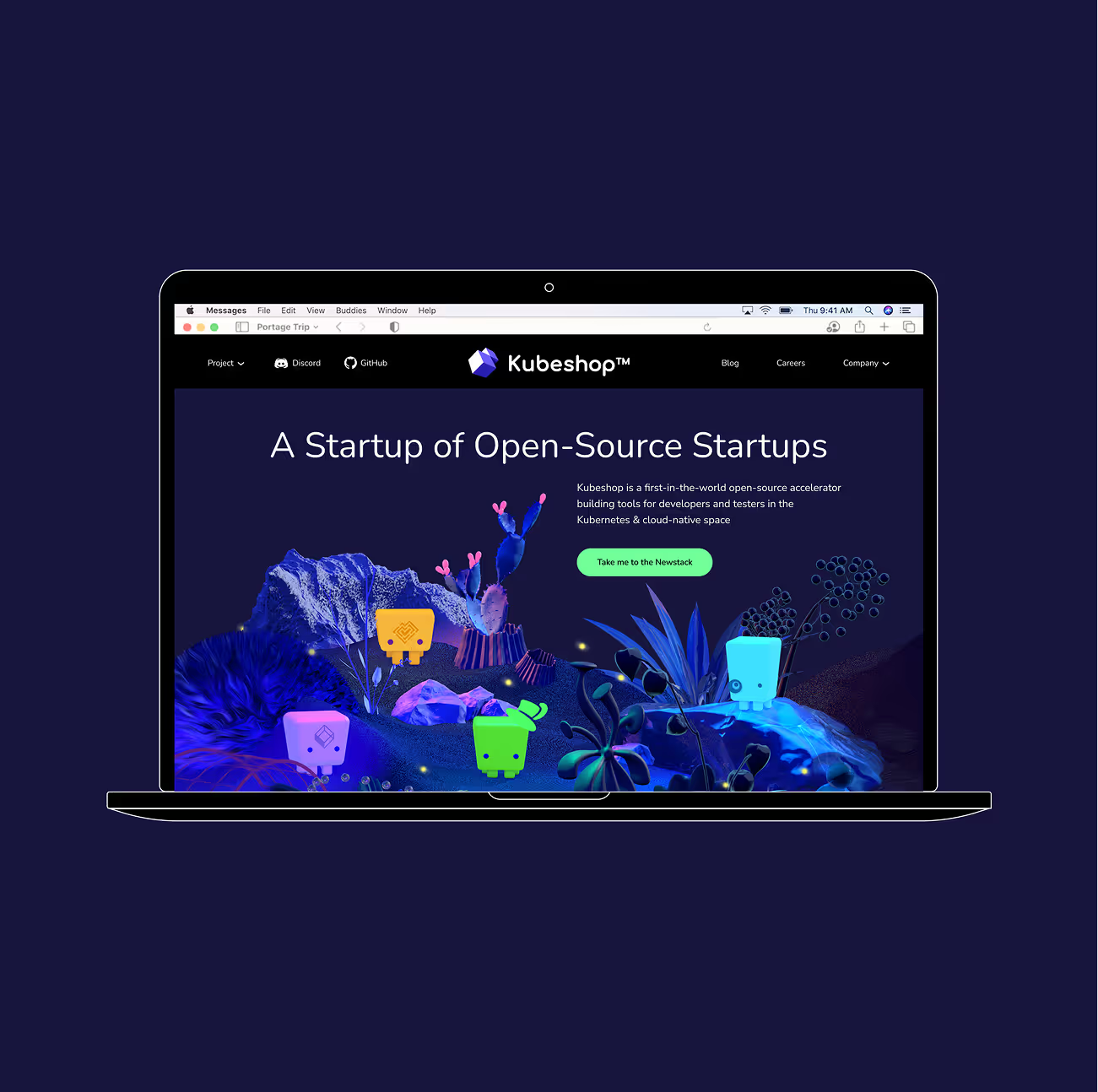
Polybox Studio designed the Konstruct umbrella brand identity in 2 weeks — creating a corporate identity system that unifies Colony, Kubefirst, and Kubefirst Pro under one visual roof.
- Timeline:2 weeks
- Services:
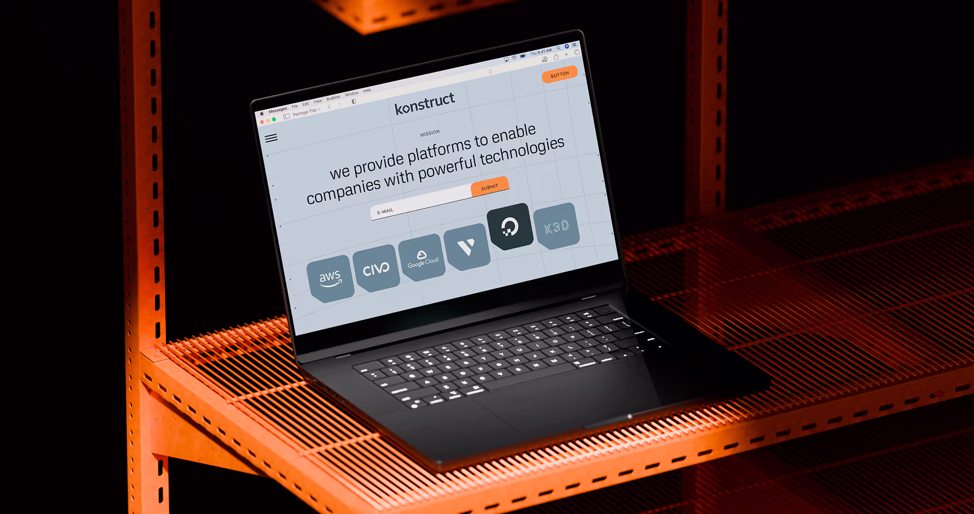
- Website:Konstruct.com
Problem Statement
In the beginning, there was Kubefirst, an automation tool that allowed quick delivery of the most popular open-source tools working together. A talented team worked hard to develop new projects.
But, different projects could have broken apart like cubes in a children's pyramid, if there was nothing to unite them. So, the team decided to create an umbrella brand, Konstruct, to house all existing and future projects under one roof.

Our role
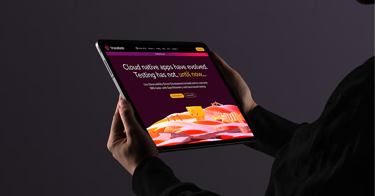
Konstruct is a house of brands uniting several directions that provide powerful technologies to empower companies. Firstly, we needed to decide on the branding strategy, considering that Kubefirst has been around for a few years now. This fact can't help but affect the new branding.
So, Konstruct adopted the 'House of Brands' strategy, similar to Unilever or Pepsico. This allows each product to have distinct, even flashy branding, while Konstruct remains the serious, professional center. Also, an umbrella brand needs to seamlessly pair with existing and future sub-brands (we gave it a code name — Brangelina).
Secondly, Konstruct needed a timeless and versatile corporate identity to not look outdated after a couple of years in a rapidly growing technological market. The new brand needed to reflect the team's growth, and their intent for moving towards a large, well-established corporation with a diverse portfolio of projects.
— Polybox marketing research
Design Rationale
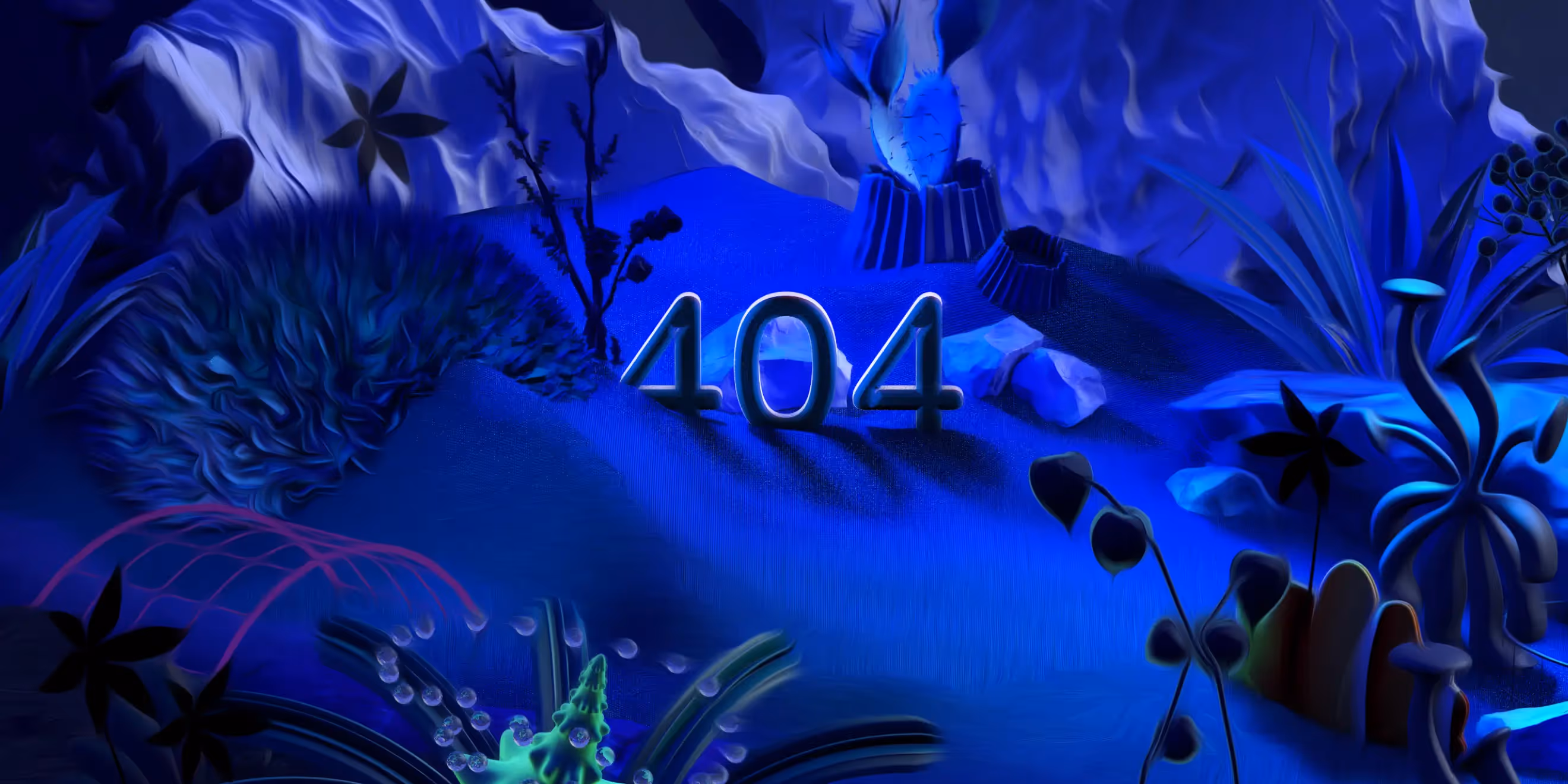
The company's branding should be all about power, automation, reliability, and speed. It's like a future spaceship, or a dynamic portal that takes you to the cool new tools. Those tools will help users get to their goals faster and make their work more efficient. Images of spaceships flying through wormholes in outer space were a major inspiration for us.

— Elizaveta Vakhrameeva
Brand designer
Logo anatomy
For the logo, we opted for a font with bold typography and a futuristic feel. The letter "O" in the word "Konstruct" transformed into an image of a portal, through which users can enter a new space. Also the "O", in fact, was literally constructed from parts of other letters — a light nod to the "construct" origin.
Futuristic grids
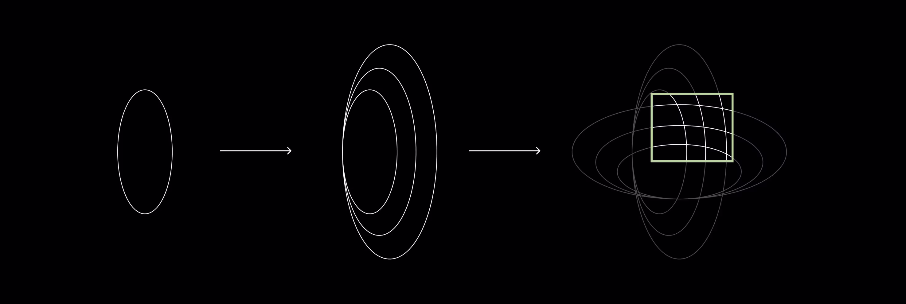
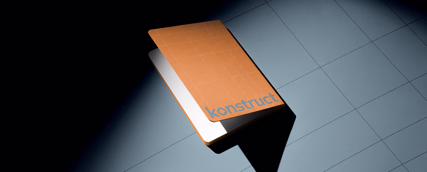
Brand Grids
Grids are an essential part of the company's brand identity. The shapes of the grids' lines are not random; they visually represent the boundaries of a wormhole tunnel.
We have developed a universal set of guidelines for creating these grids, ensuring that they can be easily scaled and used across different mediums without losing their impact.
Diving into the details
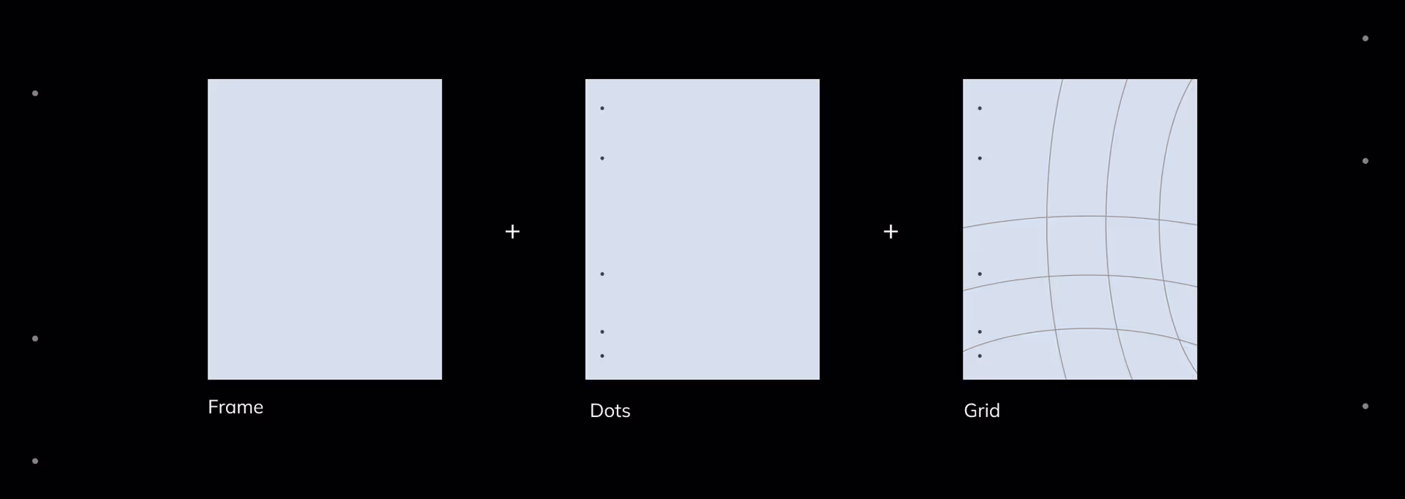
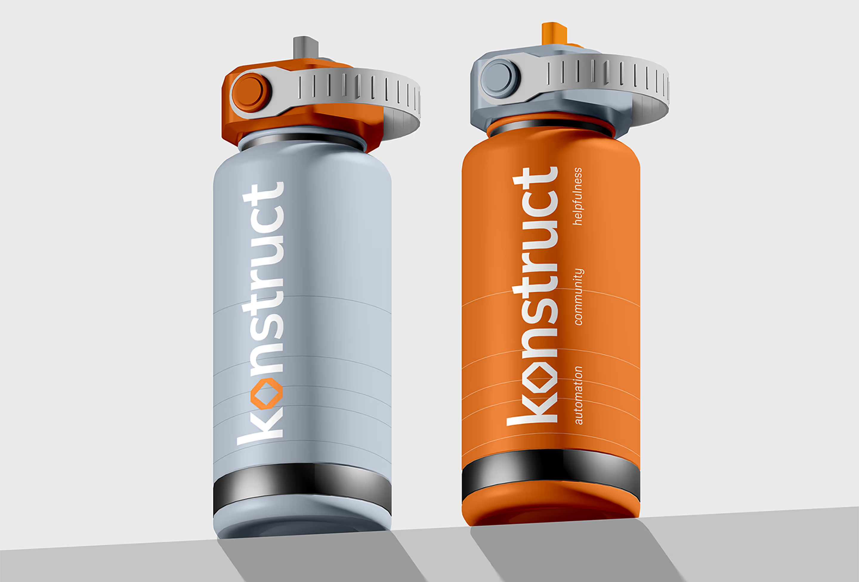
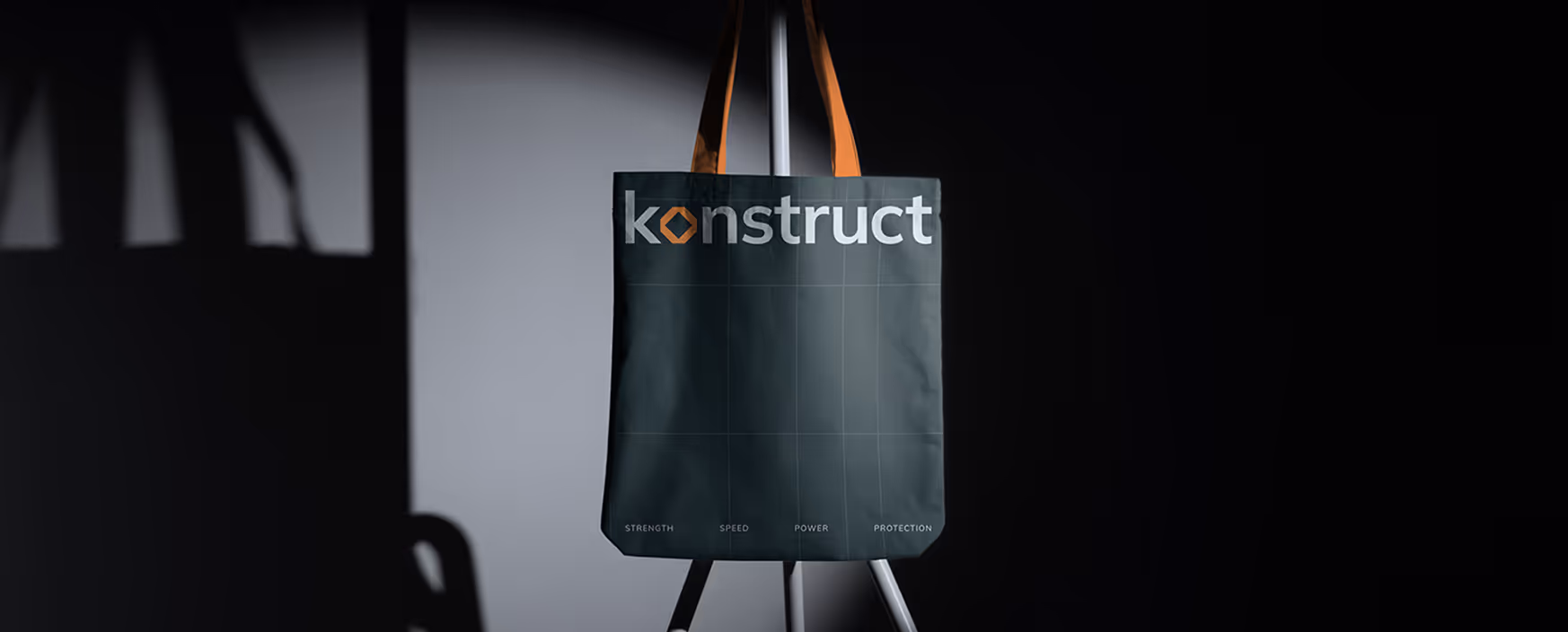
We have added some delicate elements that support the overall branding theme. These include dots on the layouts, which refer to the bolts that secure the skin of the spacecraft.
COLOR PALETTE
%201.avif)

The corporate color scheme includes cool colors and overall is inspired by space and the Northern Lights, which supports the theme of space exploration and traveling vast distances. We added a warm orange element to this cool palette, inspired by the colors of rocket plumes and the vibrant hues of cities seen from space.

%201.avif)

- ManagerValeria Kozlova
- Technical DesignerElizaveta Vakhrameeva
- DesignerElizaveta Vakhrameeva