Senaar

About the client
Brand identity for a literary studio and fiction book series
SENAAR is a literary studio creating original text-based series set in a fictional universe of the same name.
Polybox Studio delivered the complete brand identity in 2 weeks — logo, visual identity system, business cards, event badges, brand guidebook, and social media templates.
- Timeline:2 weeks
- Services:
.avif)
Problem Statement
This was our first project in the world of literature. Working on creative concepts is always tricky, as what feels magical in your head is often hard to translate into a structured visual form.
SENAAR was starting almost from scratch, as the existing design needed to be refreshed. The idea behind the project was full of potential, but as a product, it wasn’t yet ready to compete. They were entering a market flooded by massive platforms and large names in digital publishing.
Trying to promote an indie literary brand in that landscape meant they had to do more than just make it look good. The brand had to stand out and connect emotionally with readers from the very first glance.

Our role
We wanted to capture the essence of SENAAR through the right visual language.
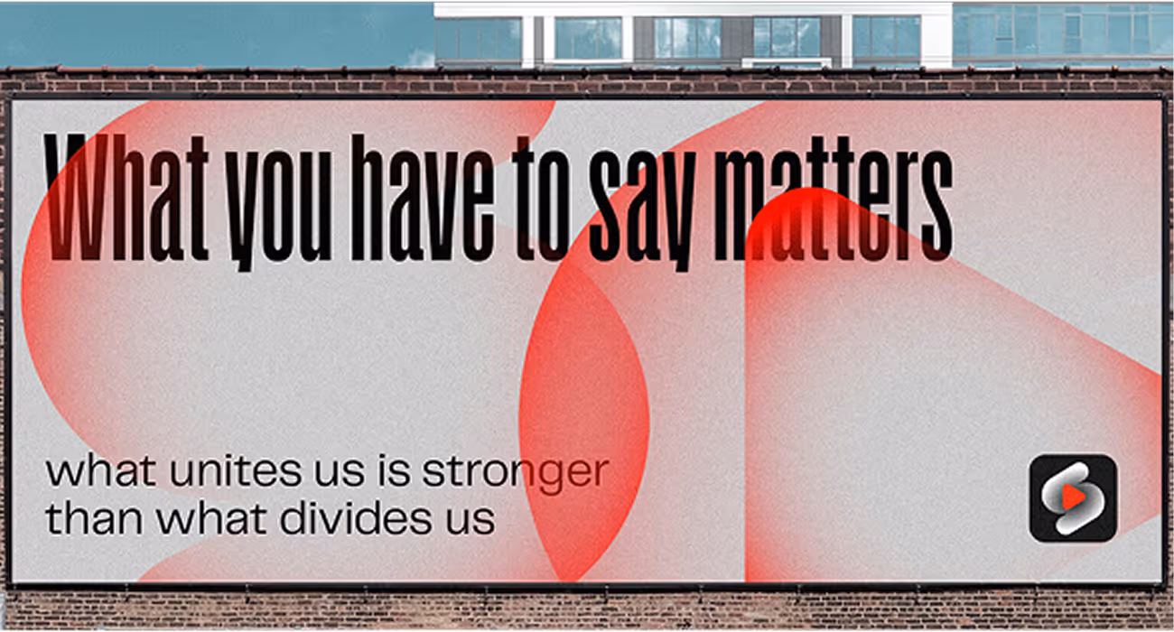
First, we had to create a unique logo that would be memorable, modern, and visually captivating. Captivating is a key word here: SENAAR is a brand rooted in fantasy, adventure, and immersive storytelling, so the identity needed to reflect that in spades.
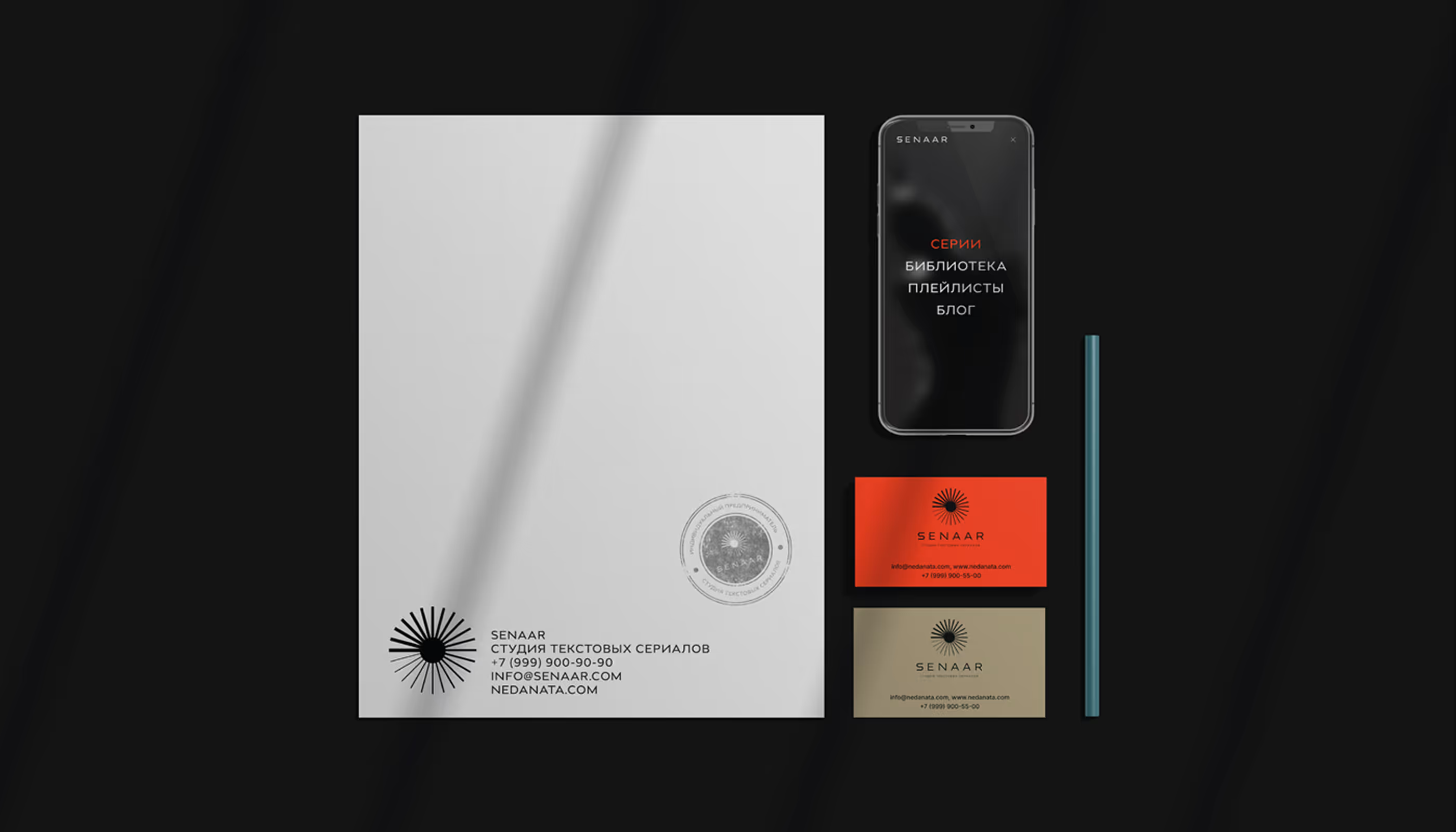
Next, we developed key brand materials like a brand guidebook, basic carriers like business cards and event badges. The cards and badges were created for future use at live events and community meetups.
To sum up, the branding needed to work seamlessly across web and print, feel timeless yet fresh, and visually stand apart from competitors in both publishing and comics. SENAAR had to guide people through magical realms and makes them never want to leave.
— Polybox marketing research
Design Rationale
We decided to give the brand a modern personality. People connect more with something that feels current. SENAAR’s character is friendly and sociable. It enjoys being in the spotlight and telling stories, while showing care and attention to every curious listener. It eagerly seeks out new knowledge and never misses a chance to share it with others. It’s easy to connect with: open, engaging, and relatable.
— Julia Molochaeva
Brand designer
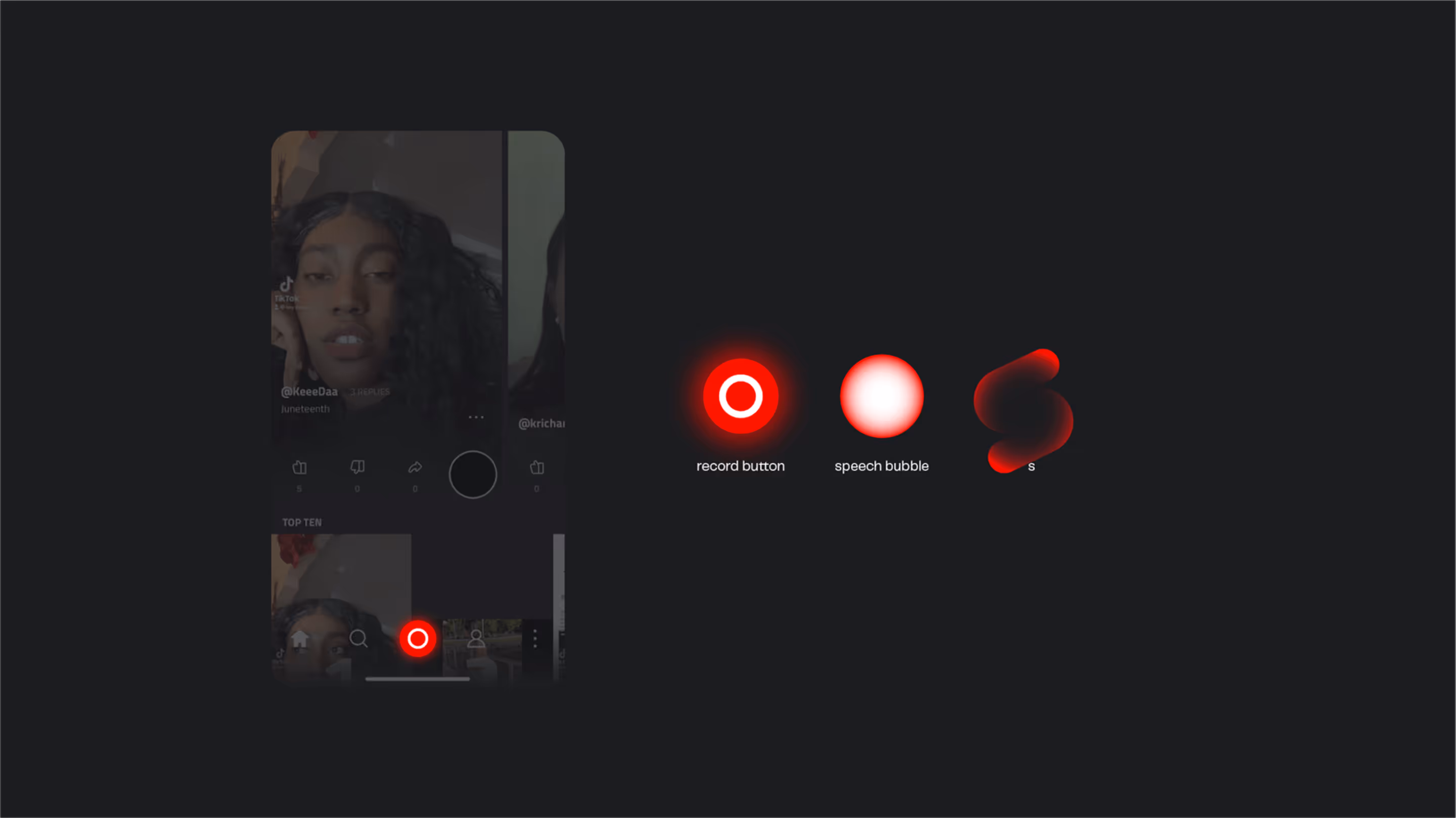
Logo anatomy

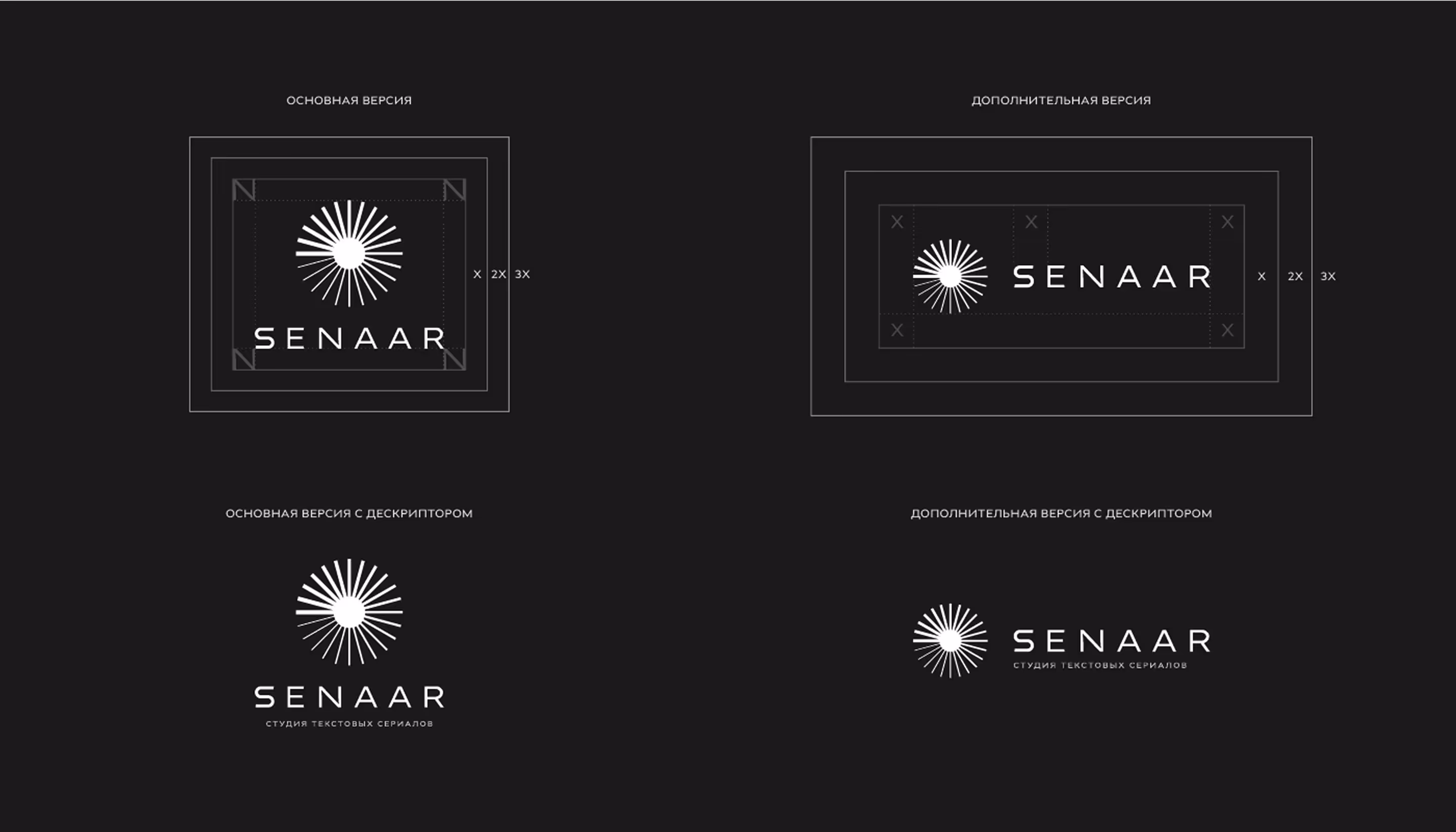
For the logo, we chose a modern typographic approach with strong, expressive fonts. The result is a minimalist wordmark paired with a clean, abstract symbol.
The symbol itself is open to interpretation: it could be seen as a sun or a mysterious hint at something from SENAAR universe. It leaves room for imagination, perfectly matching the brand’s tone.
The logo feels distinctive and versatile, designed to look good across a wide range of formats whether it’s an e-book cover or a t-shirt.
Diving into the details
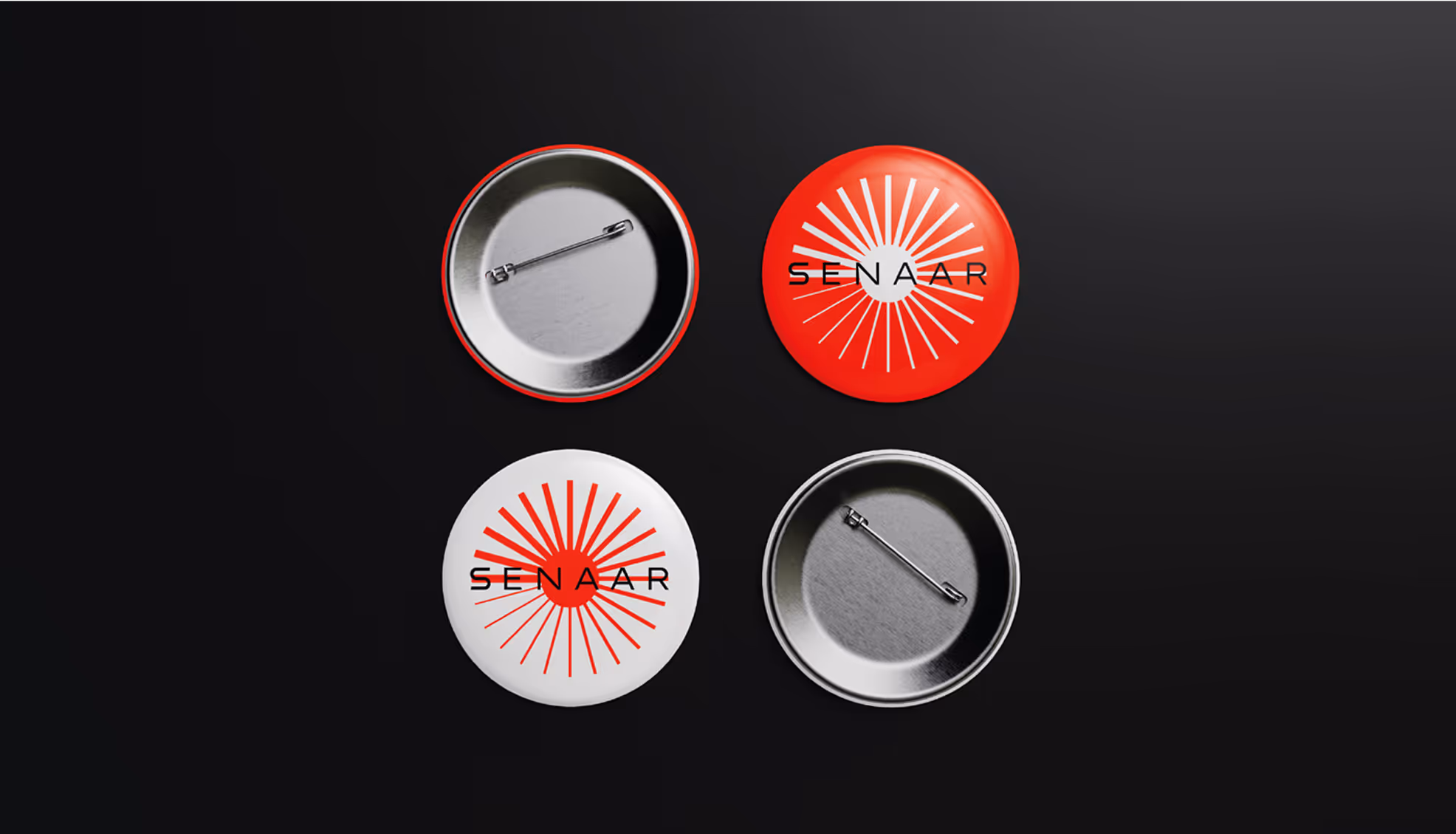
We showed examples of how business cards, pins, and badges can look: items that are needed for offline events. By the way, check out the different logo variations on the pins - it looks pretty amazing. Yes, we're definitely giving ourselves a little credit here!
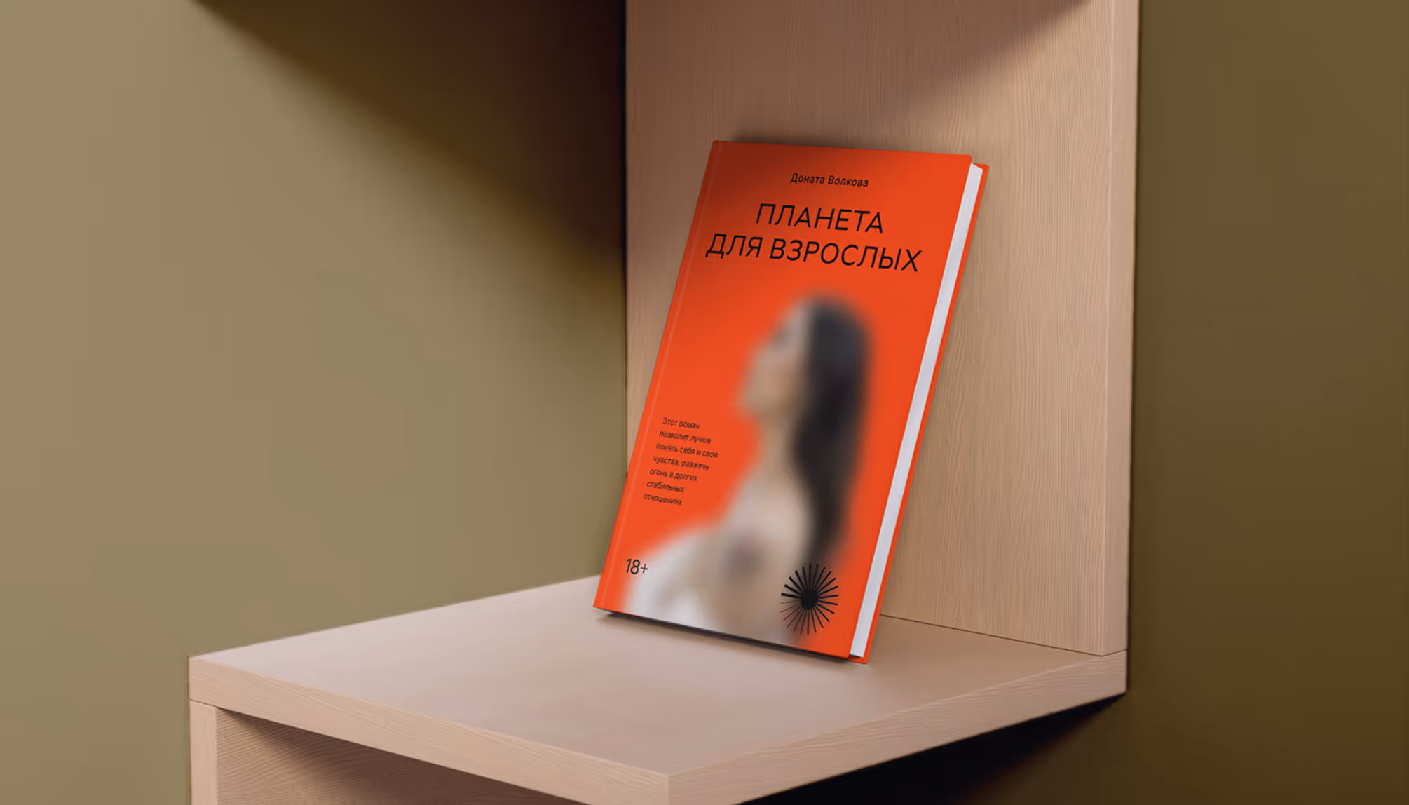
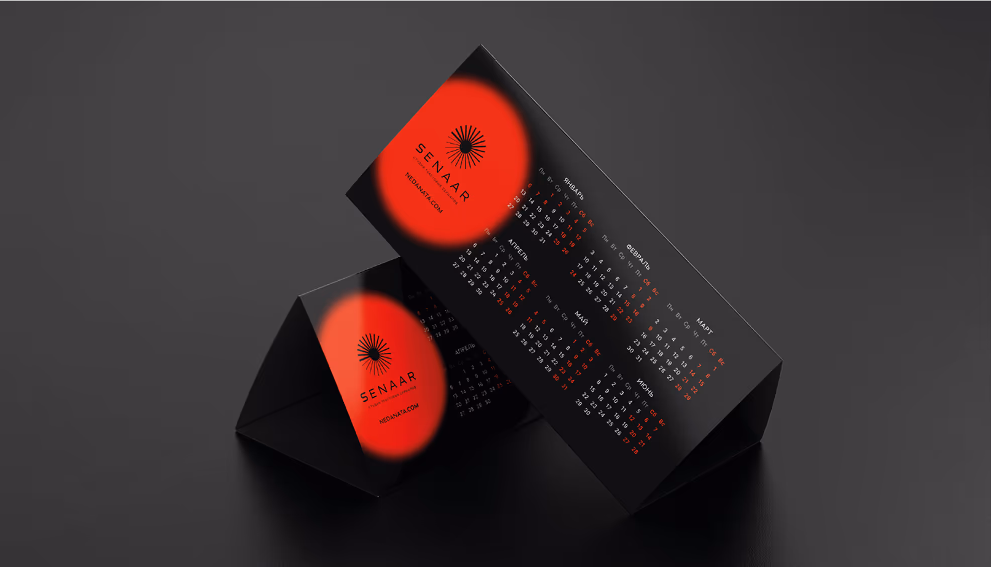
As a graphic technique, we used blurred, colorful spots. They evoke a sense of mystery and invite curiosity.
The website features a simple, clean design that's uncluttered and easy on the eyes.
.avif)

Color palette


The color palette is elegant, with muted tones serving as a calm backdrop. Bright accent colors pop against this backdrop, creating a stunning contrast.
Just like the cosmos, black offers a great canvas and an introduction to the world of SENAAR. Red, on the other hand, is the spark of life and energy within the vast universe.
This balance helps guide the viewer's attention and highlights what's truly important.
- ManagerValeria Kozlova
- Technical DesignerElizaveta Vakhrameeva
- DesignerJulia Molochaeva