Tetrad
About the client
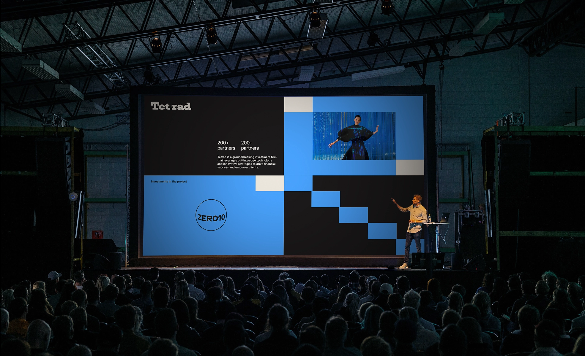
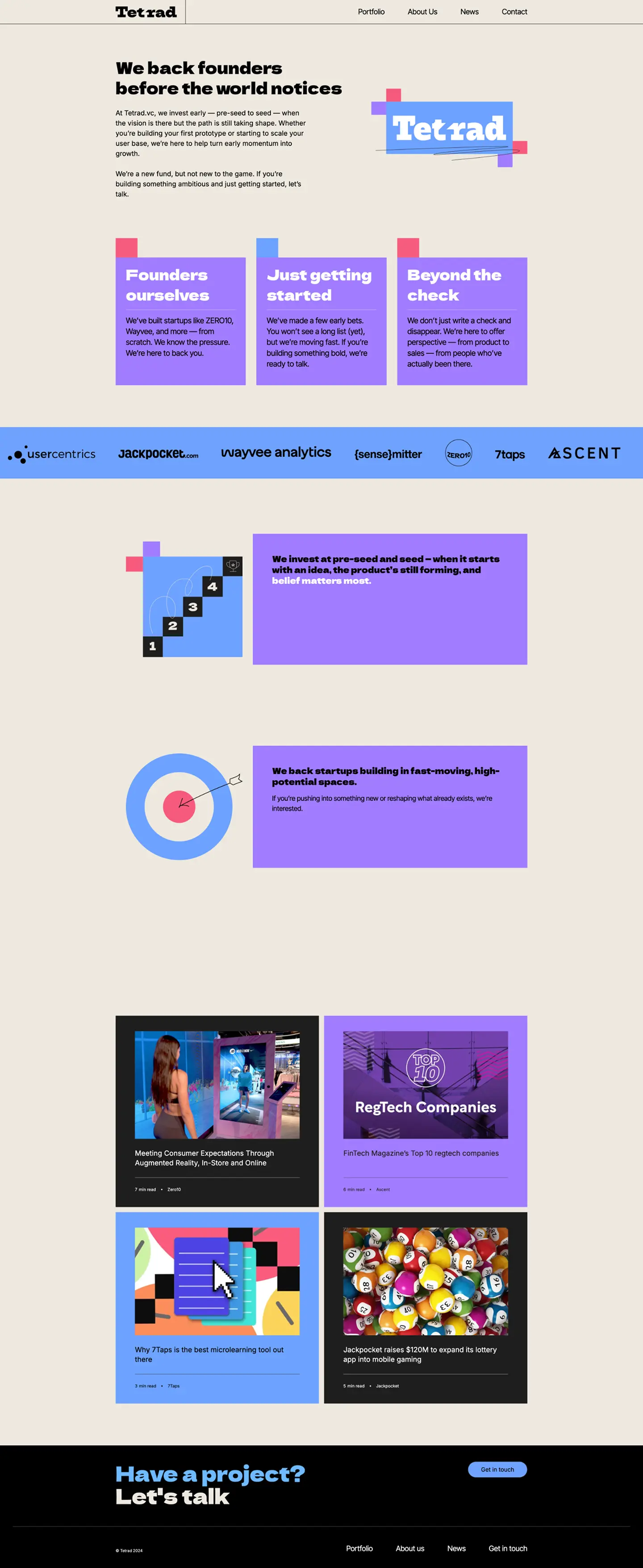
Brand identity and website design for a tech-focused venture capital fund
Tetrad is a venture capital fund that focuses on investing in high-tech startups in emerging industries.
Polybox Studio delivered the complete rebrand and website in 2 weeks — new brand identity, visual language, and website design.
- Timeline:2 weeks
- Services:
- Website:tetrad.vc
Problem Statement
The biggest challenge we had was creating a brand for our private equity fund that reflected the tech-focused approach. We had to strike a balance between showing financial strength and being innovative, while still maintaining trust from potential portfolio companies and keeping their interest.
Our role
Firstly, We needed to find a visual representation for a venture fund. And, for any fund, it takes more effort to stand out than for B2C businesses. Venture capital firms often struggle with a lack of differentiation in a competitive market. The need for strong branding is crucial at the heart of a company.
Secondly, there's a key difference between branding for B2C and branding for venture capital firms. A consumer brand has a single audience that we target. This audience can be divided into segments, but it's still one entity. A VC firm provides a service, which is similar to everyone else's on the market. It has two distinct audiences: founders and limited partners, who need to be targeted precisely.
— Polybox marketing research
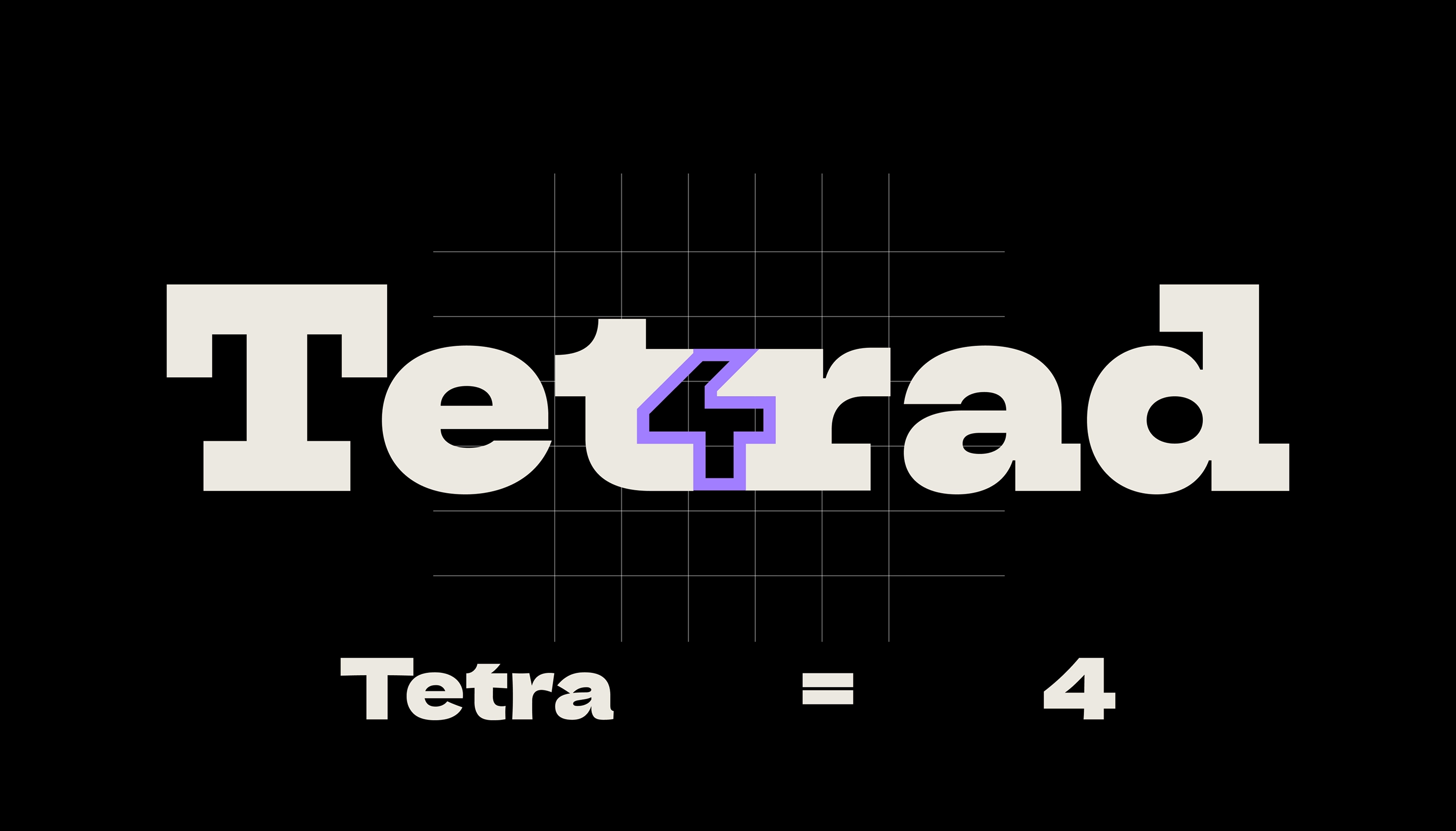
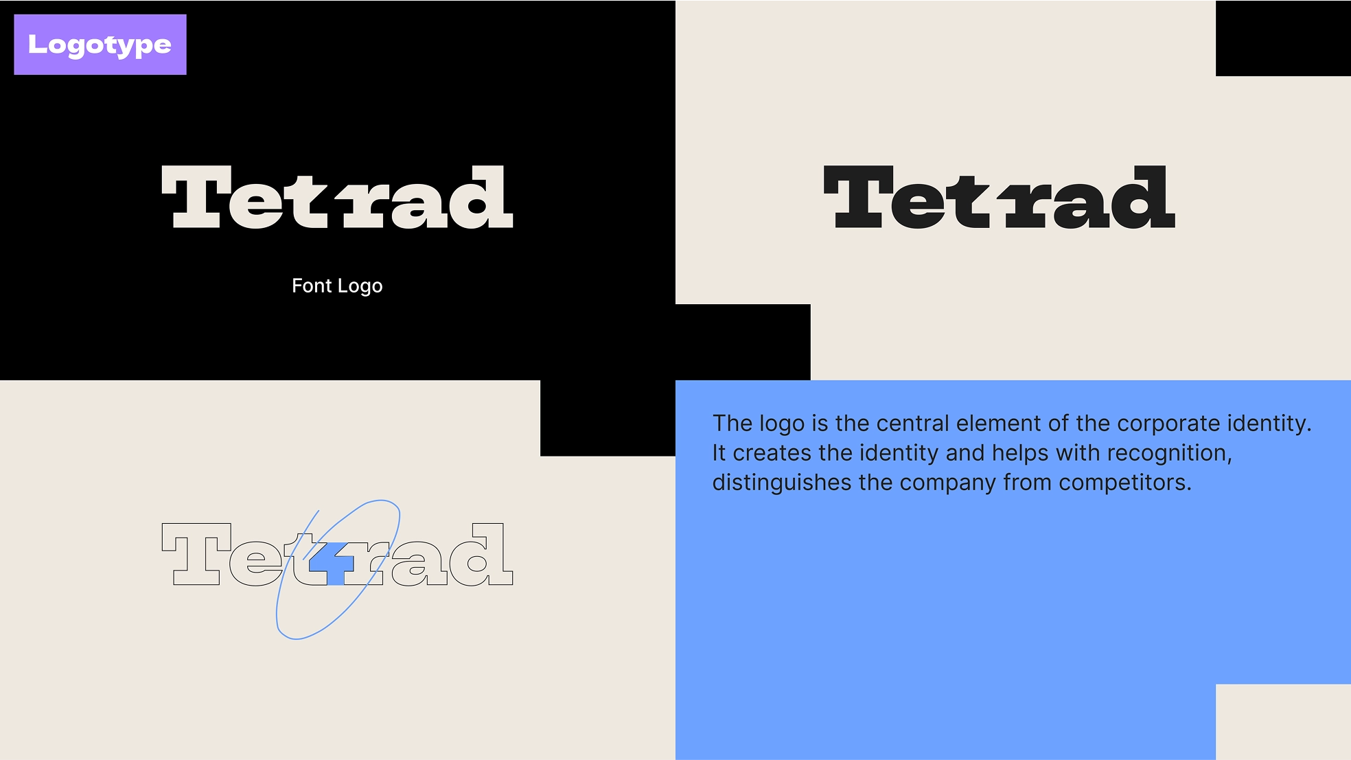
Logo anatomy
%201.webp)
The logo is based on a strong Serif font Dela Gothic One. It features a subtle customization with the number "4" included to emphasize the meaning of "tetra" (a greek word for "four").
Design Rationale
An investment company needs clear and concise messaging, but Tetrad wanted something bold and modern. So we went with color blocks that provide structure and modern feel at the same time. We added some bright colors to the palette, but toned down their saturation to make the branding pop, in a good way.

— Elizaveta Vakhrameeva
Brand designer
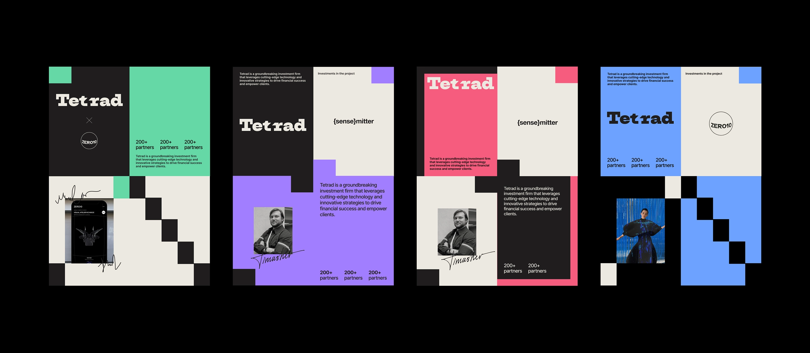
Visual language
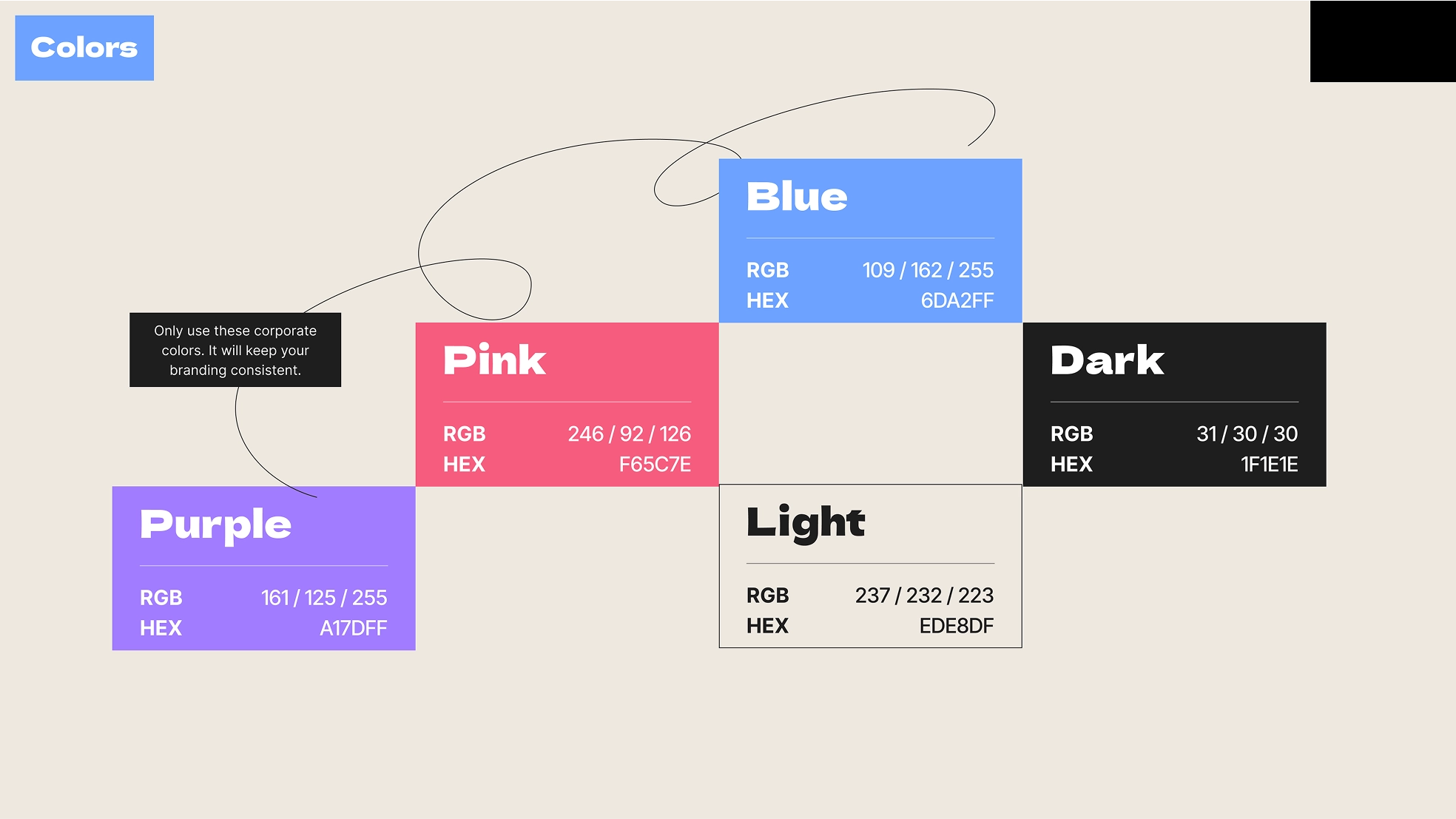
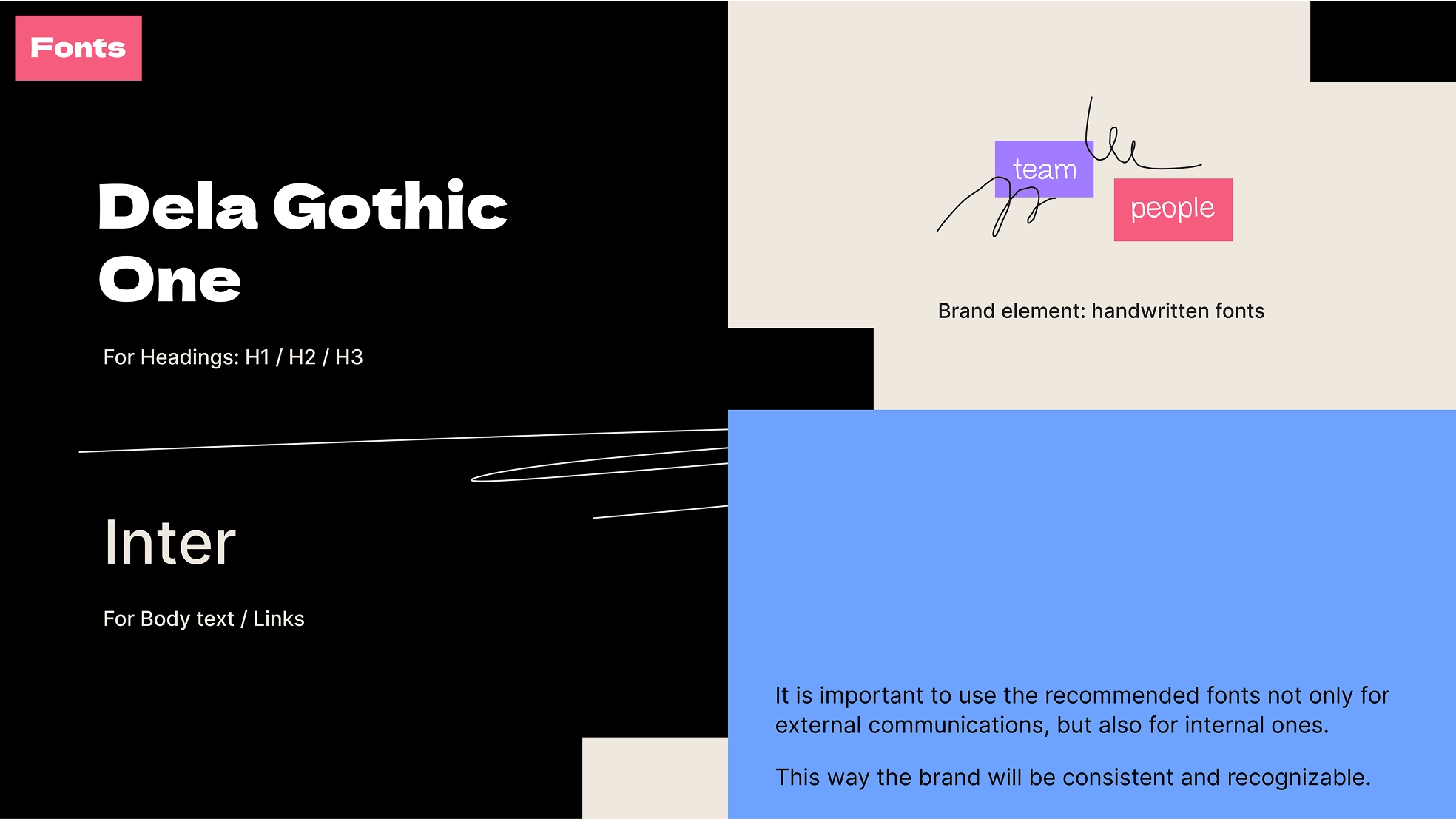

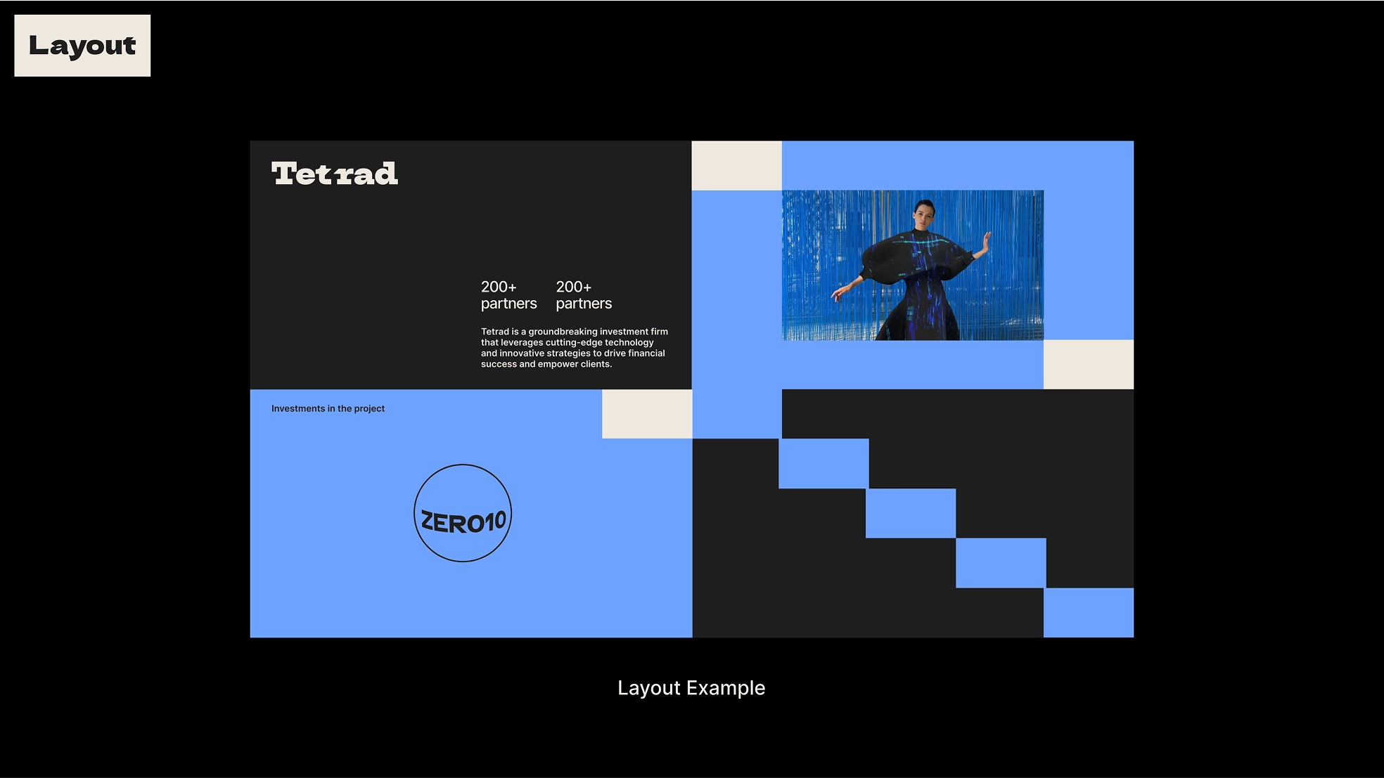
The typography and color scheme use Dela Gothic One for headers and Inter Tight for the body text, supported by a contrasting color palette. Black and white are the main colors, with blue, purple, pink, and green used as bright accents to draw attention to important content areas.
The visual identity is based on a modular grid, with basic blocks in the brand's main colors (dark gray and white).The layouts are dynamic, with diagonal lines, underlined elements and overlapping shapes. It gives both structure and a creative feel.
- ManagerValeria Kozlova
- Technical DesignerElizaveta Vakhrameeva
- DesignerElizaveta VakhrameevaBulat Alter Ego