BangBop & co

About the client
Brand identity and website design for a modern Korean fusion restaurant
Bangpop & Co. is a contemporary fusion restaurant with traditional roots, serving sustainable and modern Korean cuisine.
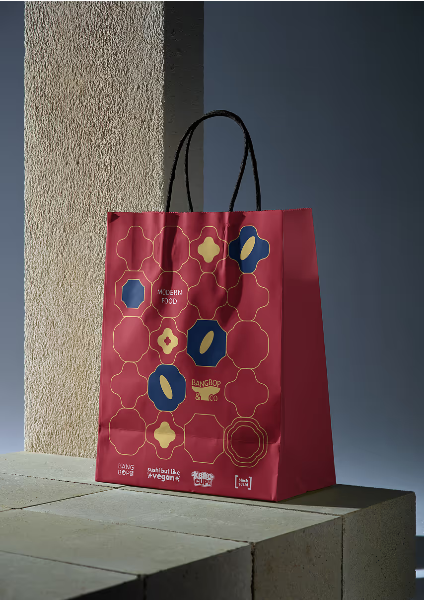
Polybox Studio delivered the complete brand identity and website in 2 weeks — logo, branded patterns, packaging, signage, and website design.
- Timeline:2 weeks
- Services:
- Website:bangbop.com
%201.avif)
Problem Statement
Bangpop's brand needed to be a perfect foundation - visually stunning, conceptually clear, and emotionally resonant - in order to position it as DC's go-to destination for innovative and delicious Korean-inspired food.
Our role
We teamed up with Bangpop to create a killer brand for them to launch in DC. Our goal was to make their message clear - a modern, Korean-fusion that would appeal to local millennials.
To do this, we had to turn their identity into a visual and messaging strategy that stood out. We created a bold, fresh identity that combined cultural roots with innovation.
This involved translating complex values like heritage and sustainability into a unified brand experience, which we accomplished through a new visual system. The result was a unique and responsible brand that established Bangpop as a serious player in DC's culinary scene.
— Polybox marketing research

Design Rationale
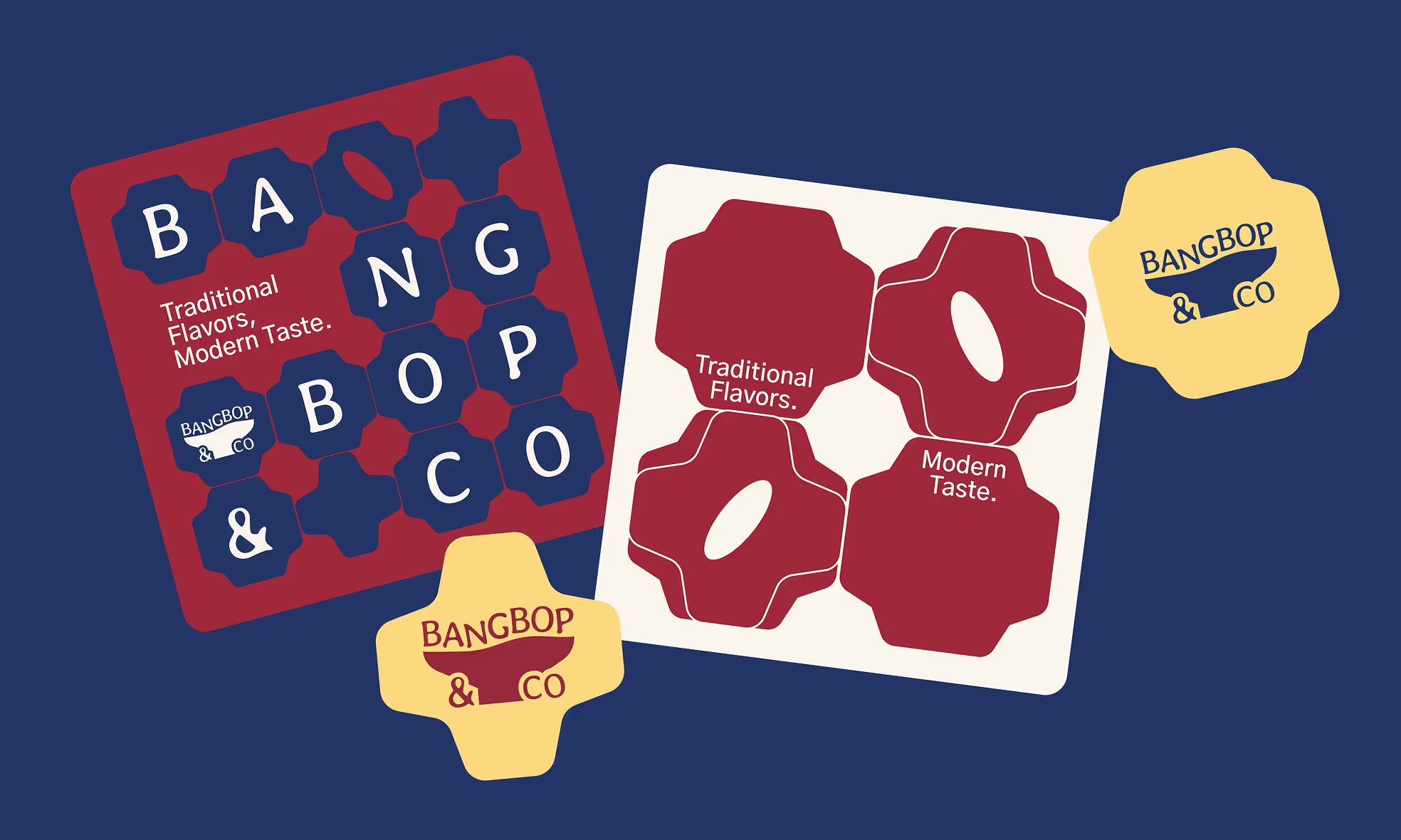
In this project, we wanted to take some Korean patterns and turn them into a sort of construction kit, showing how complex and diverse Bangpop food can be. It's like a puzzle, where you can see how a complex pattern is made up of simple pieces, and how a tasty meal can be made from basic ingredients.

— Elizaveta Vakhrameeva
Brand designer
Logo anatomy
For the logo, we chose a recognizable Asian bowl image with a slightly curved top. We used the Stylish font for the text, which has a modern and playful look. The letters look like they're all piled up together, like a colorful, overflowing meal.
By treating the letters as ingredients, we visualize Bangpop's idea - tradition as the base and innovation as the flavor.
%201.avif)
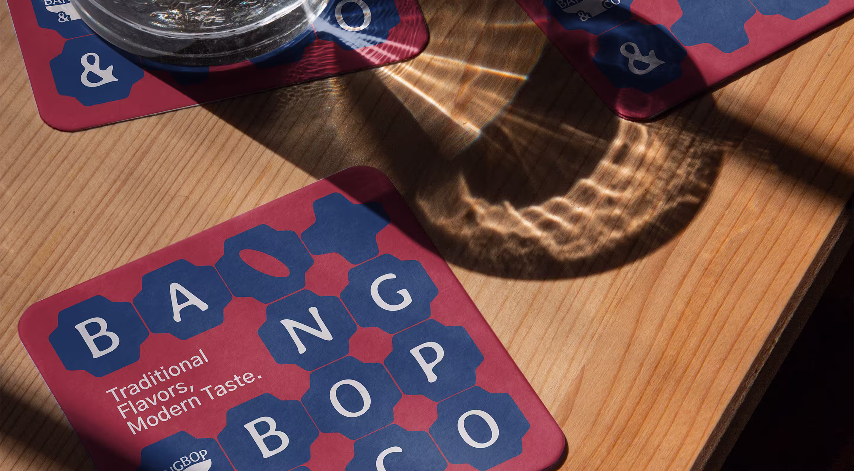
Branded patterns
%201.avif)
As a central motif for the branding, we used simplified traditional patterns. We took these patterns and filled them with new meaning. These patterns might serve as frames for food photography or emphasize information, and when stacked together, they create beautiful patterns that can be used on any material.
%201.avif)
Color palette
%201.avif)

The color scheme balances cultural authenticity with a modern touch. The main color, #9F293B, is a deep red that brings to mind Korean cuisine. It represents the rich flavor of gochujang, the spicy chili paste that's a staple in Korean dishes. The blue (#233466) is inspired by historic indigo dye, adding stability to the design.
The golden yellow (#FCD97F) is used as an accent color, giving a pop of color and hinting at gourmet details. It also adds a touch of warmth to the overall look. The cream color (#FAF5EC) represents purity and organic ingredients, like rice paper.

%201.avif)

Font hierarchy
%201%20(1).avif)
The typography system is a mix of playful energy and functional design. The Stylish font brings personality to the branding with its funky baselines and curvy shapes. It really shows off the creativity of the Korean cuisine. It's a bit unexpected, but it works well with the brand's core.
Gothic A1 has a clean and simple design, which makes it easy to read. It works great for menus, digital displays, and even body text.
- ManagerValeria Kozlova
- Technical DesignerElizaveta Vakhrameeva
- DesignerElizaveta Vakhrameeva