Paloma cosmetic
About the client
Brand identity and packaging design for a conscious cosmetics brand
PALOMA is introducing a new brand with a unique philosophy rooted in environmental consciousness, holistic well-being, and premium quality.
Polybox Studio delivered the complete brand identity and packaging design in 2 weeks — logo, visual identity, product packaging for multiple SKUs, and extended color palette.
- Timeline:2 weeks
- Services:
- Website:Konstruct.com
Problem Statement
.avif)
The company needed to introduce customers to the new brand and its values. Its visual language should subtly, but surely, attract attention amidst a sea of similar products. Overall, the design should create a unique and genuine brand worth trying in a world of ungracious consumerism.
.avif)
Our role
For a new cosmetic brand, we had to create a visual identity that represented its three main values - planet, wellness, and quality - and appealed to practical shoppers. So we avoided all eco-clichés, balancing premium minimalism and a warm touch.
Our approach was natural, warm, and minimalist. We used clean, bright colors, gradients, and clear typography, with unexpected accents and a genuine photo style that helped PALOMA stand out. Every aspect of the branding - from the packaging to the images - reinforces PALOMA's honest and holistic message without compromise.
— Polybox marketing research
Design Rationale
We saw PALOMA as the physical manifestation of the sunrise. The sunrise of self-care and mindfulness, of the new age where everyone is in touch with their own needs and wants and acts accordingly.

— Elizaveta Vakhrameeva
Brand designer
Logo anatomy

In the logo, we used the image of a rising sun, but tilted the rays to make the sign look more energetic and dynamic. The main concept behind the branding is not just the sunrise; it's also about a new start, and we wanted to show forward movement.
We used Aclonica font for the wordmark, which adds a touch of sophistication and a slight deco element to PALOMA'S logo.
_%D0%A1%D1%82%D1%80%D0%B0%D0%BD%D0%B8%D1%86%D0%B0_4.avif)
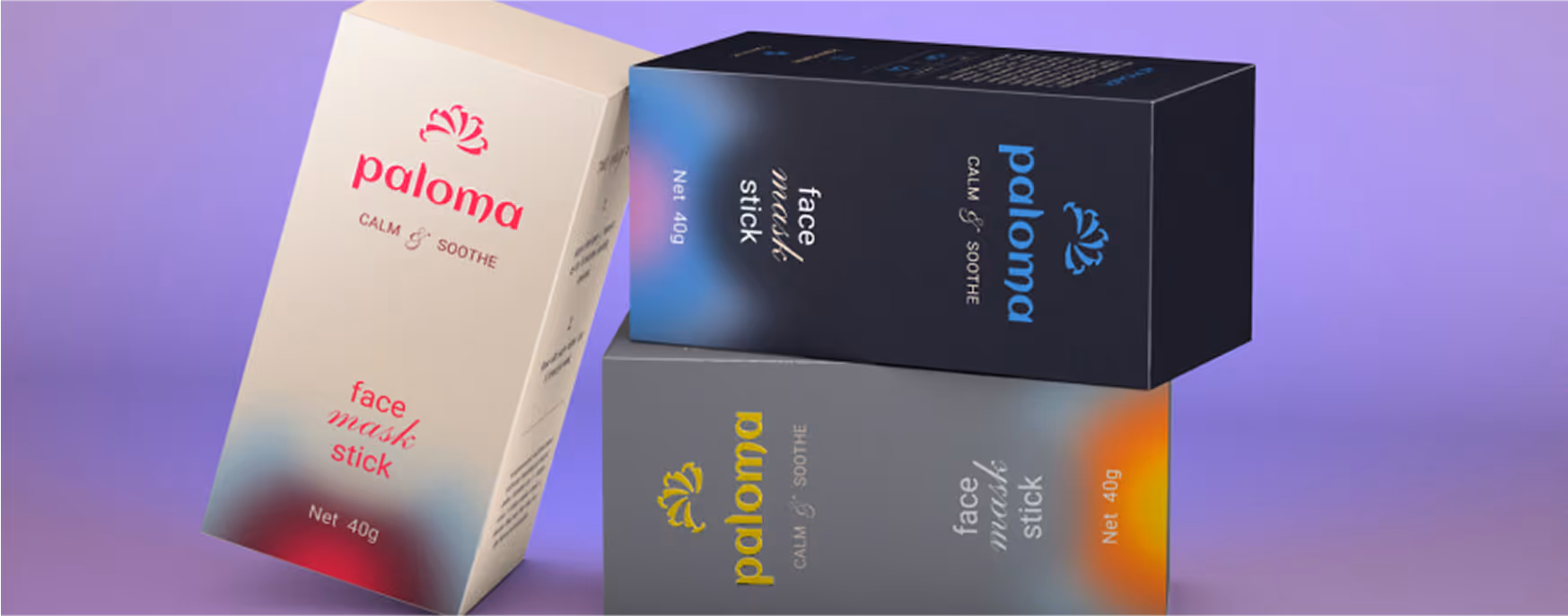
Packaging Design
.avif)
.avif)

We've gone with a minimalistic approach to packaging. Each product has a unique color scheme, with a main color for the background and accents. The extra colors give us a lot of options for combinations. To keep with the sun rising theme, we used circular gradients that look like the areolas around the sun.
We keep text to a minimum - only the basics like ingredients, how to use, and who it's for. That way, we don't overload the packaging with too much marketing info, but we still make it easy to understand for customers.
.avif)

.avif)
Extended color palette
_%D0%A1%D1%82%D1%80%D0%B0%D0%BD%D0%B8%D1%86%D0%B0_2.avif)
_%D0%A1%D1%82%D1%80%D0%B0%D0%BD%D0%B8%D1%86%D0%B0_3.avif)

We have developed two color palettes for our brand: a primary palette and a complimentary palette. The primary colors are subtle and muted, while the secondary colors are intentionally bold and vivid. These color palettes showcase the diversity of PALOMA product range and the flexibility of the brand.
- ManagerValeria Kozlova
- Technical DesignerElizaveta Vakhrameeva
- DesignerElizaveta Vakhrameeva