Super Kombucha
About the client
Brand identity and packaging design for a kombucha beverage brand
Nutricom Food & Beverages is committed to producing premium, naturally fermented drinks.
Polybox Studio delivered the complete brand identity and packaging design in 2 weeks — logo, label design, bottle shape, color palette, and marketing collateral for the product launch.
- Timeline:2 weeks
- Services:

Problem Statement
Nutricom has a wide range of products, and Nutricom Best Kombucha is the leader, with a strong presence in the East African market.
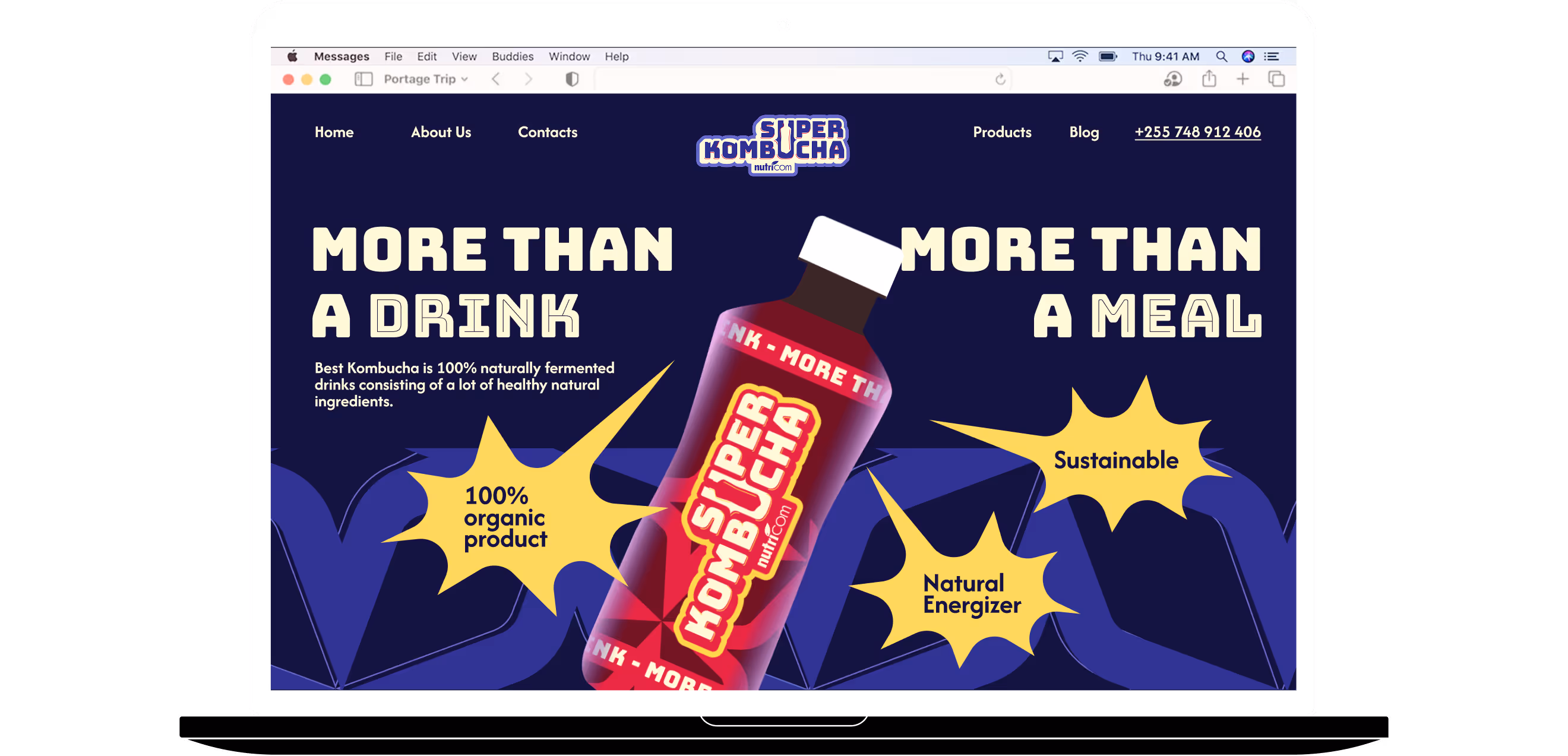
For its new product, Super Kombucha, they wanted to try something different and reach a new audience. They decided to target younger people with their healthy drink, and make their packaging bold and "super" just like the product name.
Our role
We were given the freedom not to worry about other products from the company, which was both good and bad. Without a clear brand identity, it was easy for us to lose touch with the company's vision and create packaging that didn't fit with the rest of its offerings. We had to create something unique for Nutricom while also being completely new.
Kombucha has many health benefits, so we wanted to emphasize this even to younger audiences. We didn't want our product to seem preachy or educational, but rather cool and useful. Our drink should stand out from popular carbonated drinks with its naturalness and health benefits.
— Polybox marketing research
.avif)
Design Rationale
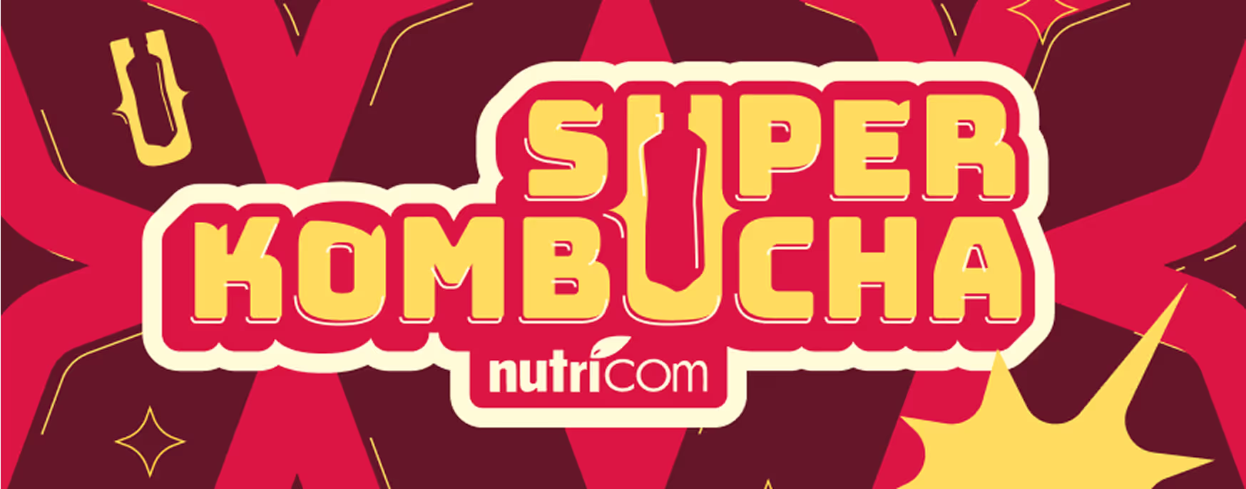
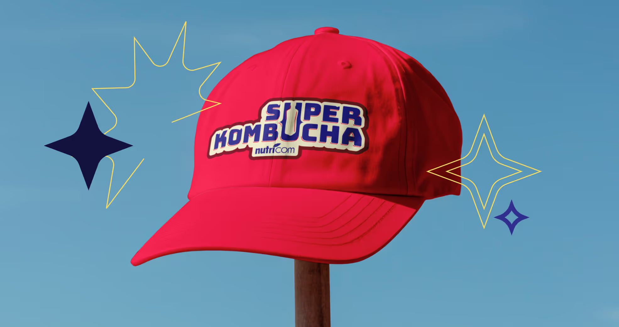
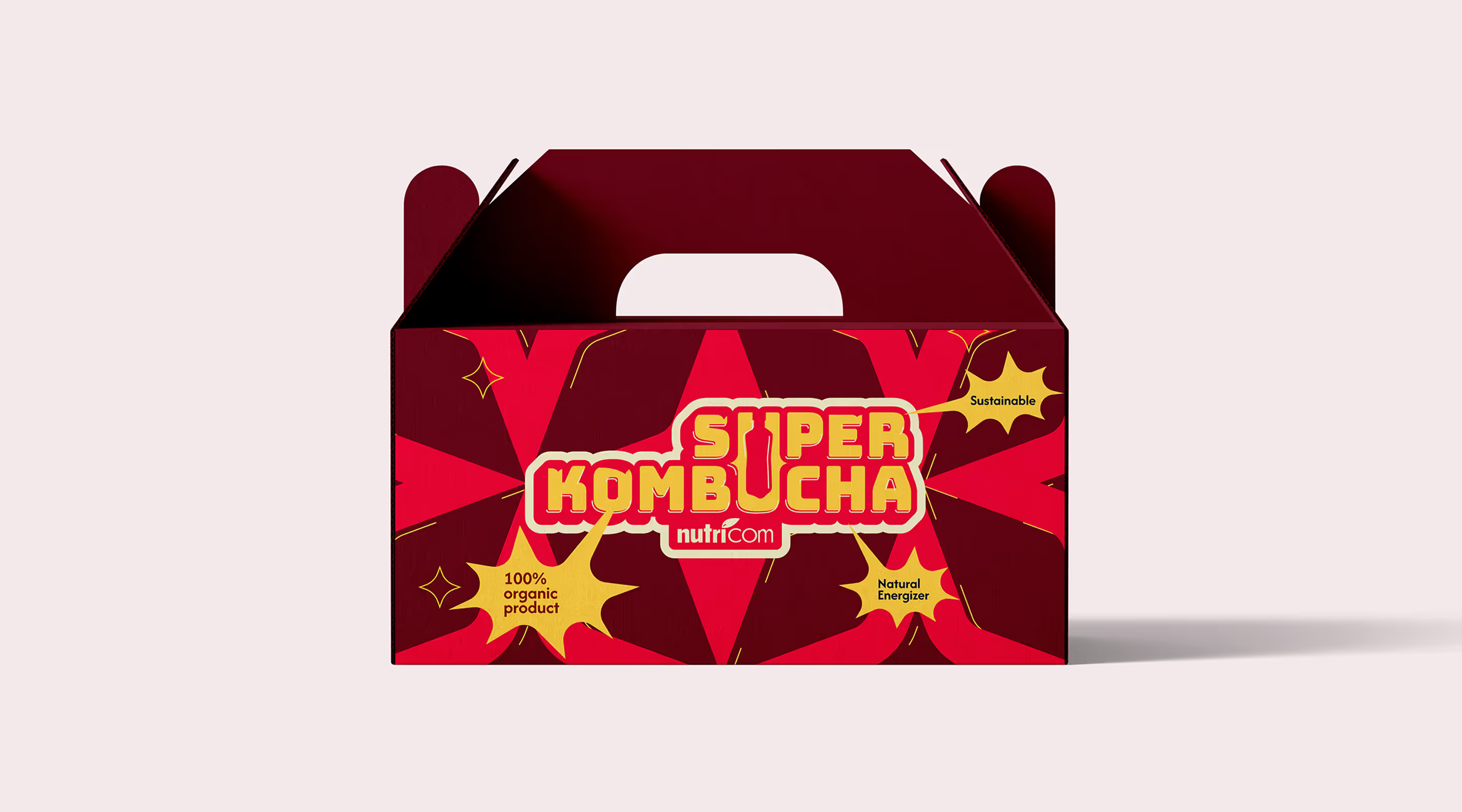
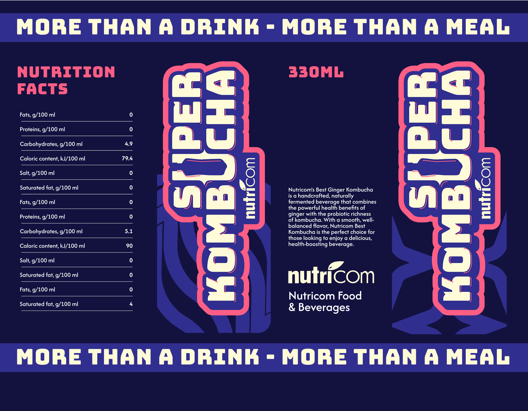
For the packaging, we took inspiration from superhero comic books. Clear lettering, colorful palette, lines of motion, and dynamic design – it was all there! We used a lot of techniques to capture that teen spirit we were going for.

— Elizaveta Vakhrameeva
Brand designer
Kombucha label

We needed to stay connected with the main brand, so we included the Nutricom name directly on the label, as well as the shape of the branded bottle that's used for other products from the company.
At the same time, the design, lettering, and 3D effects formed the basis for presenting the new drink in a unique way. The name can be used anywhere, and we deliberately made it look like a sticker or a comic book title.
%20(1).avif)
LABLE Design

Color palette
%201.avif)
The color scheme also has a comic book vibe. We used bold, bright colors for the base tones, and added yellow, red and pink for accents. With this palette, it is easy to create harmonious color combinations and have multiple options for labels when needed.
.avif)
.avif)
%201.avif)
- ManagerCamilla Davis
- Technical DesignerElizaveta Vakhrameeva
- DesignerElizaveta Vakhrameeva