Colony

About the client
Brand identity design for a bare metal provisioning platform
Colony is a bare metal provisioning and data center hardware management platform for on-premise and hybrid cloud environments.
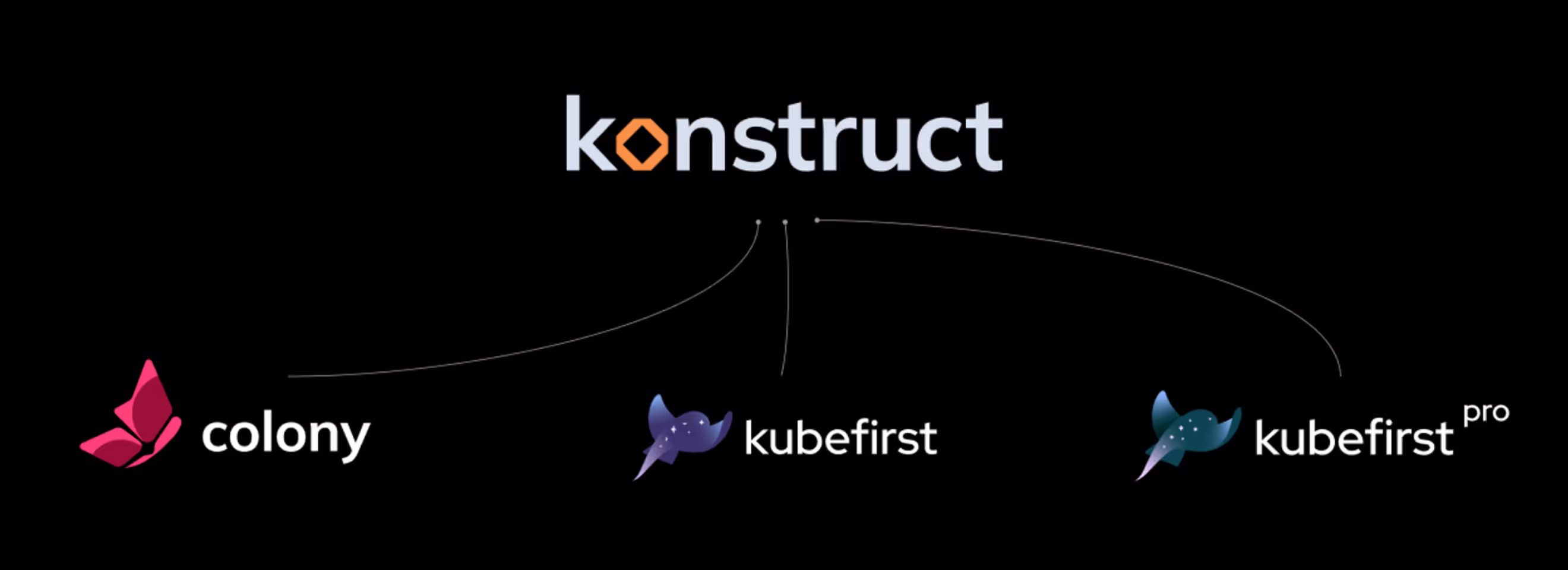
Polybox Studio designed Colony's brand identity as part of an ongoing SaaS design partnership with the Konstruct ecosystem — delivering the logo and visual identity for their bare metal provisioning product.
- Timeline:2 weeks
- Services:
PRODUCT ECOSYSTEM
Problem Statement
Colony needed a brand identity that could stand on its own in the bare metal provisioning space while fitting within the Konstruct product family alongside Kubefirst. The challenge was representing strength, stability, and raw infrastructure power — while signaling that Colony is a modern alternative to legacy tools like VMware vSphere.

Our role
Colony sits within the Konstruct ecosystem alongside Kubefirst — but it needed to feel like its own product, not a Kubefirst spin-off. The challenge was creating a brand identity that works independently in the bare metal provisioning space while still belonging to the same product family.
The audience is different too. Colony is built for system administrators who manage physical data center infrastructure — a technically demanding audience that values stability and raw capability over polish. The brand had to earn trust with people who are skeptical by default and would rather talk to a terminal than a sales team.
Kubefirst's K-ray logo is tied to the sky — cloud environments, orchestration, speed. Colony needed to be tied to the earth — physical hardware, on-premise infrastructure, raw power. This parallel gave us a clear creative direction: where Kubefirst feels light and celestial, Colony needed to feel grounded, bold, and transformative.
The butterfly emerged as the right symbol — a creature that represents metamorphosis, which maps directly to Colony's value proposition: transforming how enterprises manage bare metal infrastructure after years of legacy tooling.
— Polybox marketing research

Design Rationale
The butterfly represents transformation — the metamorphosis from legacy infrastructure management to modern bare metal provisioning. While Kubefirst's K-ray is tied to the sky and cloud environments, Colony's butterfly is tied to the earth and physical hardware.

— Elizaveta Vakhrameeva
Brand designer
Logo anatomy
The Colony logo uses a butterfly constructed from overlapping geometric planes — each wing section built as a distinct facet, giving the mark depth and dimension while keeping it flat enough for small-scale reproduction in the product interface.
The construction is deliberately angular rather than organic. The sharp facets reference the precision of physical infrastructure — server racks, circuit boards, structured cabling — while the overall butterfly silhouette keeps the mark approachable and instantly recognizable at any size, from a mobile app icon to conference signage.
- ManagerValeria Kozlova
- DesignerElizaveta Vakhrameeva
- Technical DesignerElizaveta Vakhrameeva