Testkube

About the client
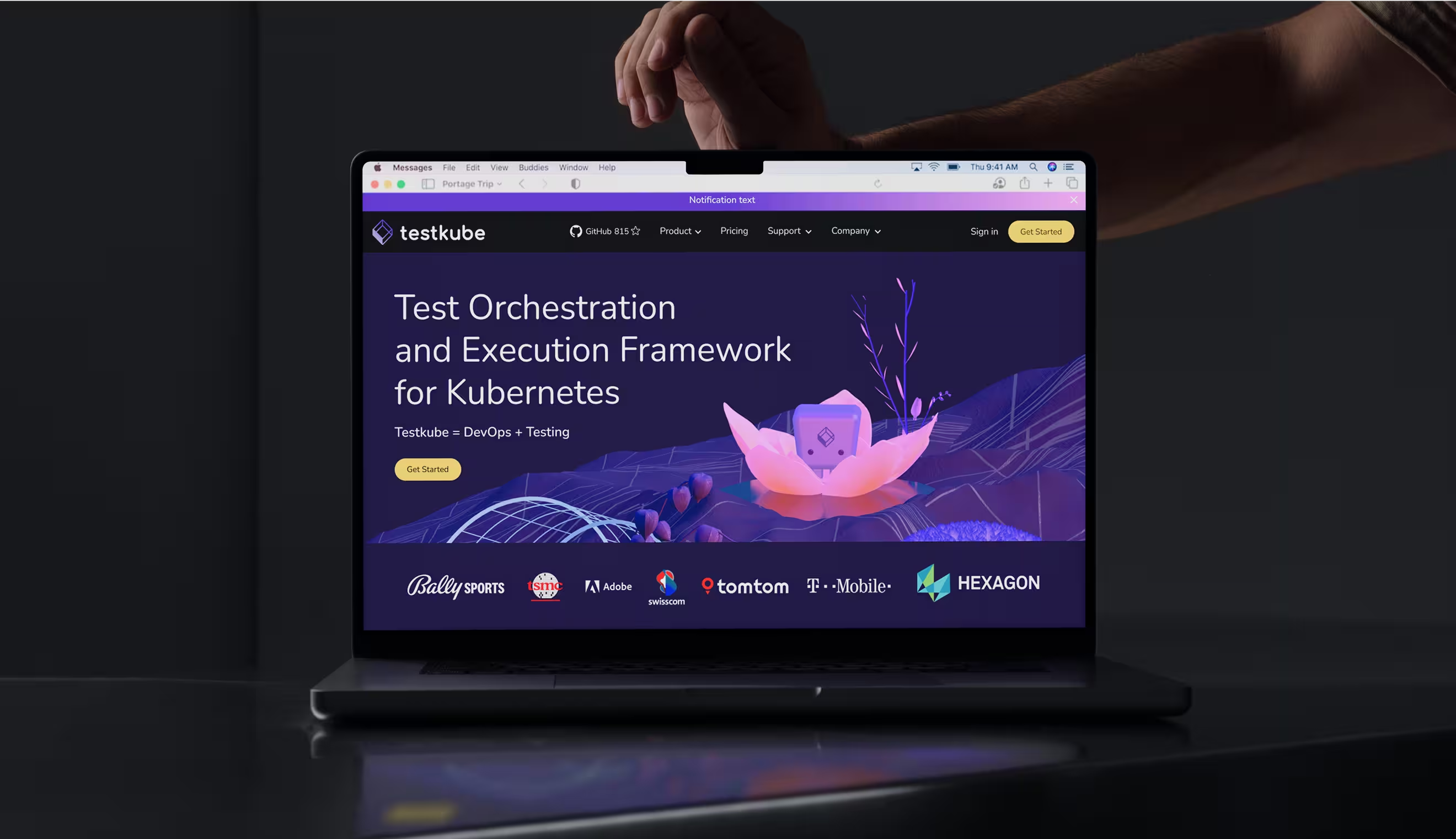
Full-service SaaS design for a Kubernetes test execution framework
Testkube is a tool that helps users run and manage tests in Kubernetes.
Polybox Studio has been Testkube's dedicated SaaS design partner on an ongoing basis — delivering brand identity, website design, UI/UX, design system, marketing design, and ongoing design support.
- Timeline:ongoing
- Website:testkube.io

Problem Statement

Testkube’s branding should fit in with the Kubeshop environment and be both visually appealing and functional. It should show the values of openness, transparency, and community involvement, and it should make Testkube stand out from the competition by showing off its unique features.

Our role
The core goal was to create an identity that combined Testkube's informal friendliness with its fundamental role within the Kubeshop ecosystem. This was not about superficial consistency — it required a shared visual code. Like siblings sharing family traits yet possessing unique personalities, Testkube needed to be seen as both a member of the Kubeshop family and a part of cloud-native testing space.
The branding itself should capture developers' attention and make them curious about Testkube. It was created for modern teams who care about CI/CD, test automation, and GitOps, so we needed to appeal to this specific audience.
— Polybox marketing research
illustrations
.avif)

.avif)
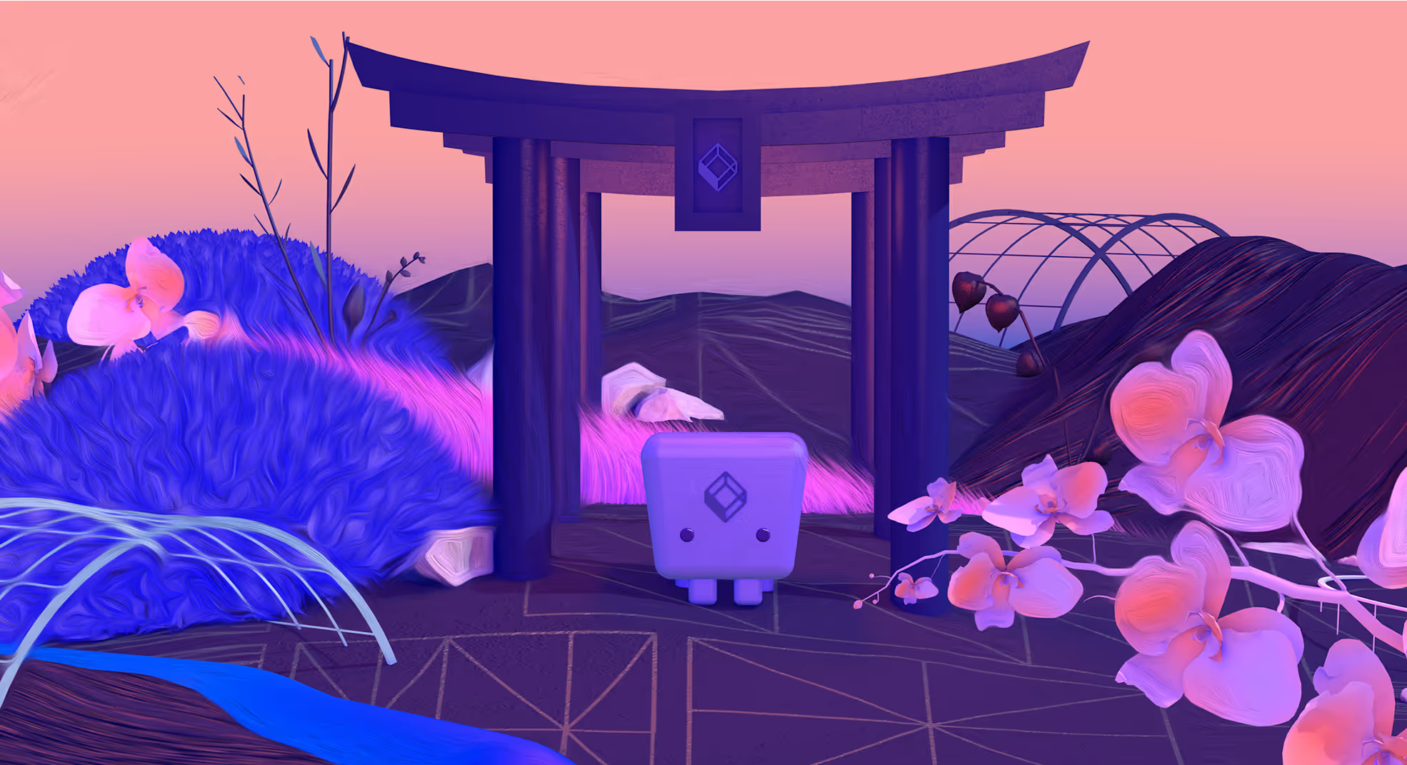

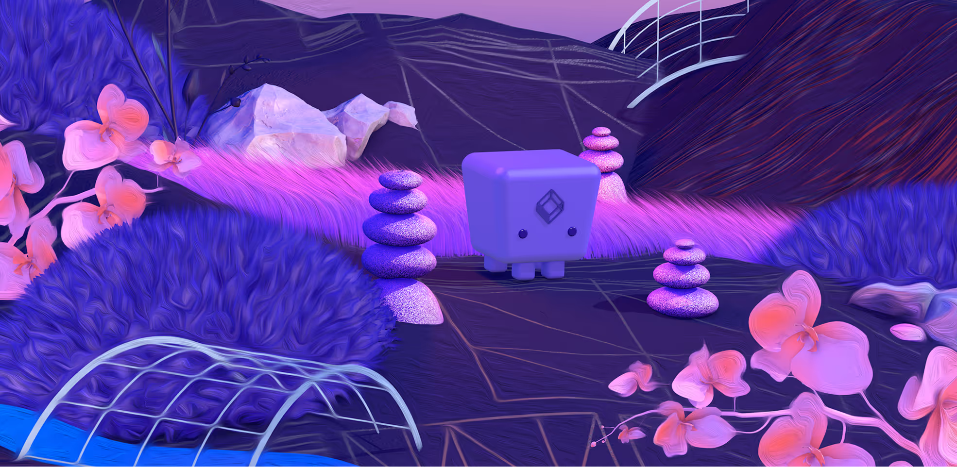
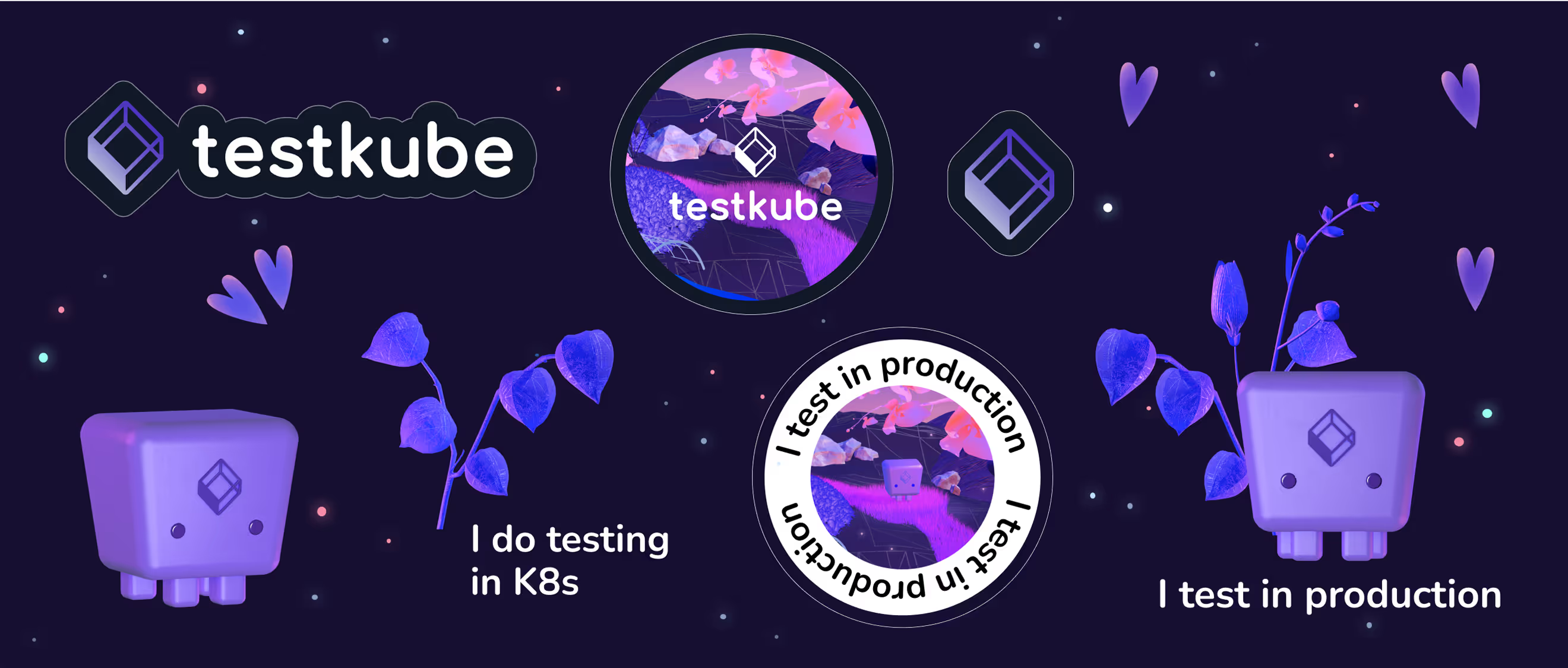
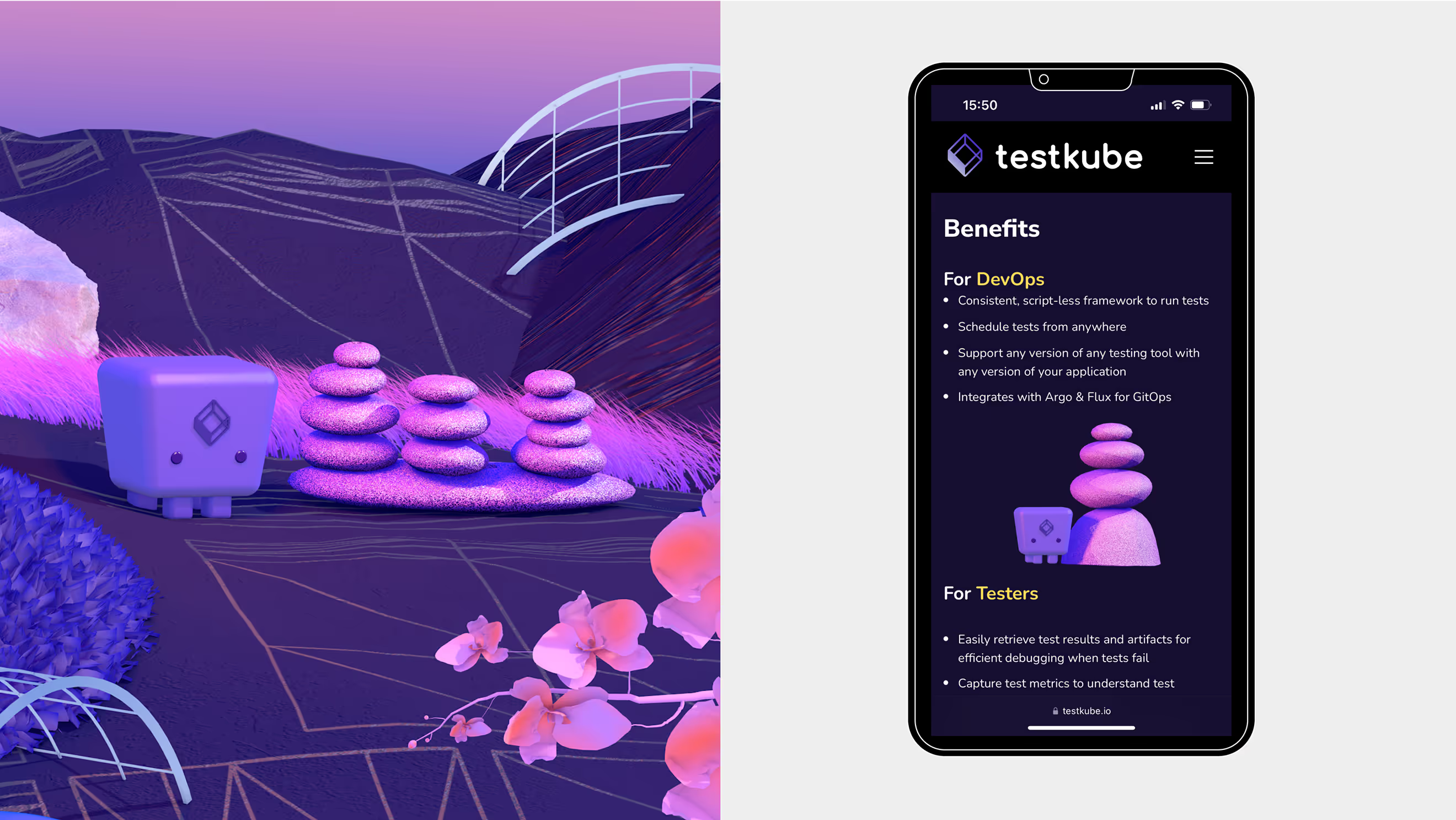
We created Testkube’s character not only as a mascot but also as a wise automation guru living in a digital zen garden. It was part of the brand story. While others were bombarding users with crazy dashboards and scary alerts, we created an oasis of calm. The message to users was, "Breathe; Testkube will take care of the tests."
Visually, we avoided rigid geometrical shapes and instead elevated organic look and feel with the shapes giving nod to the nature and growth. Botanical motifs such as orchids and lotuses demonstrated Testkube's flexibility, contrasting with other companies' corporate jungle-like environments.
For the color palette, we used calming purples, pinks, and light yellows — a combination that reduces cognitive friction according to neurologists. In contrast to widespread blue and red, this scheme provides reassurance and conveys playful sophistication; each shade carefully selected to transform anxiety into confidence.
Design Rationale
For Testkube, we wanted to go with a sci-fi/fantasy theme. Users are likely to relate to the fantasy because in their downtime, they're watching Star Wars, reading "Lord of the Rings", watching anime, or playing "Magic: The Gathering". So why not make the working environment as imaginative as their leisure world?

— Elizaveta Vakhrameeva
Brand designer
Logo anatomy
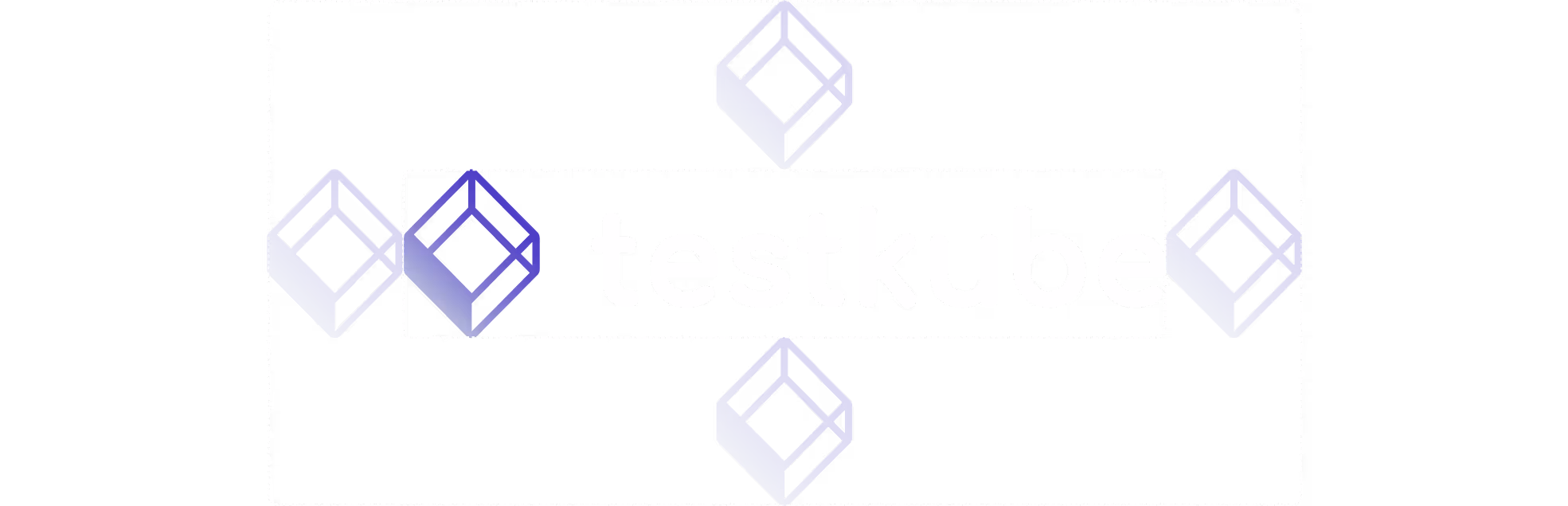
We've built Testkube logo on Kubeshop's foundation, but we've given it a bit of a twist. The symbol part of the logo is a 3D cube that represents Kubernetes' modularity, giving off calm, confident vibe. And for the text part of the logo we used proprietary Nunito.
Branded charts and diagrams

.webp)

We developed a visual style for diagrams and charts that were necessary for product presentations. Using Testkube's color scheme and rounded shapes, we transformed technical diagrams into visual storytelling tools.
.avif)

The Testkube Design System
%201%20(1).avif)
To work with a constantly changing product, we needed a solid framework that gave us enough flexibility to create new design elements. But at the same time, we had to keep a tight focus on our branding. So we created a comprehensive design system that covered everything we needed:
- The brand colors and shades.
- A clear hierarchy for fonts.
- Frequently used interface elements like buttons, cards, and controls.
- Layouts for all the different pages and screens.
.avif)
- ManagerValeria KozlovaDonata VolkovaCamilla Davis
- Technical DesignerElizaveta VakhrameevaAleksandra Kalinicheva
- Web DesignersElizaveta VakhrameevaYana KutlushinaSvetlana KalmykovaAlina SultanovaJulia MolochaevaDenis Gurkov
- DesignerElizaveta Vakhrameeva
- 3D DesignerElizaveta Vakhrameeva